# Weixin Mini Program Design Guidelines
Based on the fast speed and simplicity of Weixin Mini Programs and on the principle of fully respecting users' right to know and right to operate, these design guidelines and recommendations are intended to create a friendly, efficient, and consistent user experience within the Weixin ecosystem, while fulfilling a variety of requirements as far as possible, and achieving a mutually beneficial situation for both users and the Mini Program service providers.
# User-Friendly and Courteous
In order to avoid disruptions due to complex environments while users are using the Mini Program service in Weixin, the Mini Program should be designed to minimize user disruption from unnecessary design elements. Users are to be given a courteous introduction to the services the program offers and friendly operational guidance.
# Highlight Key Points
Every page must have a clear key focus so that the user can quickly understand the content of the page whenever a new page is opened. After you determine the key focus, try to minimize the disruption to your users from unnecessary elements that are not relevant to user decisions and operations on the page.
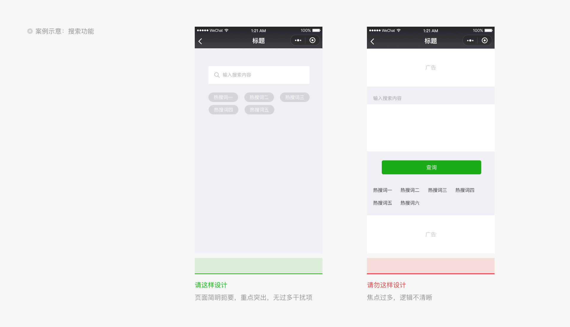
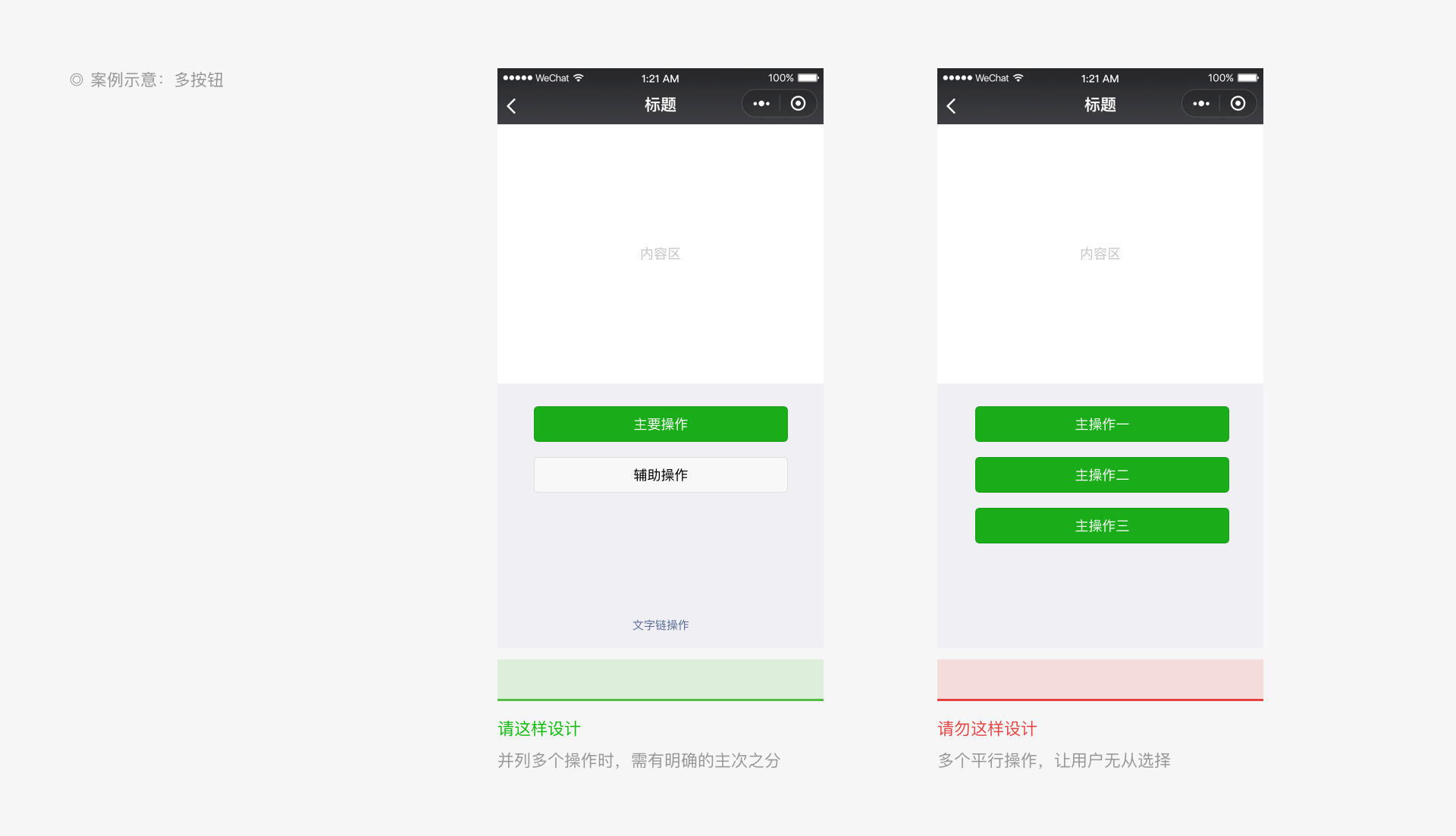
# Case study 1
# Case study 2
# Provide Clear Processes
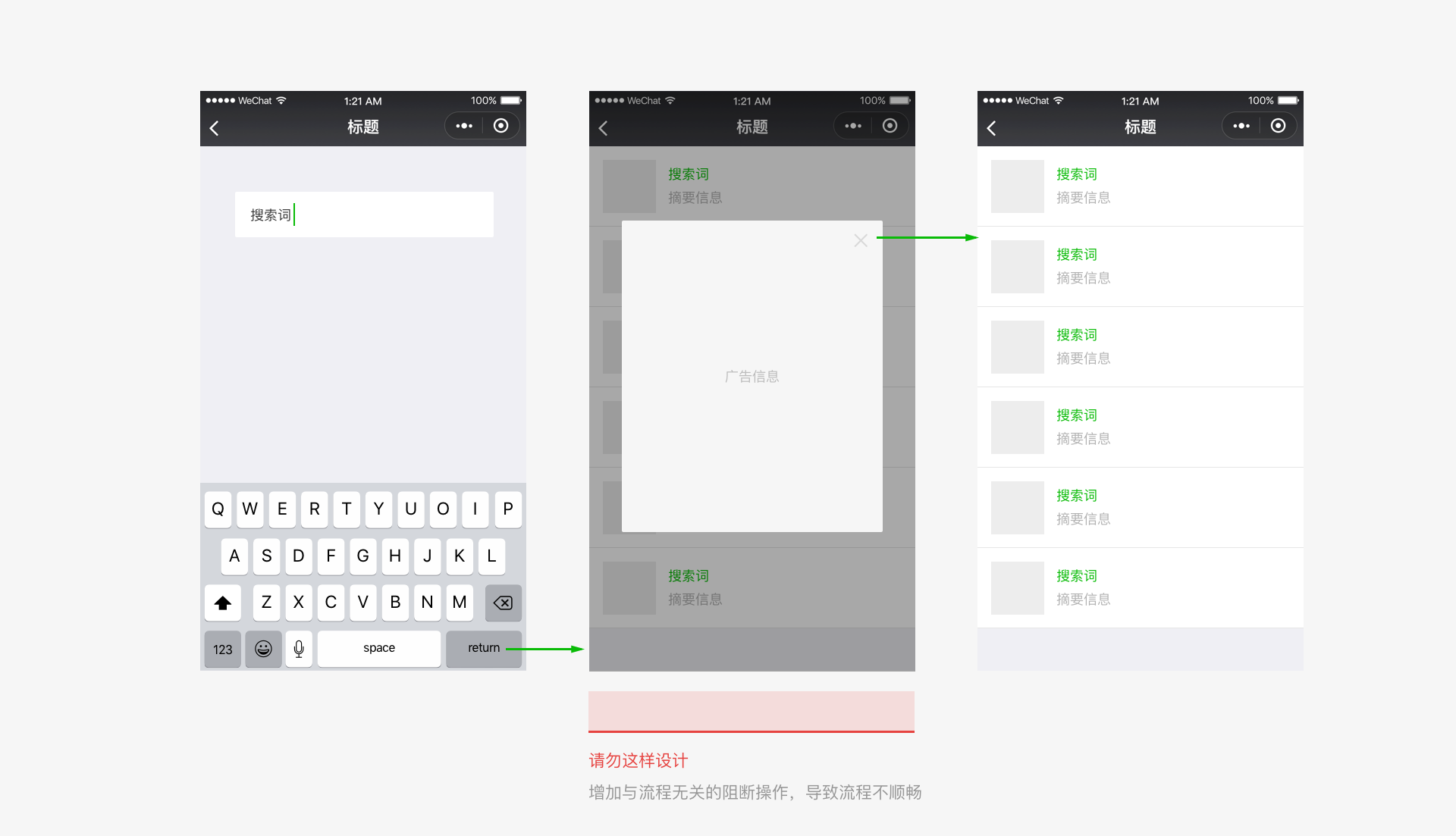
To create a smooth user journey, avoid interrupting users with unnecessary elements that are not related to the user's goals when the user performs an operation.
# Clarity
Whenever a user enters our Mini Program, we have the responsibility and obligation to clearly inform users where they are currently and where they can go from their current location, and to ensure that the user can easily browse through pages without getting lost. This enables us to offer the user a safe and enjoyable experience.
# Provide Clear Navigation and Freedom of Movement
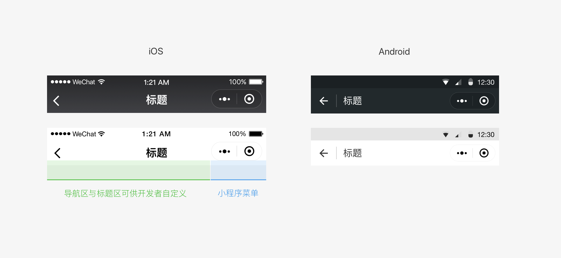
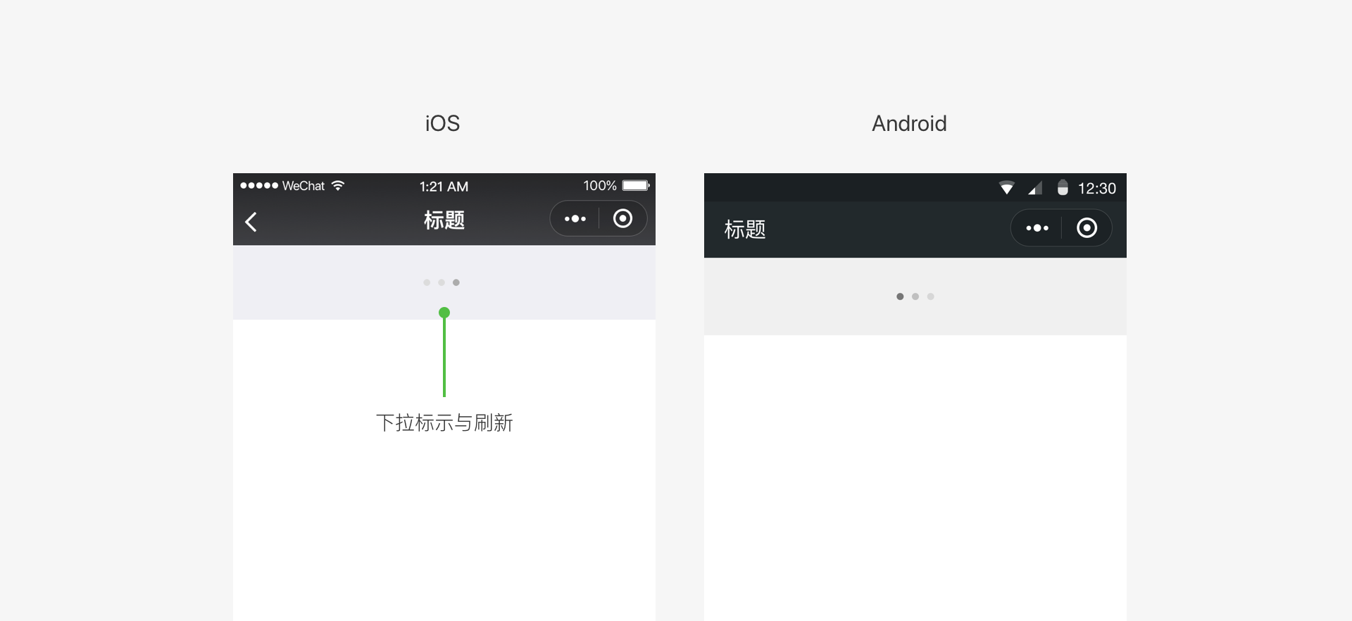
Critical to protecting users from getting lost when browsing through pages, navigation must inform the users of matters including the current location, possible destinations, and how to get back. Weixin does not provide a uniform navigation bar style in Mini Programs. You can design the navigation bars in the Mini Program homepage and secondary pages as needed. We advise you to include an operation to return to the previous page in the upper left corner of secondary pages. In addition, iOS users can return to the previous Mini Program or Weixin page by swiping to the right from the edge of the screen. Android users can do this by pressing the "Back" button.
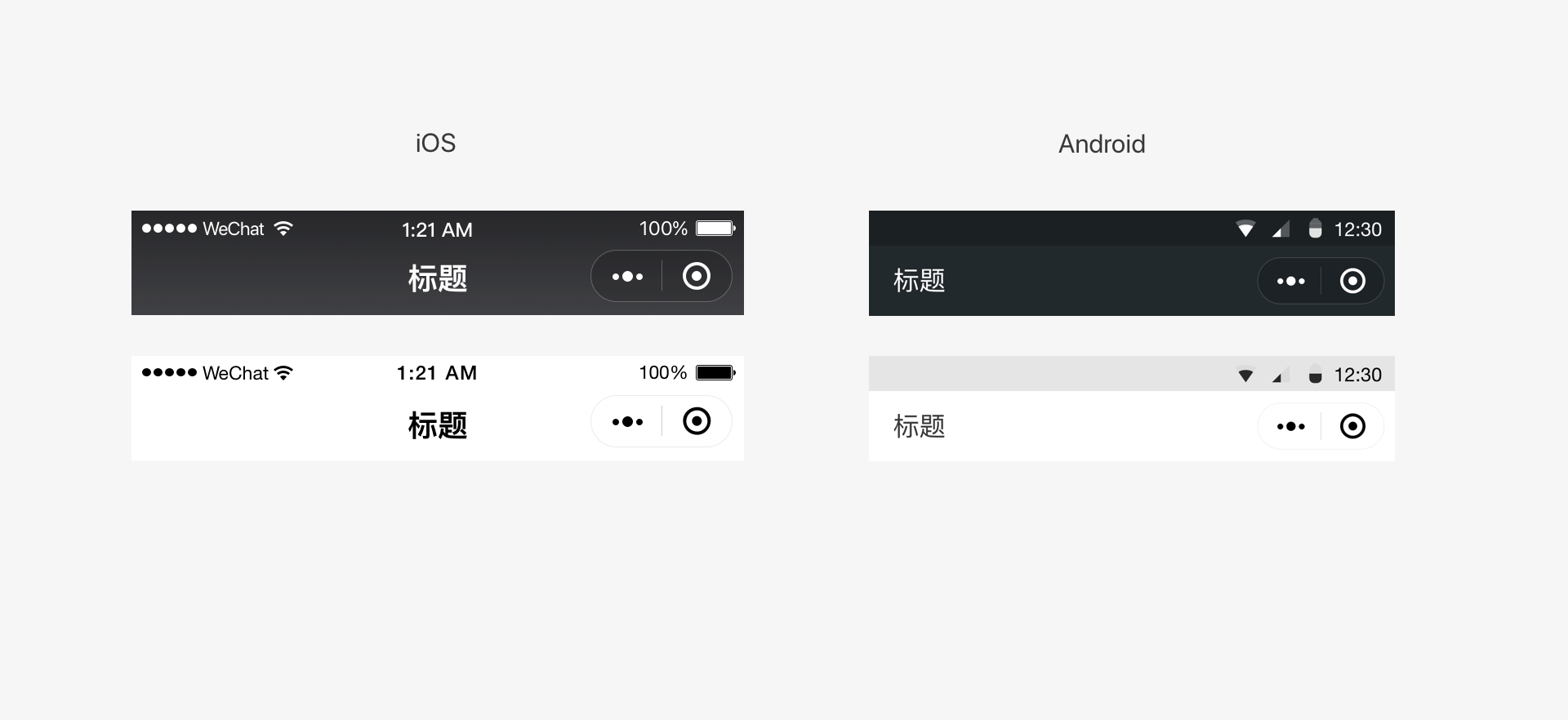
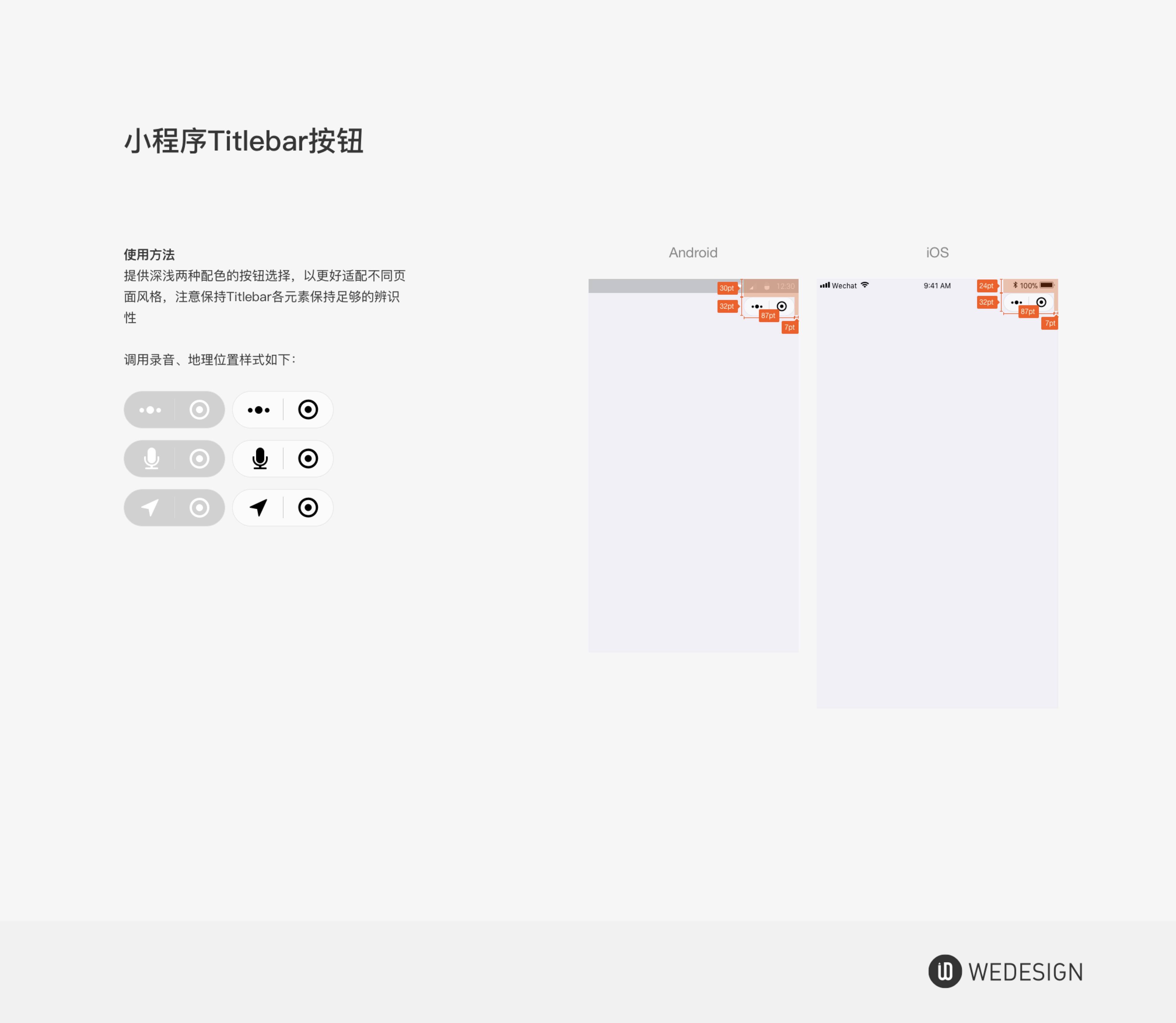
# Mini Program menu
For all pages of the Mini Program, including embedded webpages and plug-ins, Weixin will place an official Mini Program menu in the upper right corner (as shown below). Developers cannot customize its content, but they can choose a light/dark base color to suit the design of the page.
The official Mini Program menu has a fixed position in the page. Do not place other items in this position during design. When you need to add interactive elements around this menu, be aware whether the interactive event will conflict and whether the operation is easy to use.
# Color scheme for the Mini Program menu (iOS and Android)
When the menu's usability is guaranteed, you can select Weixin's dark/light color scheme for your Mini Program menu according to your needs.
# In-page navigation
You can add your own navigation within the page based on your functional design requirements. Consistency in the navigation operations should be maintained across all pages to facilitate movements backward and forward. Due to the limited size of the mobile screen, try to keep your Mini Program page navigation operations simple and easy. It is recommended to design your Mini Program navigation bar obviously different from the official Weixin Mini Program menu for easy distinction.
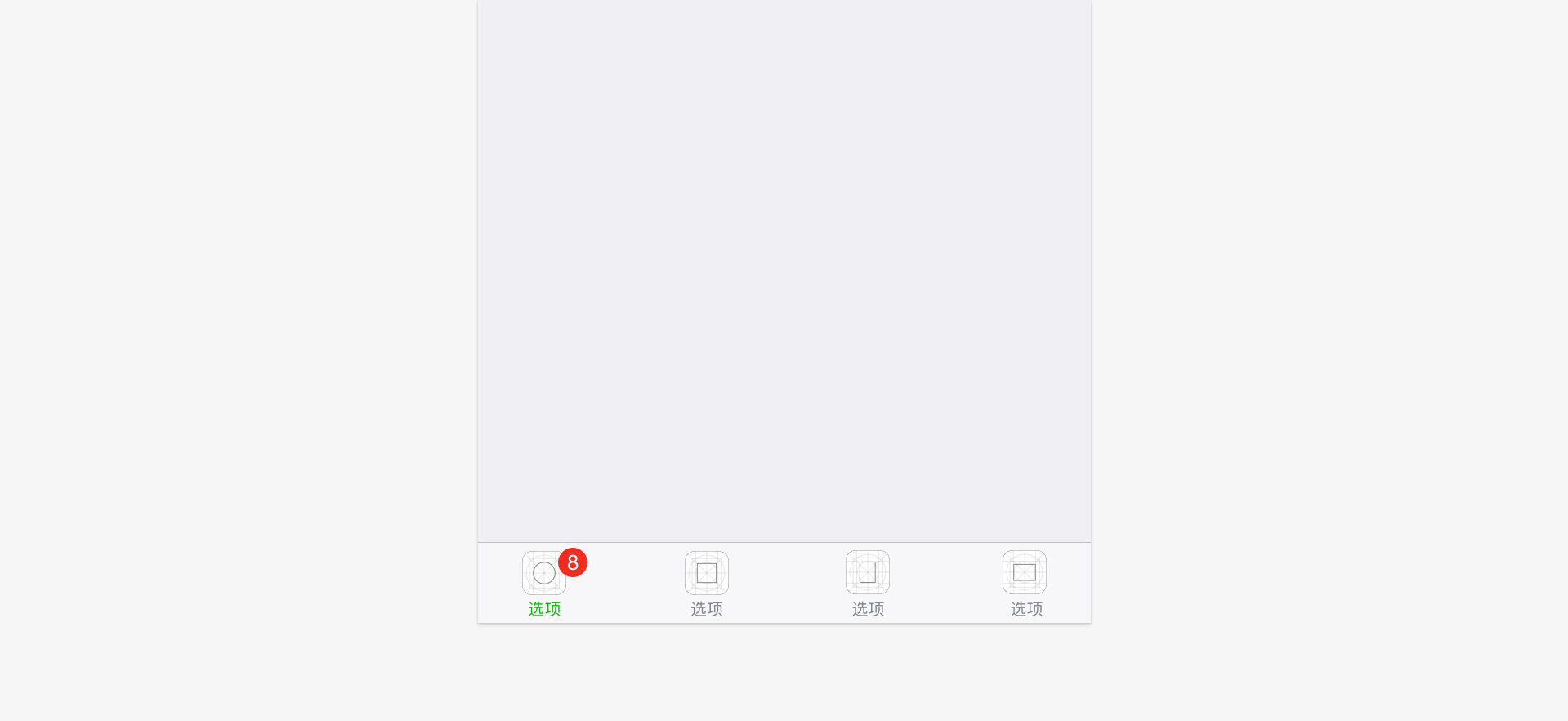
You can add tabs to the pages of the Mini Program to aid navigation. The tab bar can be fixed at the top or bottom of the page so that users can switch between different tabs easily. The number of tabs should be between two and five (both inclusive). In order to ensure sufficient space for easy tapping, it is recommended to use not more than four tabs. A single page should only contain one tab bar.
You can use Weixin's bottom tab style in the homepage of the Mini Program. This style is specifically designed for the homepage of the Mini Program. You can customize the icon style, tab text, text color and others during development. For specific settings such as icon size, refer to the Development Documentation and the WeUI basic control library.
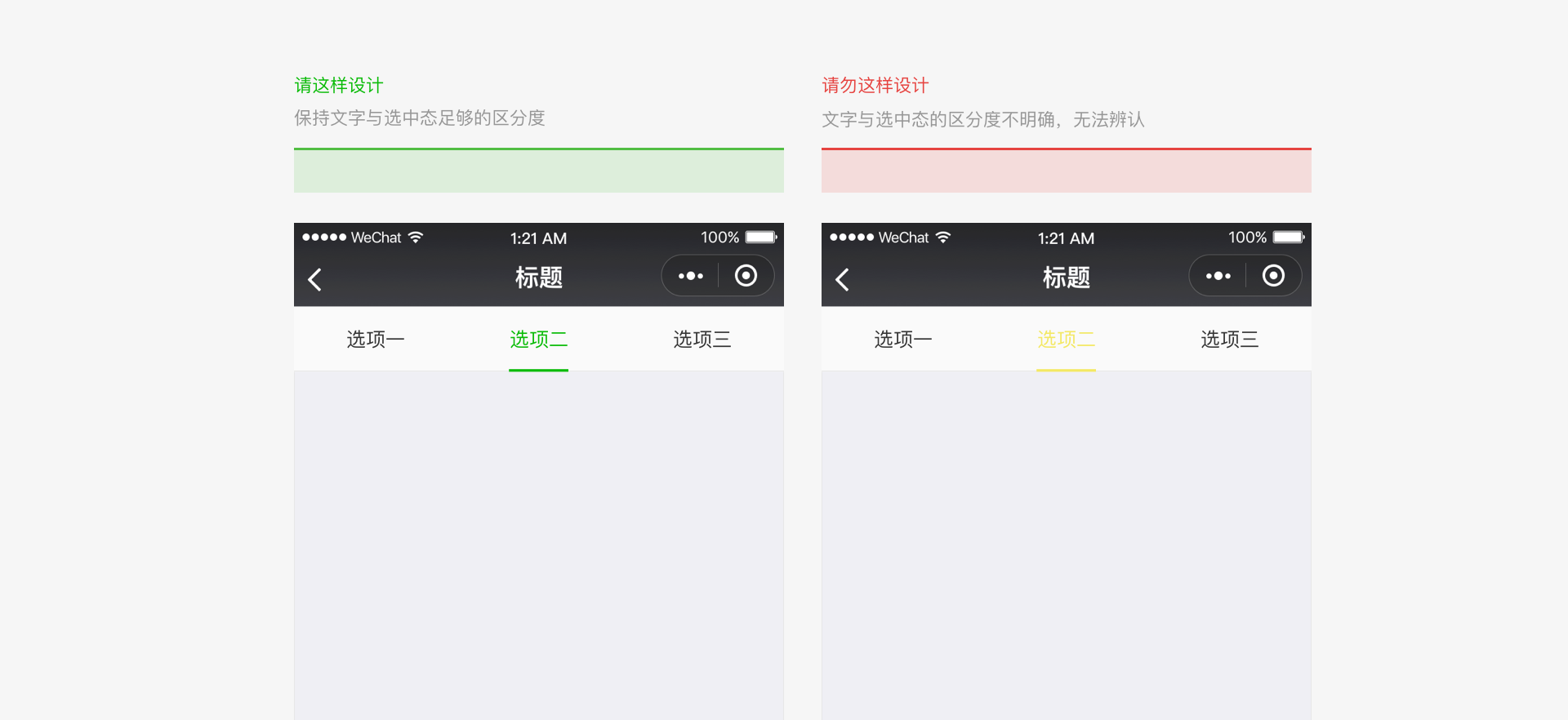
You can customize the color of the top tab bar. When selecting the color, you must be aware of the usability, visibility, and accessibility of the tab bar.
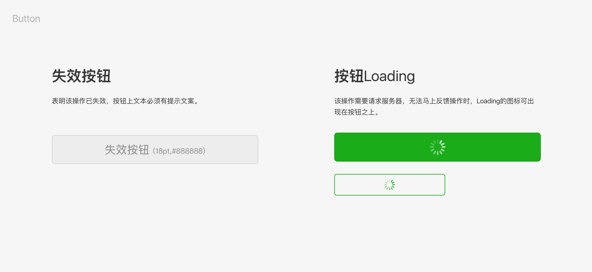
# Reduce Wait Times with Prompt Feedback
Excessive wait times on pages will lead to user dissatisfaction, but using the technology offered by Weixin Mini Programs significantly reduces wait times. When loading and waiting cannot be avoided, prompt feedback must be given in order to reduce user dissatisfaction.
# Start-up page loading
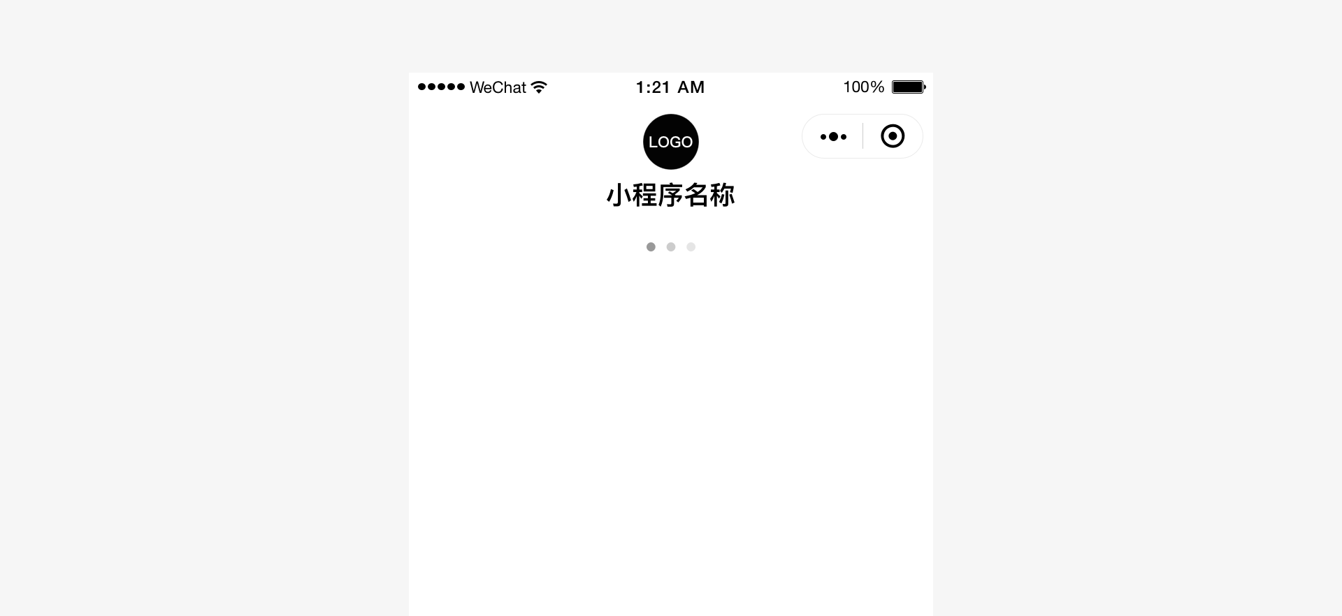
The Mini Program start-up page is one of the Mini Program pages providing the chance for a certain degree of branding display in Weixin. This page highlights the Mini Program brand's special features and loading status. Elements on the start-up page other than the brand logo, such as the loading progress indicator, are provided by Weixin by default and cannot be altered. You do not need to develop these elements.
# Swipe-down-to-refresh/load
Weixin offers the standard swipe-down-to-refresh/load feature and style within Weixin Mini Programs. You do not need to develop this feature.
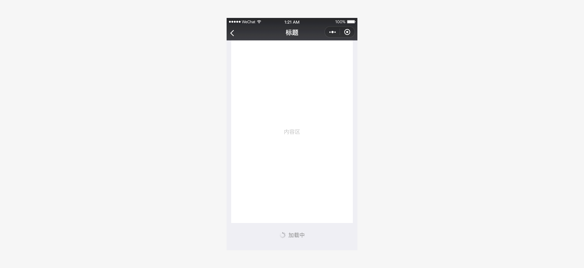
# In-page loading feedback
You can define the loading style for Mini Program pages. For both local and global loading, keep the custom loading style as plain as possible and use simple animations to inform the user of the loading progress.
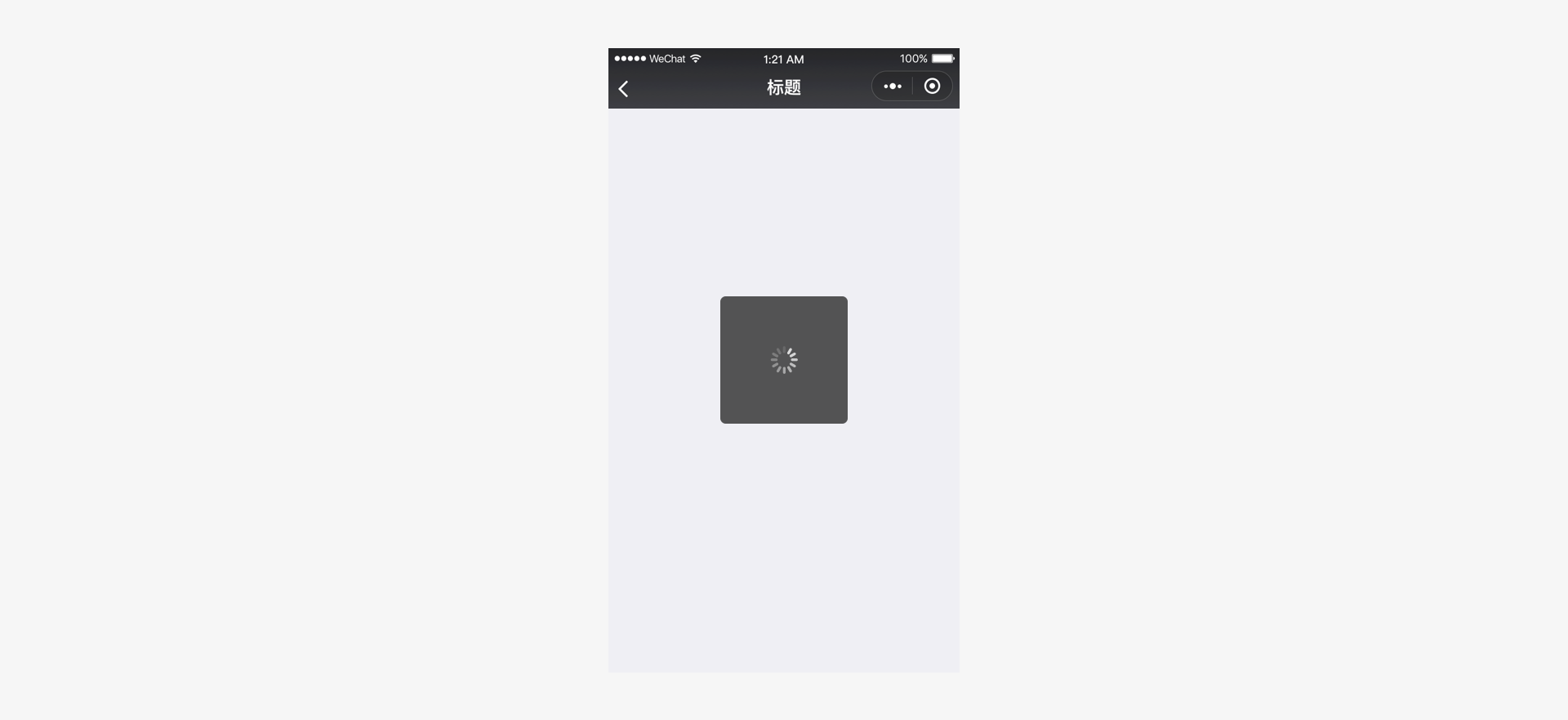
# Modal loading
The modal loading style will cover the entire page. It is not possible to clearly indicate the specific loading location or content, which may cause concern on the part of the user. For this reason, it must be used with caution. Modal loading should only be used for certain global operations.
# Local loading feedback
Local loading feedback only provides feedback on the page that triggers loading. This feedback mechanism is more focused and entails less page movement. Weixin recommends this form of feedback. For example:
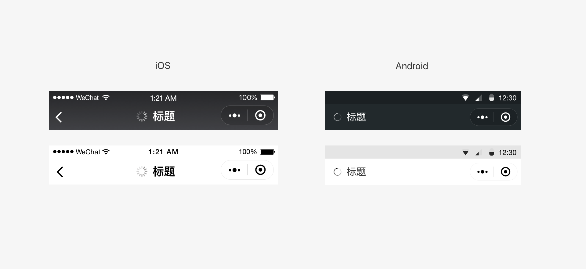
# Global loading feedback
Developers can refer to the styles in the images and use the title bar to indicate the progress of loading the Mini Program page content. For example:
# Loading feedback considerations
- For a long loading time, you should provide a cancel operation and add a progress bar to show the loading progress.
- During the loading process, animation effects should be displayed continuously. Their absence can give the false impression that the interface has frozen.
- No more than one loading animation should be used on a single page at the same time.
# Feedback on results
Apart from offering prompt feedback while the user is waiting, clear feedback should also be provided with regard to the results of an operation. Depending on the actual situation, you can choose between several feedback styles. For local operations, direct feedback can be given in the operation area. For the results of page-level operations, pop-up notifications, modal dialog boxes, or result pages can be used.
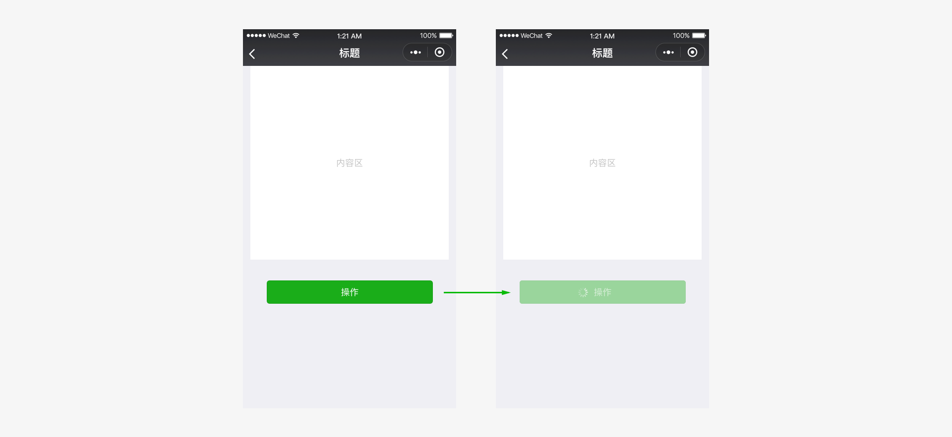
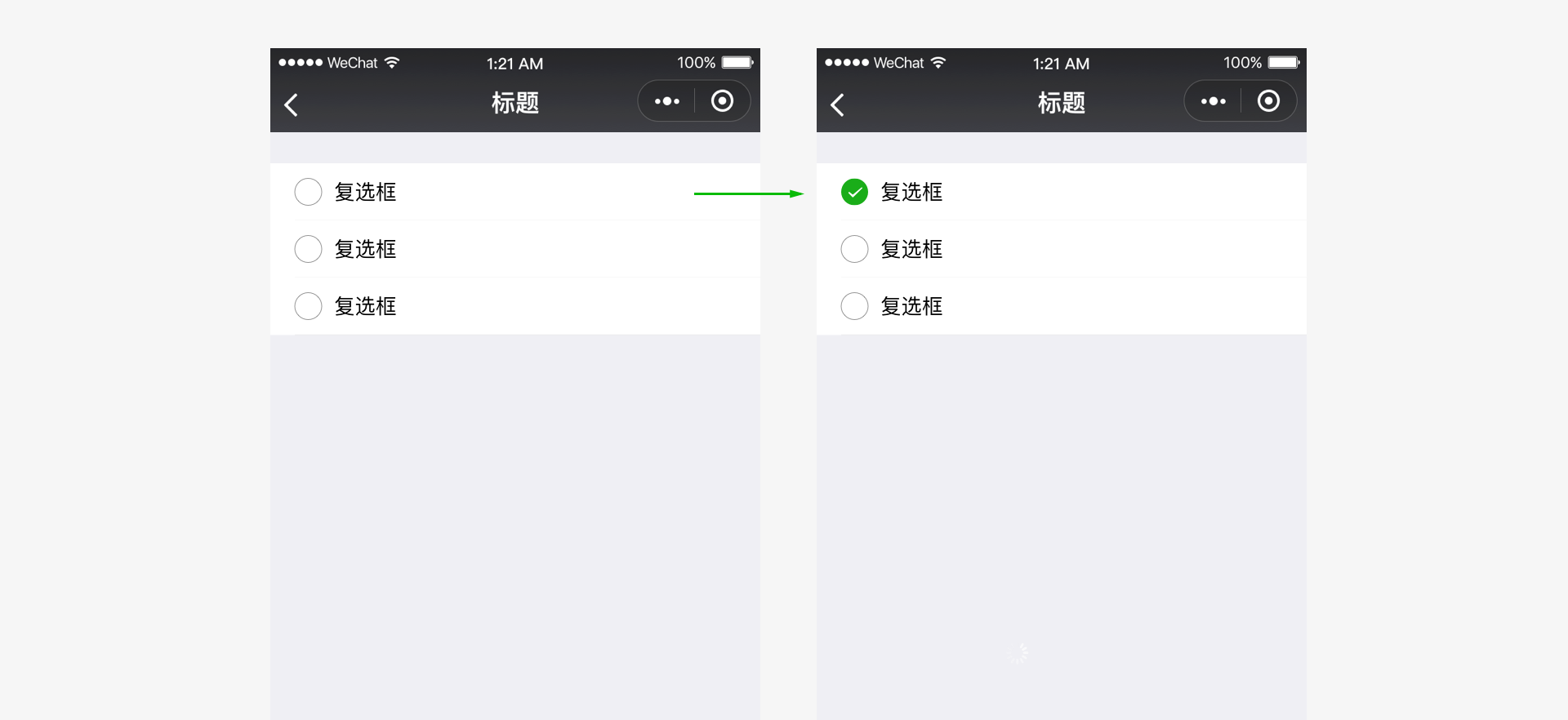
# Feedback on local operations
For local operations, direct feedback can be given in the operation area. The figure below provides before-and-after images for tapping multiple selection controls. For common controls, Weixin Design Center provides a control library, in which the controls all come with complete operation feedback.
# Results of global operations - Icon-style pop-up notifications
Icon-style pop-up notifications are suitable for lightweight operational prompts that do not provide important information, such as notifications that indicate success. These notifications will automatically disappear after 1.5 seconds without interrupting the current process and have less impact on users. Please note that brief icon-style pop-up notifications are not suitable for error prompts, which must clearly inform the user of the important information.
# Results of global operations - Text-style pop-up notifications
Text-style pop-up notifications are suitable for prompting minor errors or errors that need to use short text to explain the situation. They will automatically disappear after 1.5 seconds without interrupting the current process and have less impact on users.
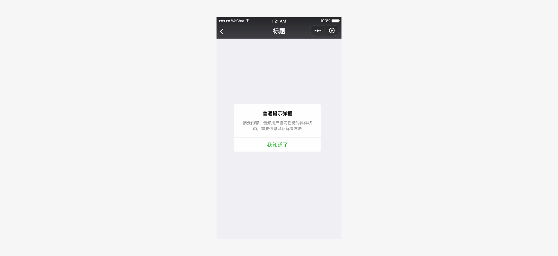
# Results of global operations - Modal dialog boxes
If an operation result must be clearly acknowledged by the user, use a modal dialogue box to display the notification and provide directions for the next operation.
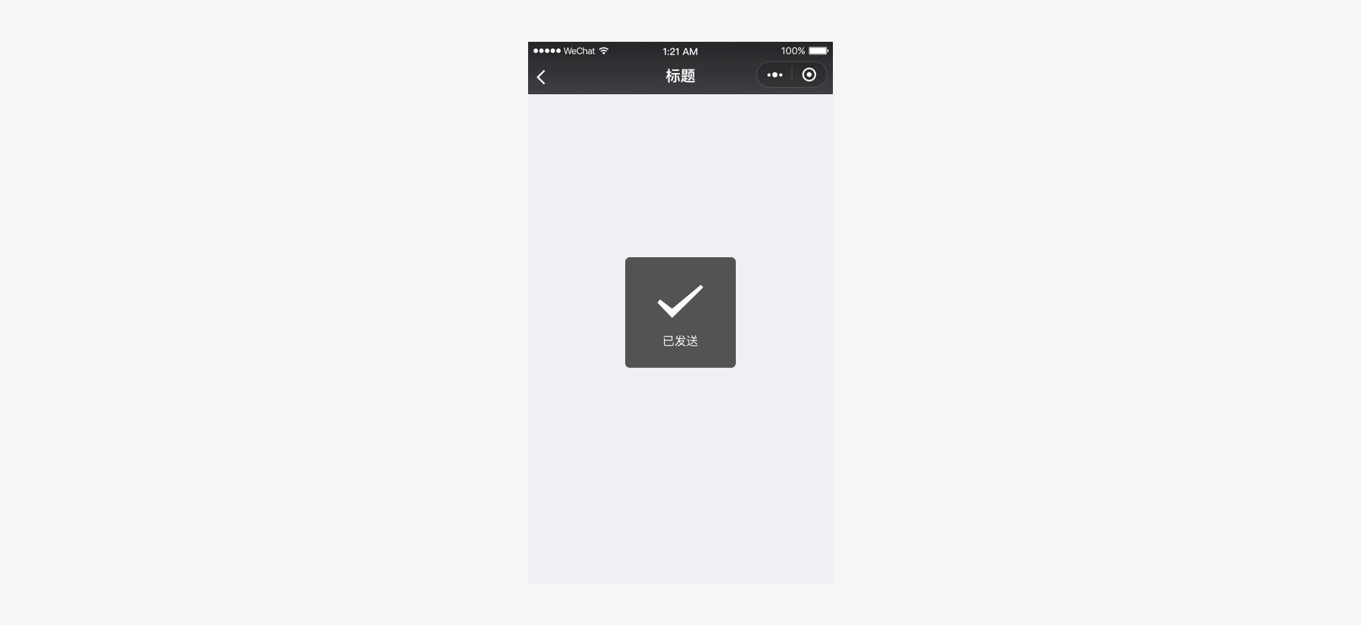
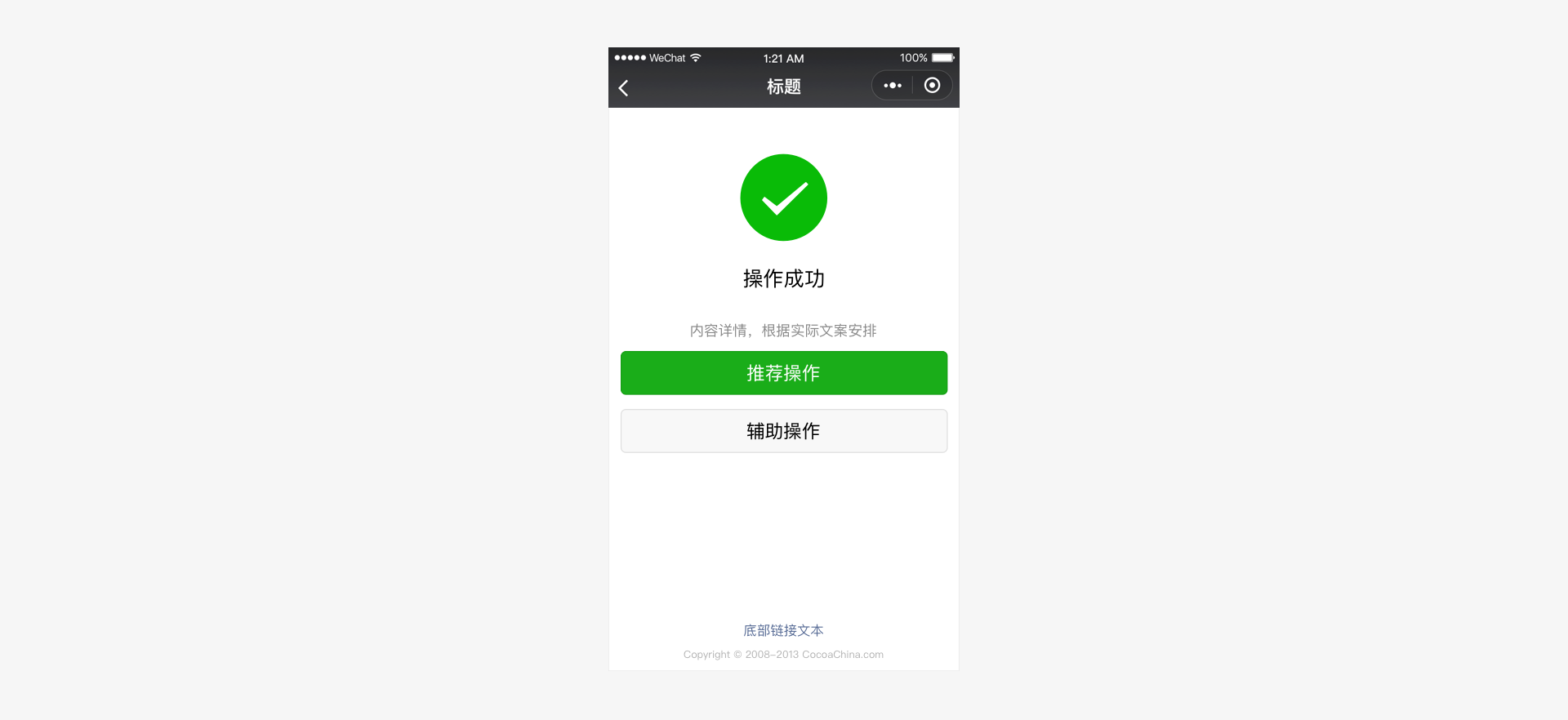
# Results of global operations - Result pages
If the operation result indicates the end of the current process, use the operation result page as feedback. This clearly informs the user that the operation ends. You can also provide directions for the next operation according to the actual needs.
# Control Exceptions and Provide a Way Out
When you design any task or process, abnormal states and processes are often overlooked. These are the situations where users become dissatisfied and need help. Therefore, special attention must be given to these exceptions. When an exception occurs, users must be given the necessary prompts and offered a solution.
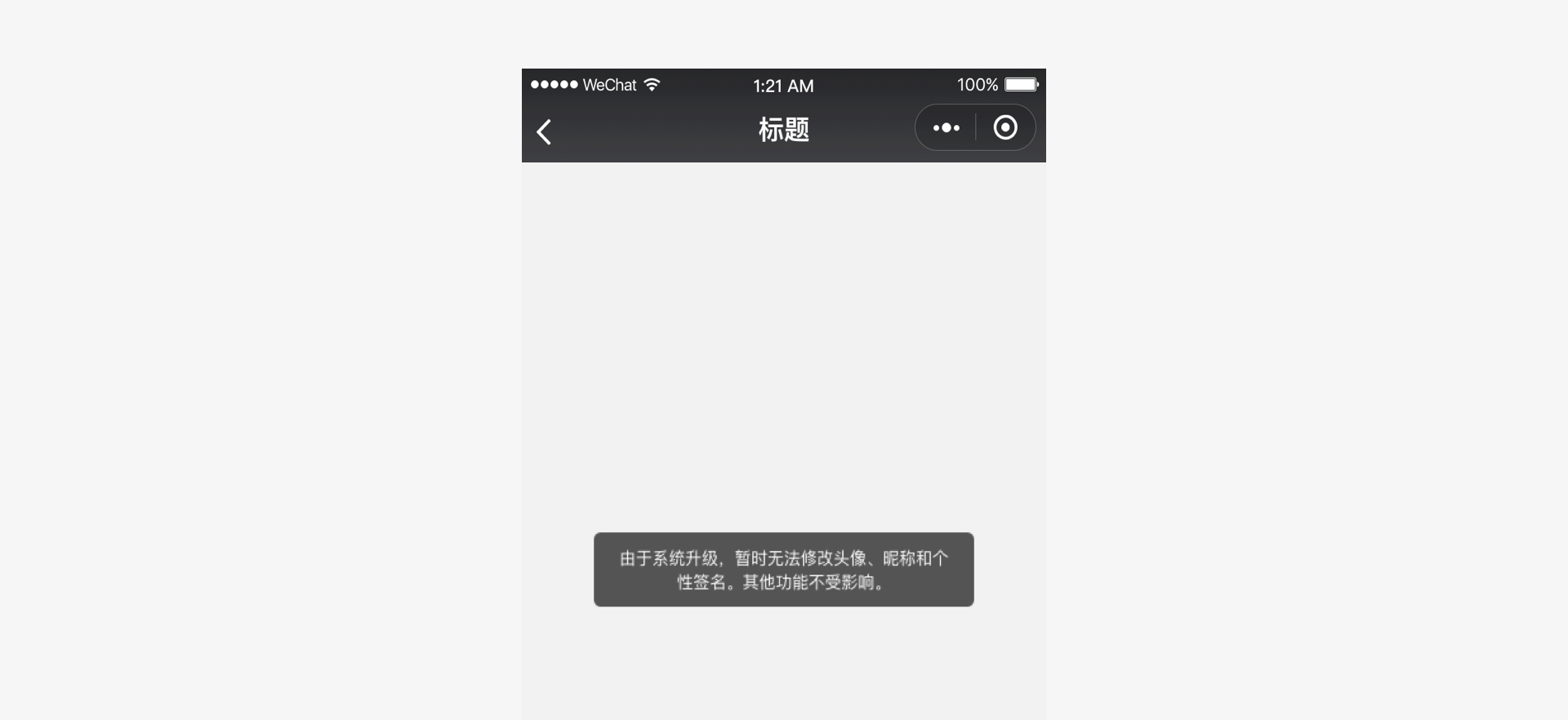
In the event of an exception, a user may stay on a page without knowing what to do. To avoid this problem, use the modal dialog box and result page methods mentioned above to report exceptions. Additionally, in form pages, especially in those which contains many items, the incorrect items should be clearly indicated in order to facilitate modification by the user.
# Exception state - Form page errors
When an error occurs in a form, give the cause of the error at the top of the form and indicate the error field to prompt the user to make necessary modifications.
# Convenience and Elegance
Although input is simple and convenient on mobile devices, mobile input is more error-prone than using a physical keyboard and mouse. To adjust to this change, you must make full use of mobile phone features in their designs, providing users with a convenient and elegant interface.
# Minimize User Input
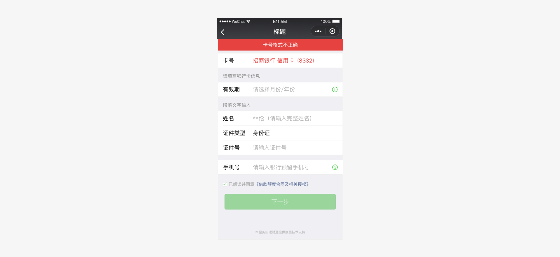
Since the mobile keyboard area is small and congested, data input can be difficult and errors are easily made. Therefore, when designing the Mini Program's pages, use existing APIs or other easy-to-use controls to minimize user input and improve the input experience.
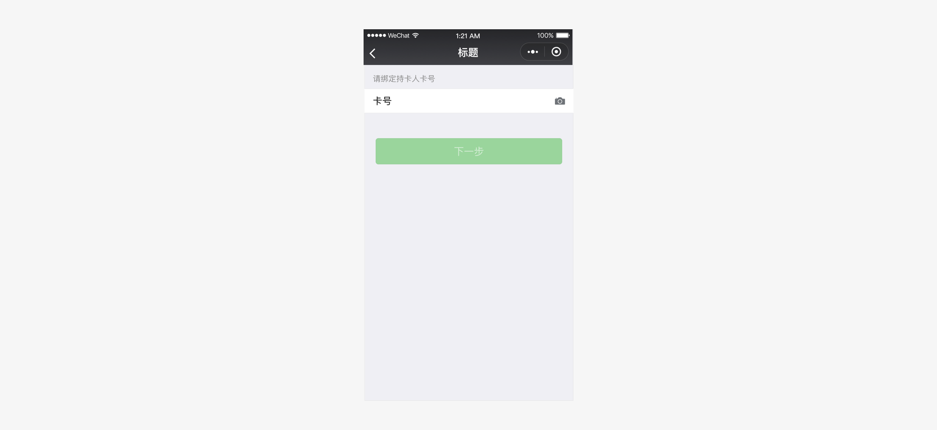
For example, in the figure below, in the bank card addition process, a camera recognition API is used to facilitate user input. Besides, Weixin team provides various Mini Program APIs (such as the geographic position API), via which you can greatly improve user input efficiency and accuracy, and further enhances the user experience.
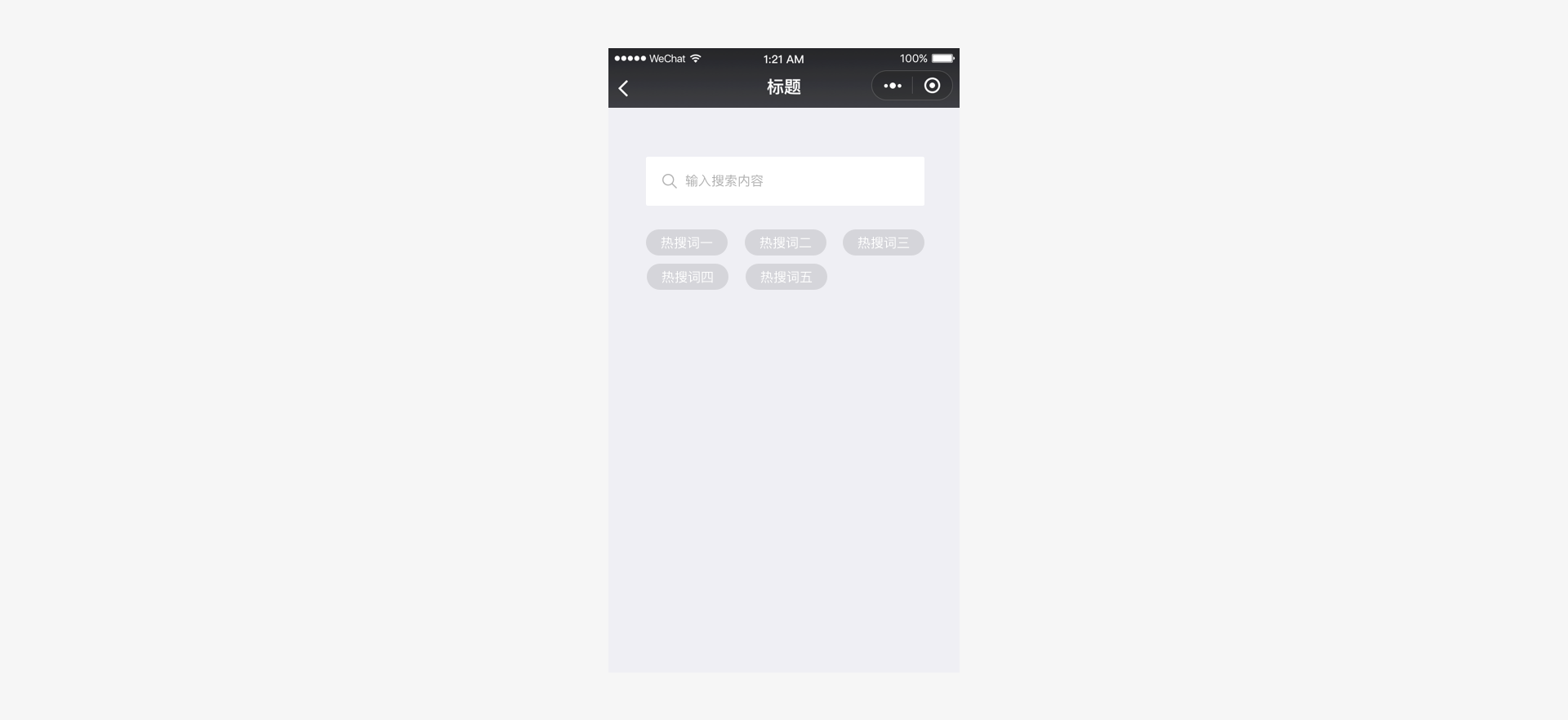
Apart from the use of APIs, in cases where manual input cannot be avoided, let users select from a few options rather than input via the keyboard. On the one hand, recognition is easier than recall. It is easier for users to select from a few options than to input something they have to recall from memory. On the other hand, single-key input on the congested mobile phone keyboard is very likely to make mistakes. In the figure below, a few options generated from the user's search history are provided to help the user perform a quick search, reducing or avoiding unnecessary keyboard input.
# Avoid Incorrect Operations
A mobile interface is handled by touching the screen with your fingers. This method is much less accurate than a mouse. Therefore, when designing controls that are to be touched on the page, the touch area must be carefully considered. This will help avoid incorrect operations due to the size of the touch area being too small or too congested. Such problems easily occur when an interface which was originally designed for a computer screen is directly transferred to a mobile phone without making any adaptations. As different mobile phones have different resolutions, the pixel size suitable for tapping also varies. However, after conversion into physical measurements, a size of 7 mm to 9 mm is acceptable. In the standard component library provided by Weixin, touch effects and adaptations for different screen sizes have been considered for the control elements. Therefore, we highly recommend you use or simulate standard control sizes during design.
# Use APIs to Improve Performance
The Weixin Design Center has already introduced a set of web page standard control libraries, including the Sketch Design Control Library and Photoshop Design Control Library. The Mini Program components will continue to be improved in the future. All these controls already fully take the distinctive properties of mobile pages into consideration, which ensures usability and operationality on the mobile screens. At the same time, the Weixin Development Team is constantly improving and expanding the Weixin Mini Program APIs and providing more common libraries. These resources not only offer the user faster service, but also greatly benefit page performance, improving user experience.
# Consistency and Stability
Apart from the above principles, we recommend that access to Weixin Mini Programs always adheres to the principles of consistency and continuity between different pages, and that consistent controls and interactive modes be used as much as possible on different pages.
Providing consistent page experience and continuous interface elements are the best way to reduce the discomfort that arises when jumping from page to page. Because of this, you can develop a Mini Program in a consistent and stable manner as required by using standard controls offered by Weixin.
# Visual Standards
# Font
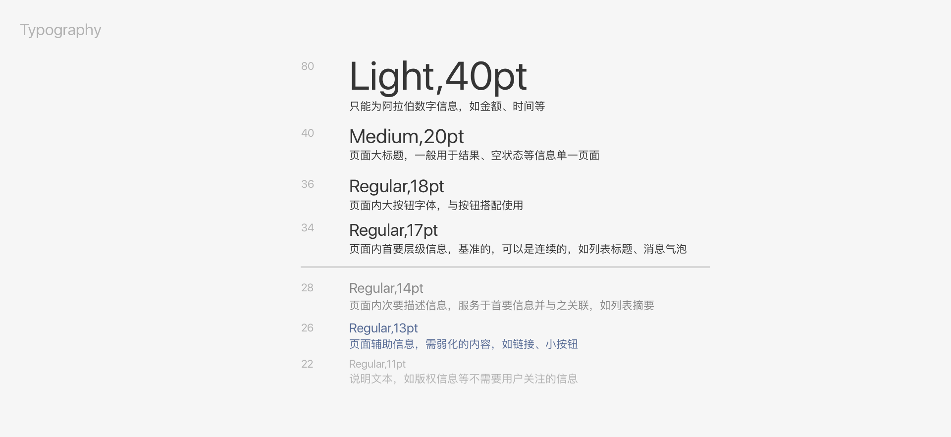
The fonts within Weixin should be consistent with the fonts of the system running Weixin. Common font sizes are 20, 18, 17, 16, 14, 13, and 11 (pt). Specific use cases are as follows:
# Font color
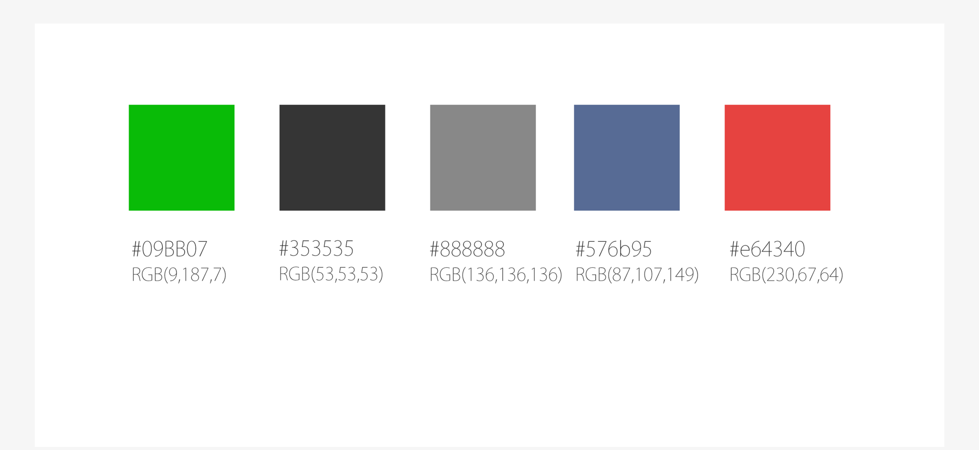
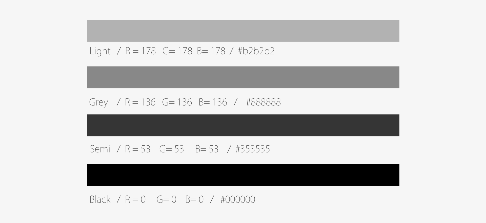
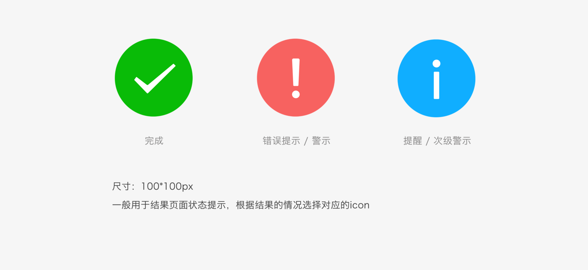
Use black for primary content and gray for secondary content. Light gray is the default value for timestamps and forms. Use semi-black for large areas of descriptive text that form part of primary content.
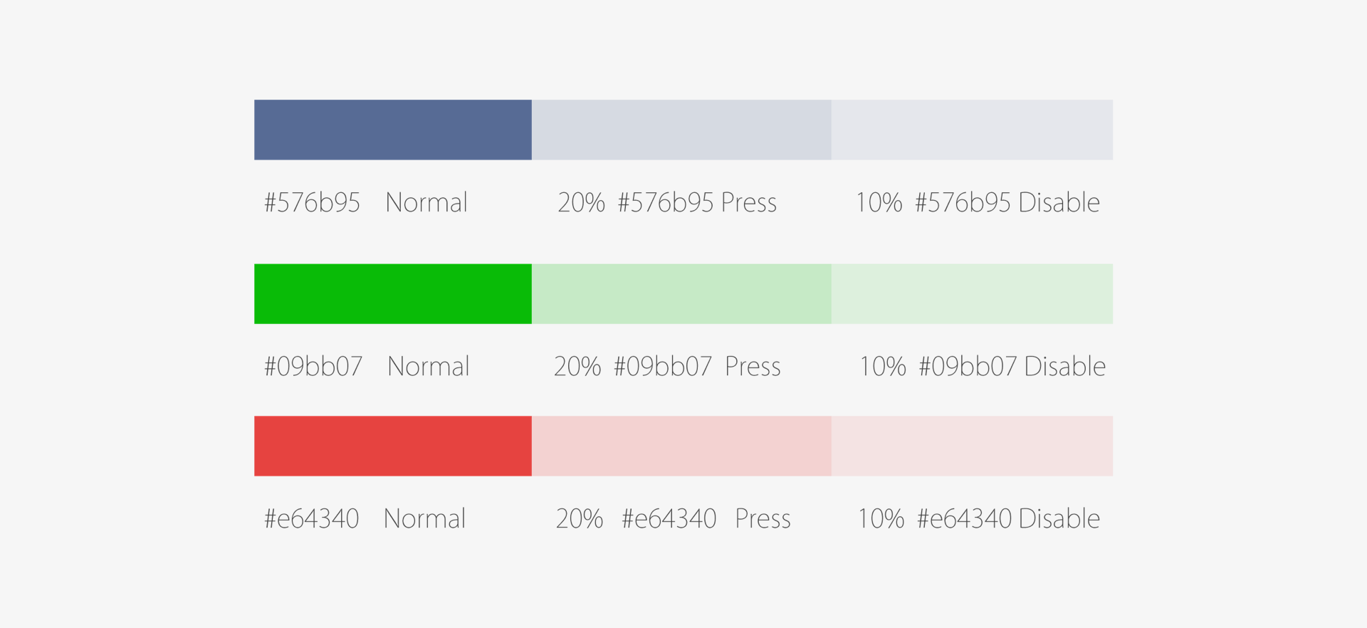
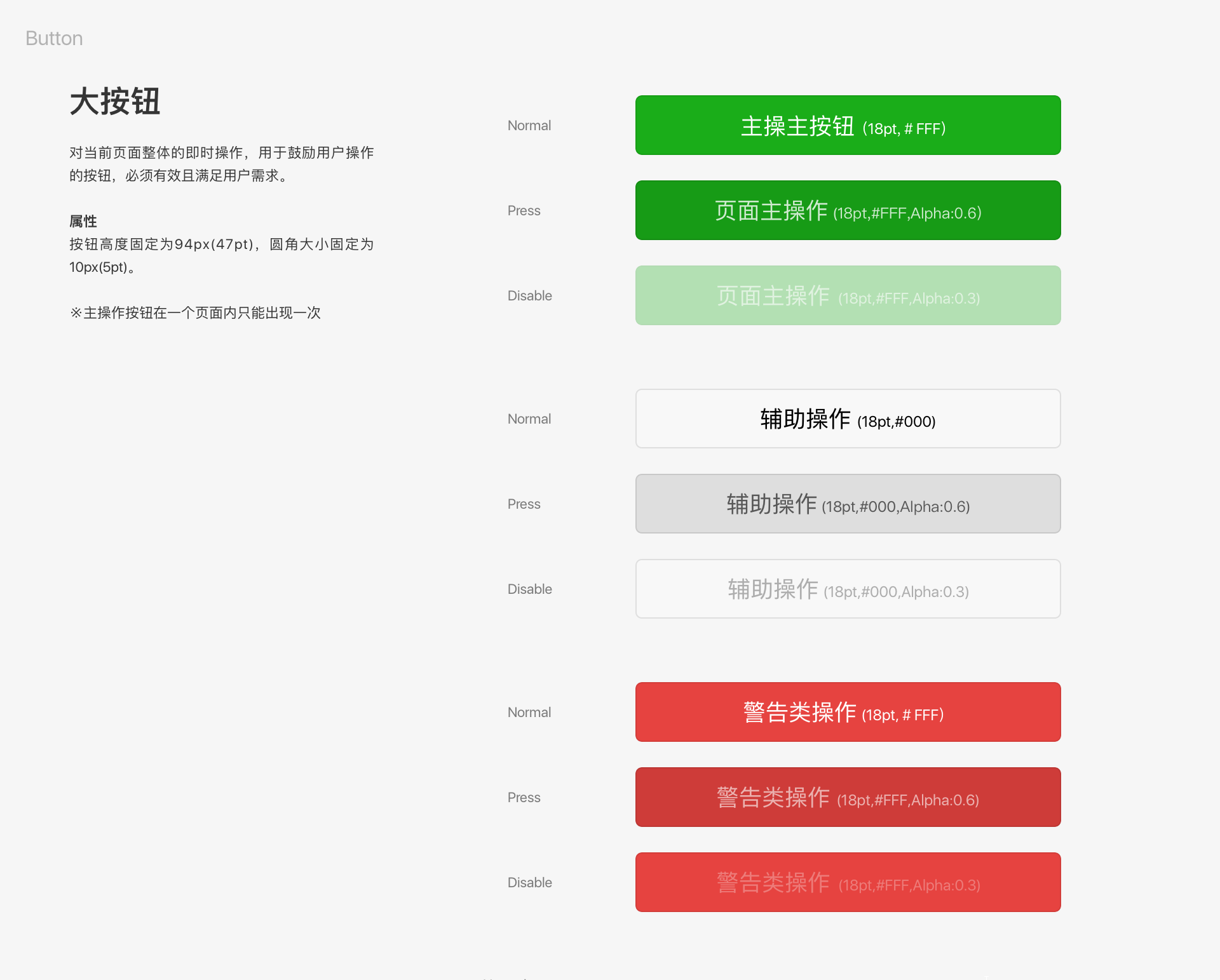
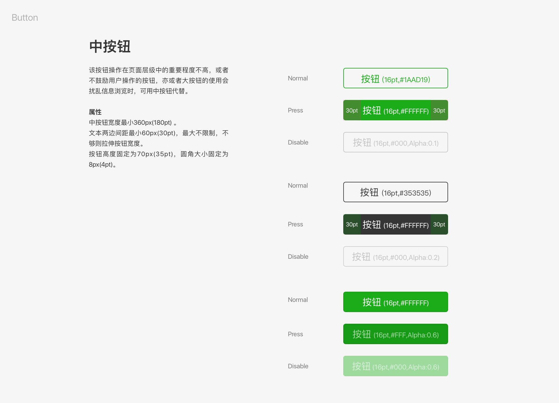
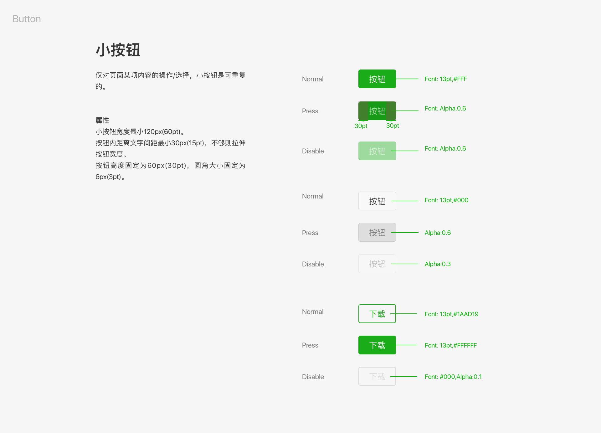
Blue is used for links, green for successfully completed actions, and red for errors. In Press and Disable statuses the level of transparency is decreased by 20% and 10% respectively.
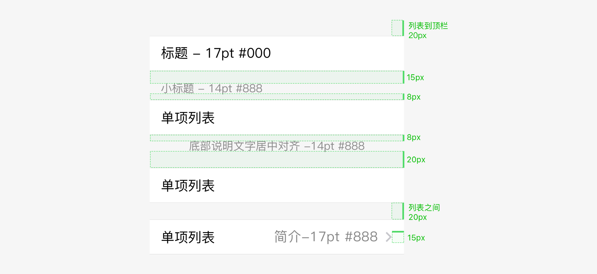
# Lists
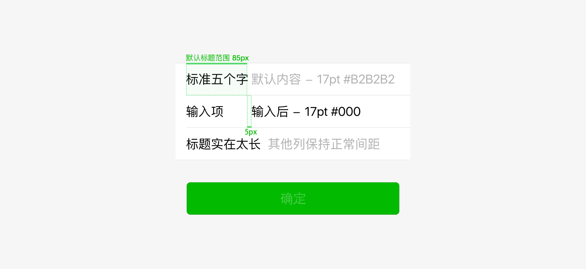
# Form Input
# Buttons
# Icons
# Resource Downloads
In order to facilitate design, Weixin offers a set of basic control libraries for web design and for use in Mini Programs. It also offers resources that are easy for developers to call.
Preview URL: https://weui.io