# Mini Program Large Screen Adaptation Guide
# I、Overview
To ensure that users have a smooth and user-friendly experience when using Mini Programs on PC, this guide provides a series of suggestions for large screen adaptation for your reference.
# 1.1 Why Adapt?
Since users can use Mini Programs on PC and may switch between different screen sizes, to ensure a smooth and user-friendly experience across various screen sizes, we recommend that developers adapt their Mini Programs according to the devices and scenarios used by users. It is recommended to use a grid system and responsive strategies to achieve dynamic page layout.
- •Use a grid system for page design
- •The grid system is regular, and its element widths and heights can be represented as percentages. This feature makes the pages and layouts designed with a grid system predictable, thereby improving the consistency and reusability of page layouts at different resolutions.
- •Develop responsive strategies for Mini Program pages
- •Responsiveness refers to how a system responds to external changes, that is, a change strategy formulated through reasonable design solutions and standardized techniques.
- •Developing a responsive strategy ensures that the Mini Program provides a reasonable and coherent user experience on any screen size.
# 1.2 Experience of Unadapted Mini Programs on PC
WeChat Mini Programs that are not adapted cannot change the window size on PC. The specific display rules are as follows.
Mini Programs Displayed in Portrait Mode
Regardless of the screen size, they are always displayed in the mobile phone size of 414x736.

Mini Programs Displayed in Landscape Mode
Regardless of the screen size, they are always displayed in the tablet size of 768x1024.
Mini Programs Displayed in Portrait Mode
With the tablet size of 1072x768 as the benchmark screen size, the mini program window is proportionally scaled based on the mobile phone size of 320x568.
Mini Programs Displayed in Landscape Mode
With the tablet size of 1072x768 as the benchmark screen size, the mini program window is proportionally scaled based on the mobile phone size of 736x414.
# II、Developer Adaptation Design Guidelines
# 2.1 Basic Adaptation Principles
PC screens have more space and advantages for displaying content compared to mobile phones, such as the ability to open multiple windows simultaneously, drag windows, and switch windows to different sizes.
To maximize the value of the larger screen size, the following principles should be followed during adaptation:
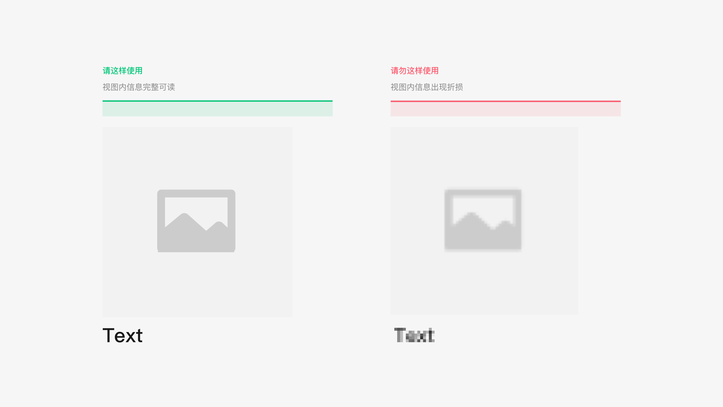
1. Complete and readable view information display
After the Mini Program view size changes, the view information should remain complete and readable, without any distortion, loss, or reduction in resolution.
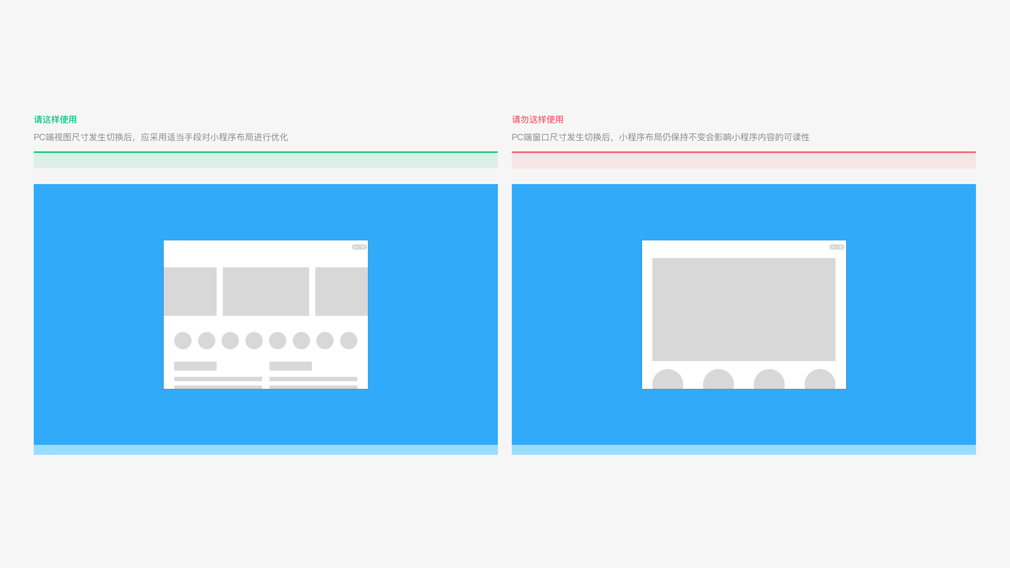
2. Smooth and friendly interaction during view size changes
When the Mini Program view size increases, more information can be displayed. The view switching process should be smooth and friendly, and appropriate methods can be used to optimize the Mini Program layout.
# 2.2 Dynamic Layout - Common Layout Methods
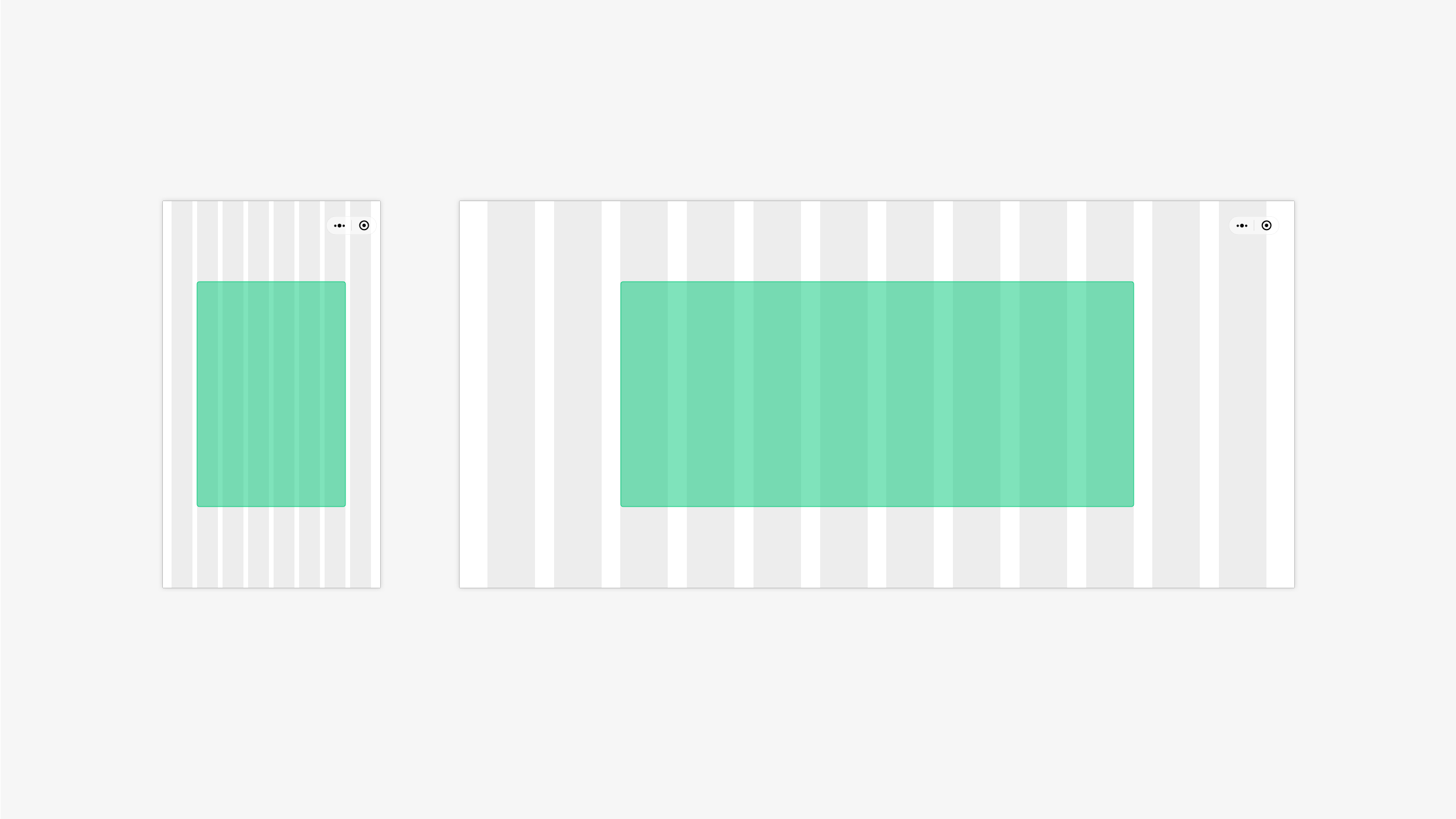
1. Horizontal Stretching
Layout characteristic: Horizontal stretching of page elements to an area suitable for the screen size. Commonly used for pages with simple elements/structures, such as lists and tables.
Adaptation rule: The page display height is fixed, but the width is not. When the display size of the layout changes, the display width of the elements also changes.
2. Line Break Arrangement
Layout characteristic: Elements on the page are arranged vertically or horizontally depending on the layout width. Commonly used for content presentation pages with fewer levels of information structure, such as content detail pages.
Adaptation rule: Determine whether the horizontal width of the layout area can accommodate several elements. If it can, use horizontal arrangement; if not, use vertical arrangement.
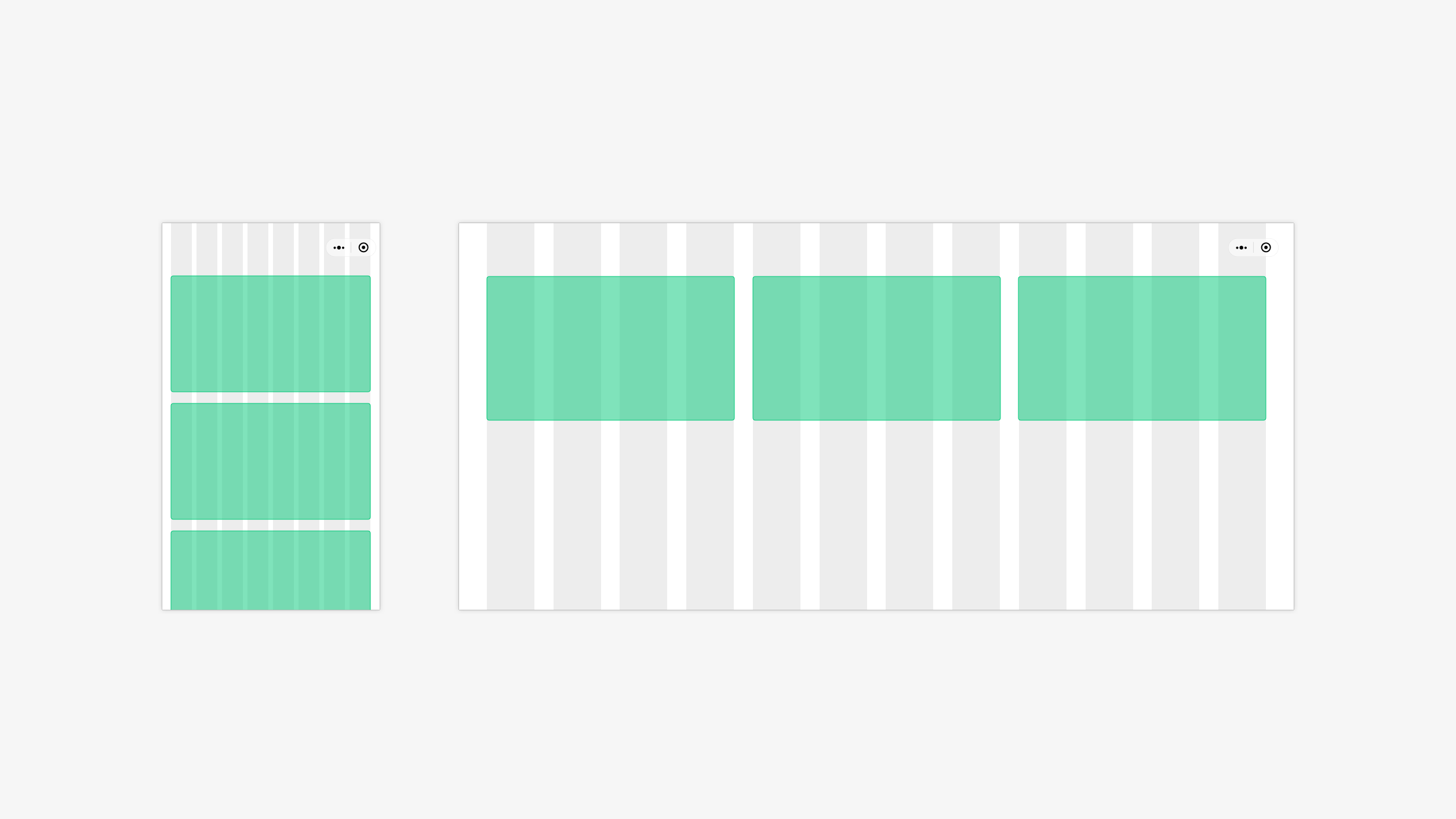
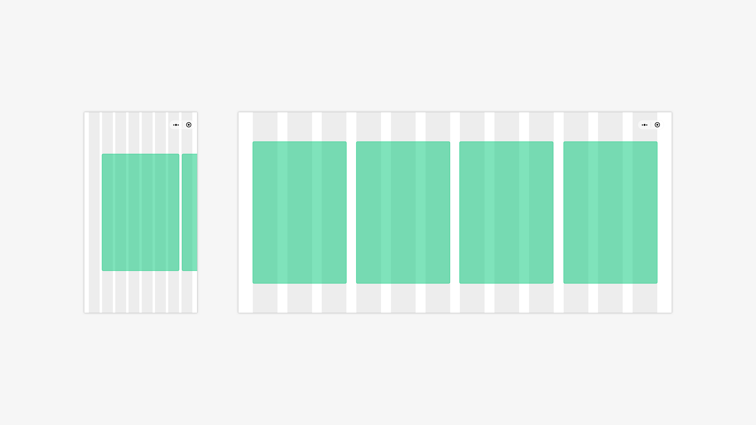
3. Horizontal Expansion
Layout characteristic: Elements on the page are repeatedly extended to an area suitable for the screen size. Commonly used for pages with a fixed module structure and simple, orderly module layouts, such as e-commerce pages.
Adaptation rule: While keeping one of the element sizes or spacing unchanged, add more elements horizontally based on the horizontal width of the layout area.
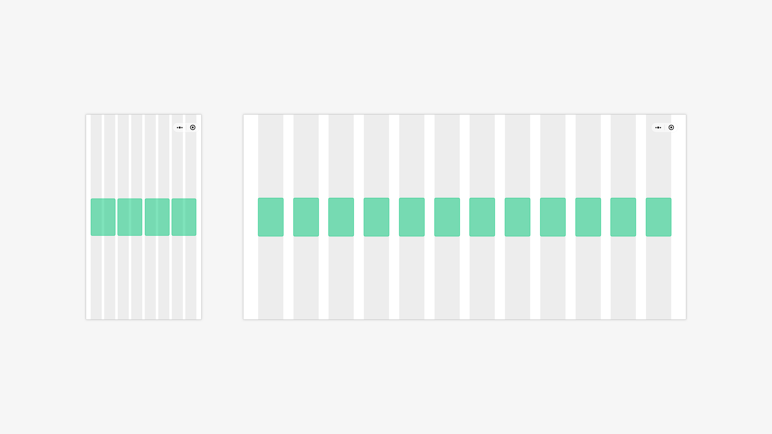
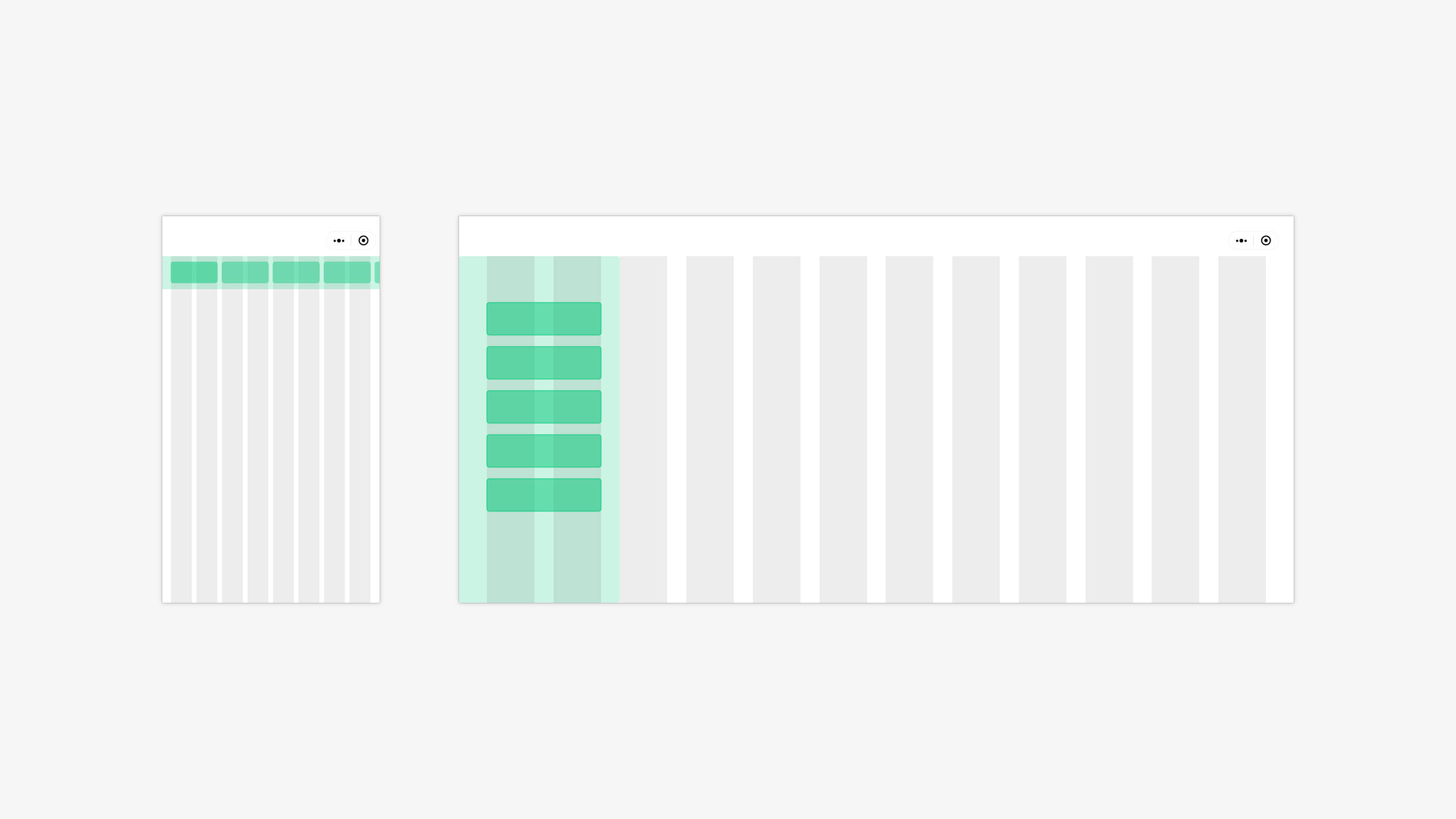
4. Paginated Display
Layout characteristic: Utilizing the screen width to arrange layout components with similar properties horizontally. Commonly used for content presentation pages with fewer levels of information structure, such as song lists and app lists.
Adaptation rule: The width rules for individual components can be defined, and the number of repeatable elements can be automatically calculated as the horizontal width of the layout area changes.
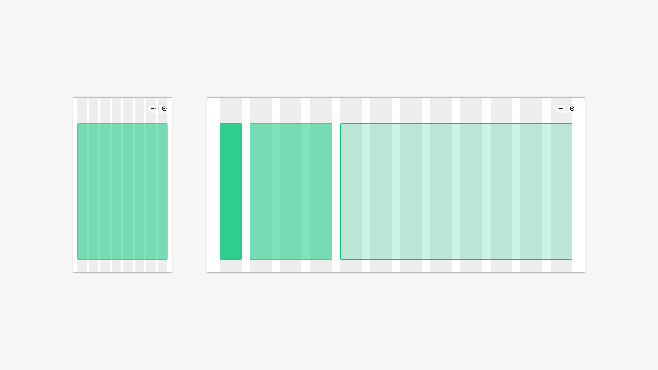
5. Hierarchical Display
Layout characteristic: The page is divided into multiple columns, with each column displaying content from different modules. There is a clear primary-secondary relationship between the columns, with the subordinate parts relying on the primary part for existence. Commonly used for pages with a clear hierarchical structure where column display does not affect information retrieval, such as utility apps, with the left side being the main menu, the middle being the sub-menu, and the right side being the content details.
Adaptation rule: Set a minimum width for each column. Based on the horizontal width of the layout area, determine the number of levels that can be accommodated and display the corresponding number of columns.
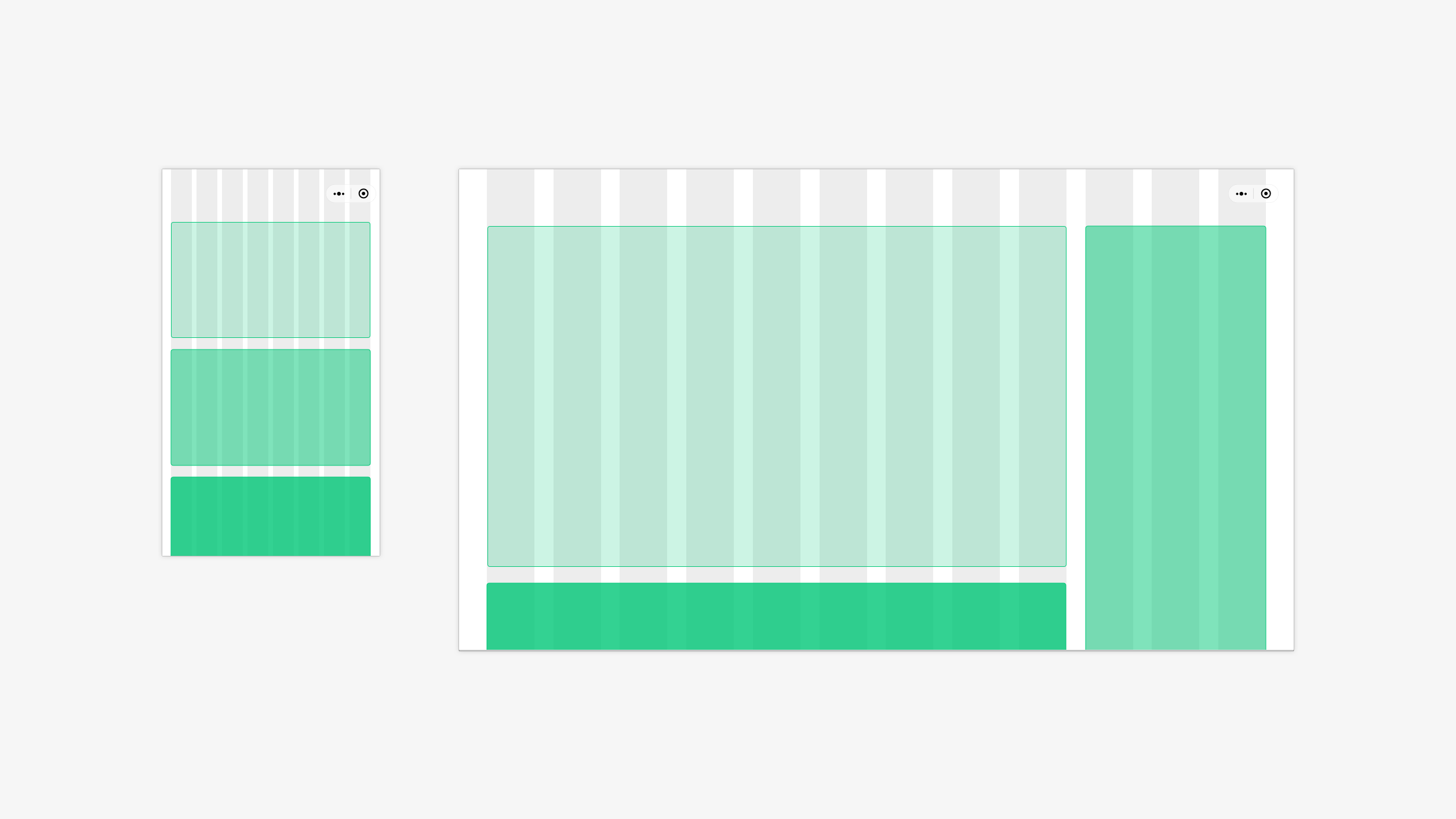
6. Free Layout
Layout characteristic: The page is divided into multiple functional modules. After determining the primary module, the subordinate modules are arranged around it. Commonly used for pages with multiple functional modules, where there is only one primary module, such as content detail pages.
Adaptation rule: Determine the maximum display value and fixed position of the primary module. As the horizontal width of the layout area changes, the subordinate modules automatically calculate the possible display mode around the primary module.
7. Sidebar
Layout characteristic: There is a clear primary-secondary relationship on the page, with the primary module being the navigation module. On larger screens, the primary module can be displayed as a sidebar, allowing for quick browsing or operation of both the primary and secondary modules.
Adaptation rule: Set a breakpoint width for the page. Once the breakpoint is exceeded, the primary module changes to a sidebar, and the subordinate modules automatically calculate the amount of information that can be displayed based on the width of the layout area.
# 2.3 Interaction Method Translation - Gesture Interaction and Mouse
Unlike mobile devices, PC devices mainly rely on the mouse and keyboard for operations, providing physical and more stable control. Since the pointer is very small, users can position and operate more accurately.
To make Mini Programs better suited for PC devices, it is necessary to translate the operations that rely on gesture input on mobile devices to those on PC devices during adaptation.
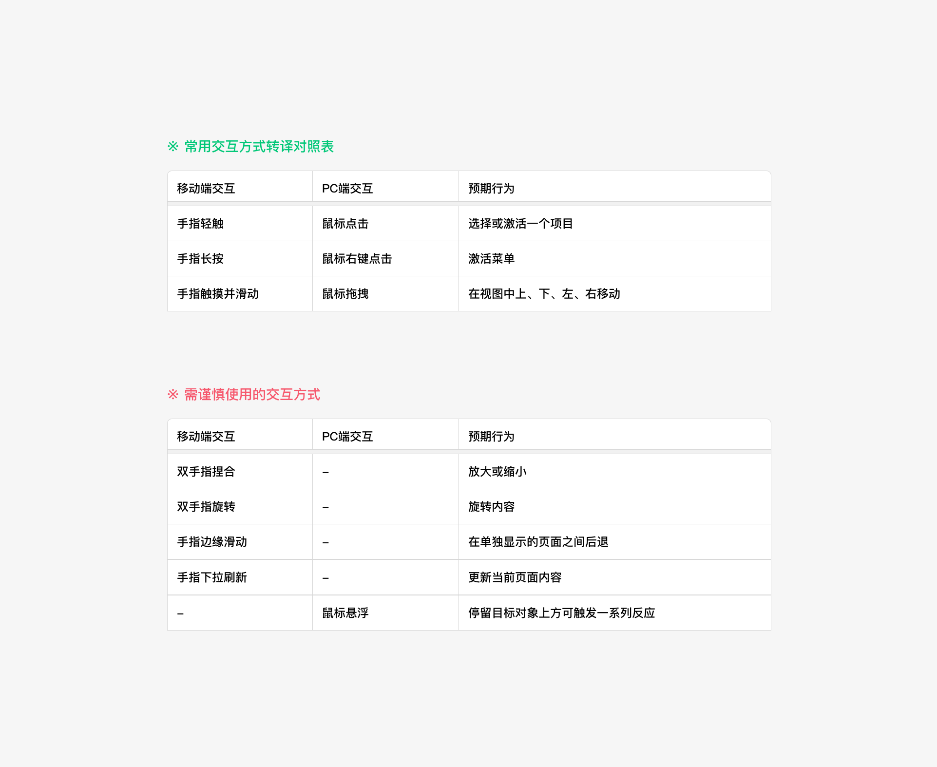
Common Interaction Method Translation Table
Both mobile and PC devices have their unique interaction methods. The following translation methods can be referred to during adaptation.
# 2.4 Other Important Points for Adaptation
When adapting Mini Programs for PC, the following key points require special attention.
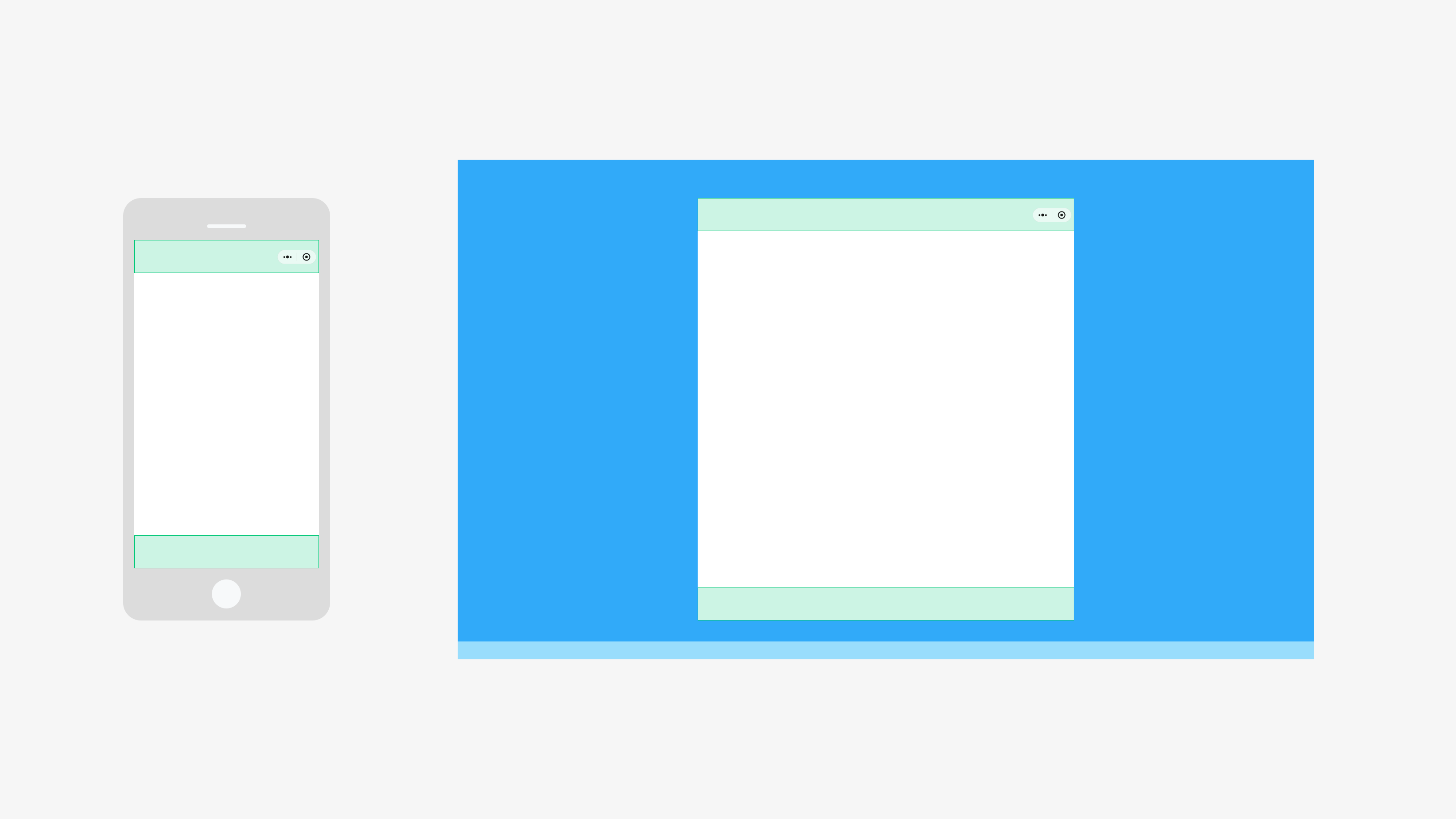
1. Navigation Bar and Tab Bar
The height of the Navigation Bar and Tab Bar (if present) should remain unchanged after adaptation.
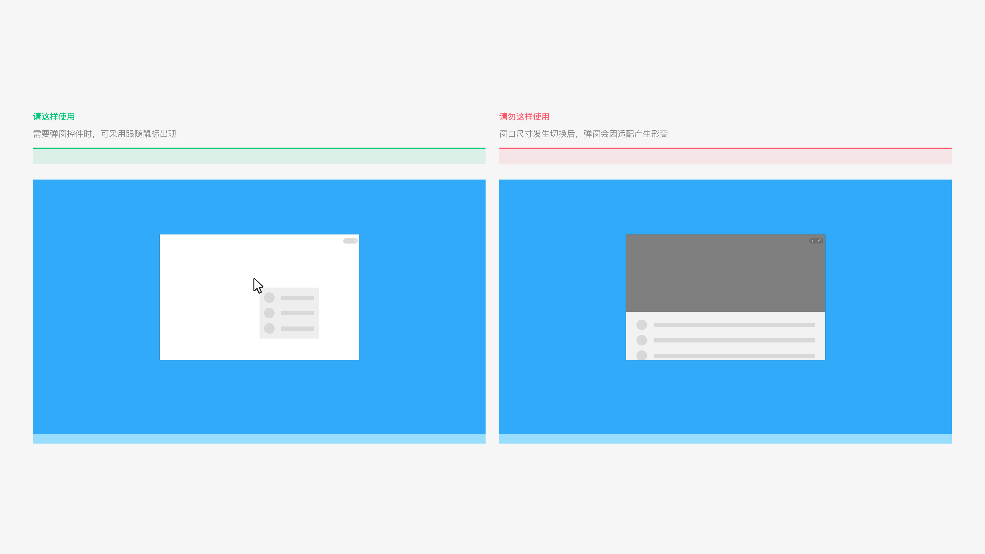
2. Pop-ups
To avoid deformation of pop-up controls during adaptation, these controls can be displayed with the mouse pointer following their positions.
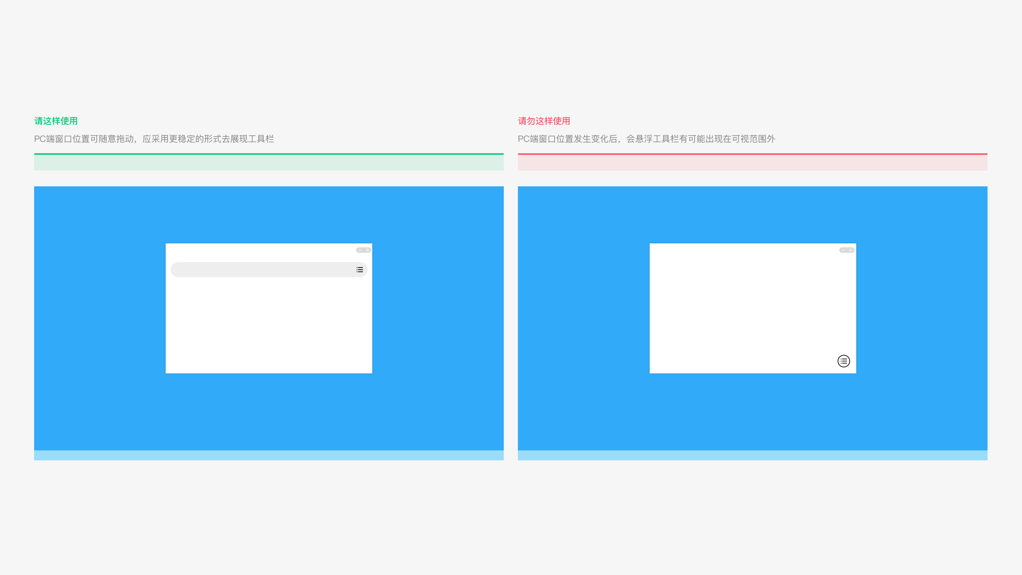
3. Floating Toolbars
Floating toolbars may become out of view due to changes in window position. In PC adaptation, if the toolbar is related to a specific area, it is recommended to use a more stable display method.
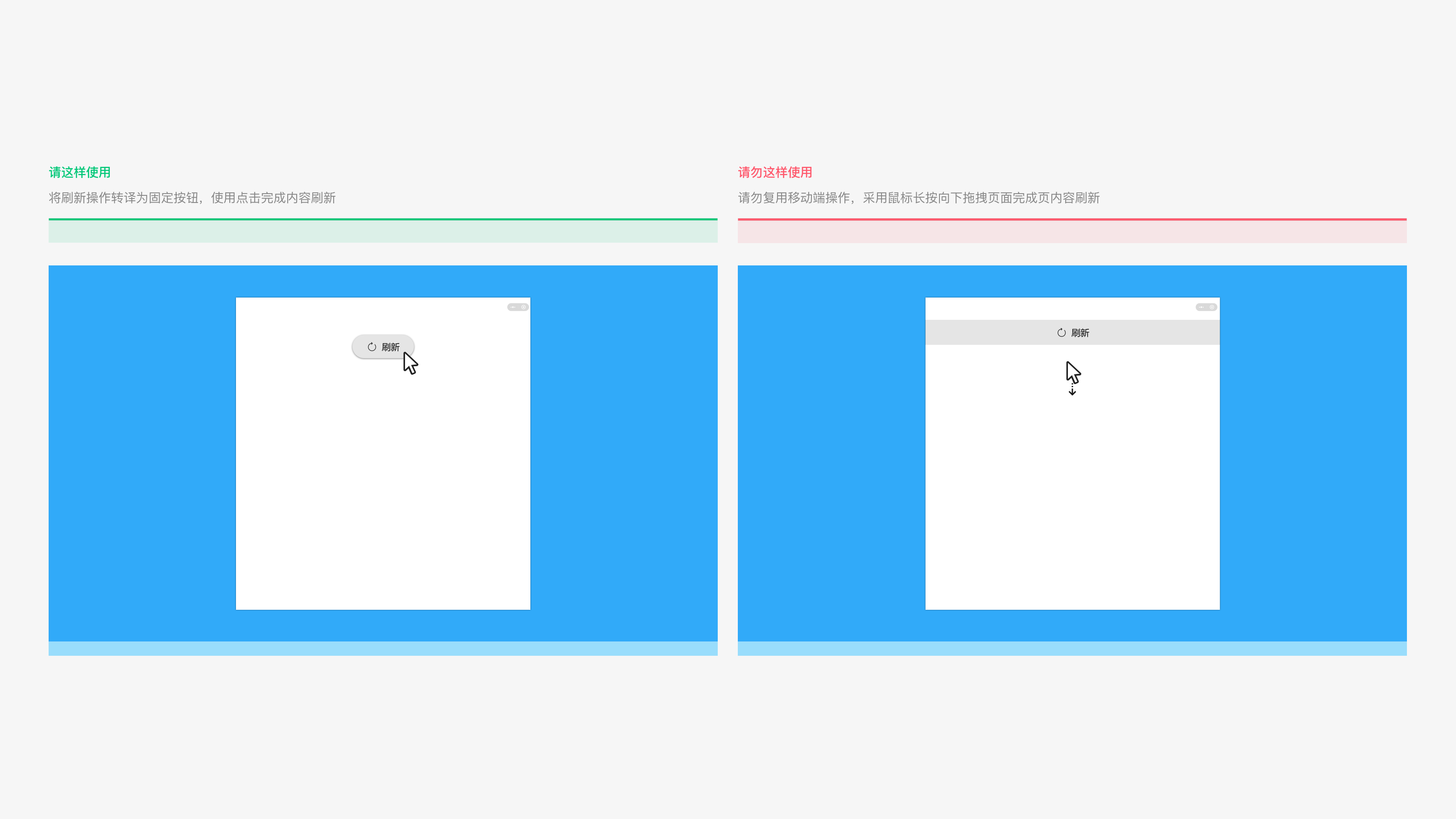
4. Page Refresh Operations
On PC, using finger scrolling down to refresh the page is not user-friendly. If your Mini Program page requires refresh functionality, you should adopt a more stable display method for this action.