# Mini Program Aging-friendly Design Guidelines
# I、Why Age-friendly Design is Needed
To enable the elderly community to access and use internet application information more equally and conveniently, we recommend that developers adapt their Mini Programs according to the user's WeChat font size settings.
# II、WeChat Font Size
Developers can obtain WeChat font size-related parameters through wx.getAppBaseInfo or wx.getSystemInfo:
- 1.fontSizeSetting: User font size (in px)
- 2.fontSizeScaleFactor: Font scaling factor
It is recommended to use the wx.getAppBaseInfo interface, as the wx.getSystemInfo interface will no longer be maintained in future versions.
# 2.1 Rules for WeChat Font Size Changes
iOS On iOS, there are 7 WeChat font size levels: 1 standard level, 1 reduced level, and 5 increased levels.
Different screen sizes and font setting levels correspond to different user font sizes (fontSizeSetting). The fontSizeScaleFactor (font scaling factor) is calculated by dividing the current user font size by the standard font size (17px).
The rules for changes in user font size (fontSizeSetting) are as follows:
| Screen Size | -1 | Standard | +1 | +2 | +3 | +4 | +5 |
|---|---|---|---|---|---|---|---|
| 414-pixel Screen | 16 | 17 | 18.5 | 20 | 22 | 23.8 ("Care Mode" font size) | 25.5 |
| 375-pixel Screen | 16 | 17 | 18 | 19.5 | 21 | 22 | 23.8 ("Care Mode" font size) |
| 320-pixel Screen | 16 | 17 | 18 | 19 | 20.5 | 22 | 23.8 ("Care Mode" font size) |
| iPad | 16 | 17 | 20 | 24.5 ("Care Mode" font size) | 27.5 | 29.75 | 29.75 |
For native navigation bars, chat dialog boxes, and Moments text, WeChat has made special adjustments that developers can refer to.
The rules for changes in font size for native navigation bars remain consistent across all screen sizes, as follows:
| -1 | Standard | +1 | +2 | +3 | +4 | +5 |
|---|---|---|---|---|---|---|
| 16 | 17 | 18.5 | 20 | 20 | 20 | 20 |
The rules for font size in chat dialog boxes and Moments text are as follows:
| Screen Level | -1 | Standard | +1 | +2 | +3 | +4 | +5 |
|---|---|---|---|---|---|---|---|
| 414-pixel Screen | 16 | 17 | 18.5 | 20 | 24.5 | 25.5 | 27.5 |
| 375-pixel Screen | 16 | 17 | 18.5 | 19.5 | 23 | 25.5 | 27.5 |
| 320-pixel Screen | 16 | 17 | 18 | 19 | 21 | 25.5 | 27.5 |
| iPad | 16 | 17 | 20 | 24.5 | 27.5 | 28.73 | 30 |
Android On Android, there are 8 WeChat font size levels: 1 standard level, 1 reduced level, and 6 increased levels.
Different levels correspond to different font scaling factors (fontSizeScaleFactor). The user font size (fontSizeSetting) is determined by multiplying the standard font size (16px) by the font scaling factor (fontSizeScaleFactor) and rounding the result.
| Parameter | -1 | Standard | +1 | +2 | +3 | +4 | +5 | +6 |
|---|---|---|---|---|---|---|---|---|
| Font Scaling Factor | *1 | *1 | *1 | *1.12 | *1.125 | *1.4 ("Care Mode" factor) | *1.55 | *1.65 |
| User Font Size | 16 | 16 | 16 | 18 | 18 | 22 | 25 | 26 |
Additionally, the device-independent pixel values change for different levels, and the actual font display size is determined by multiplying the device-independent pixel value change factor by the user font size (fontSizeSetting). Due to this variation, even if the user font sizes for levels -1/Standard/+1 and +2/+3 are the same, the actual font display sizes may differ.
Device-independent pixel values currently do not apply to Mini Programs. This feature will be changed in future versions, so developers do not need to understand the device-independent pixel value change factor. They can simply adapt according to the user font size (fontSizeSetting).
The actual font display sizes caused by different device-independent pixel values are as follows for developers' reference:
| Parameter | -1 | Standard | +1 | +2 | +3 | +4 | +5 | +6 |
|---|---|---|---|---|---|---|---|---|
| Device-independent Pixel Value Change Factor | *0.91 | *1 | *1.11 | *1.11 | *1.18 | *1.18 | *1.18 | *1.18 |
| User Font Size | 16 | 16 | 16 | 18 | 18 | 22 | 25 | 26 |
| Actual Font Display Size | 14.56 | 16 | 17.76 | 21.24 | 21.24 | 25.96 | 29.5 | 30.68 |
# III、Age-friendly Design Standards
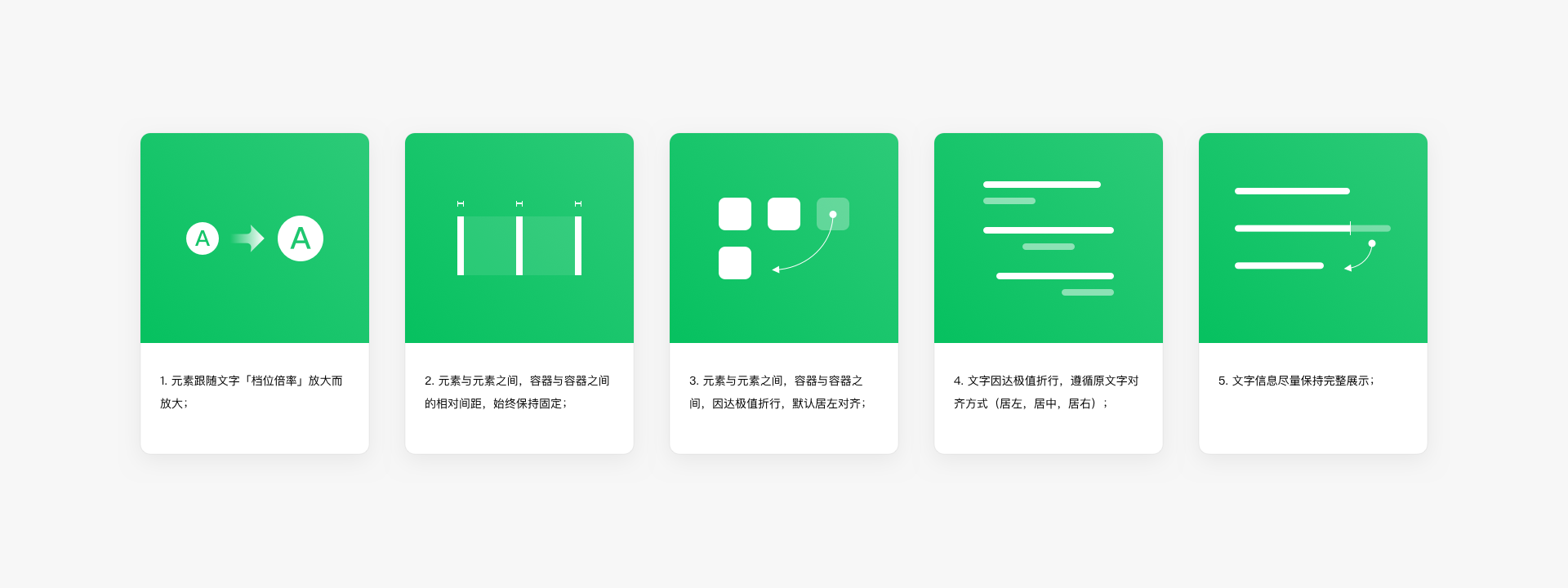
# 3.1 Basic Rules for Adaptive Aging-friendly Interfaces
- 1.Elements should scale up in proportion with the "level factor" of the text;
- 2.The relative spacing between elements and between containers should remain constant;
- 3.When elements or containers reach their maximum size, they should wrap and align to the left by default;
- 4.When text wraps, it should maintain its original alignment (left, center, right);
- 5.Text content should be displayed as completely as possible.
# 3.2 Font Style Rules
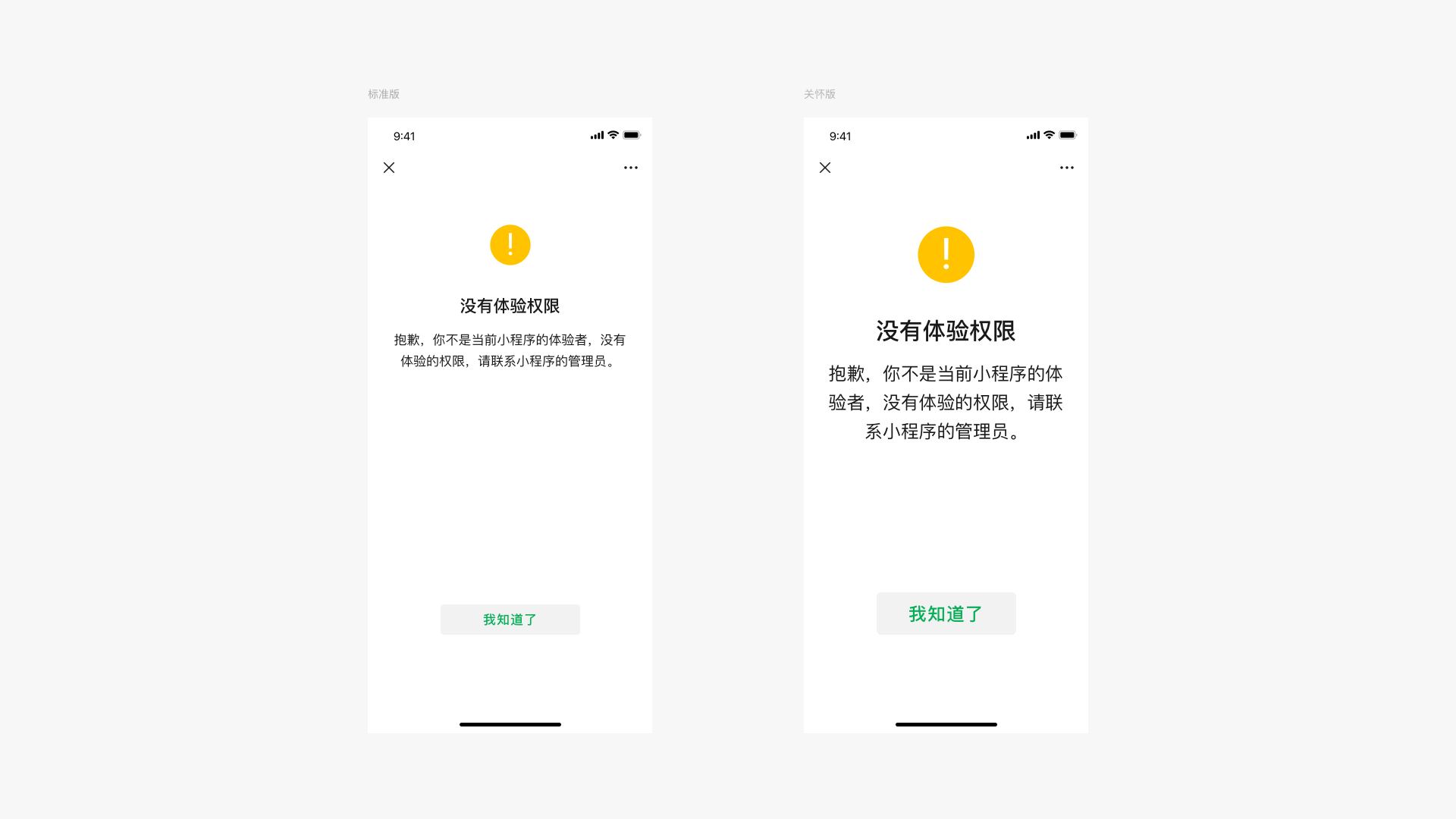
In aging-friendly mode, fonts, graphic elements, and buttons are scaled up by a factor of 1.4, while element spacing and navigation bar dimensions remain fixed.
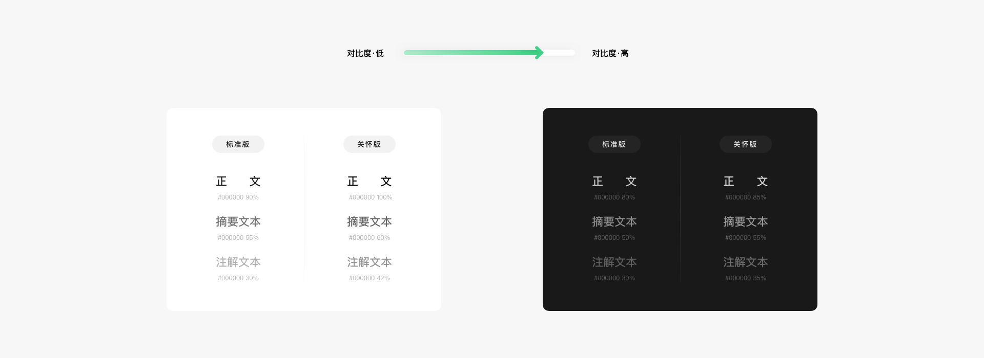
The contrast between text/text images and other elements should be at least 4.5:1 (when the font size is greater than 18 dp/pt, the contrast between text and text images should be at least 3:1). In aging-friendly mode, the contrast can be enhanced to improve readability.
# 3.3 Hotspot Area Rules
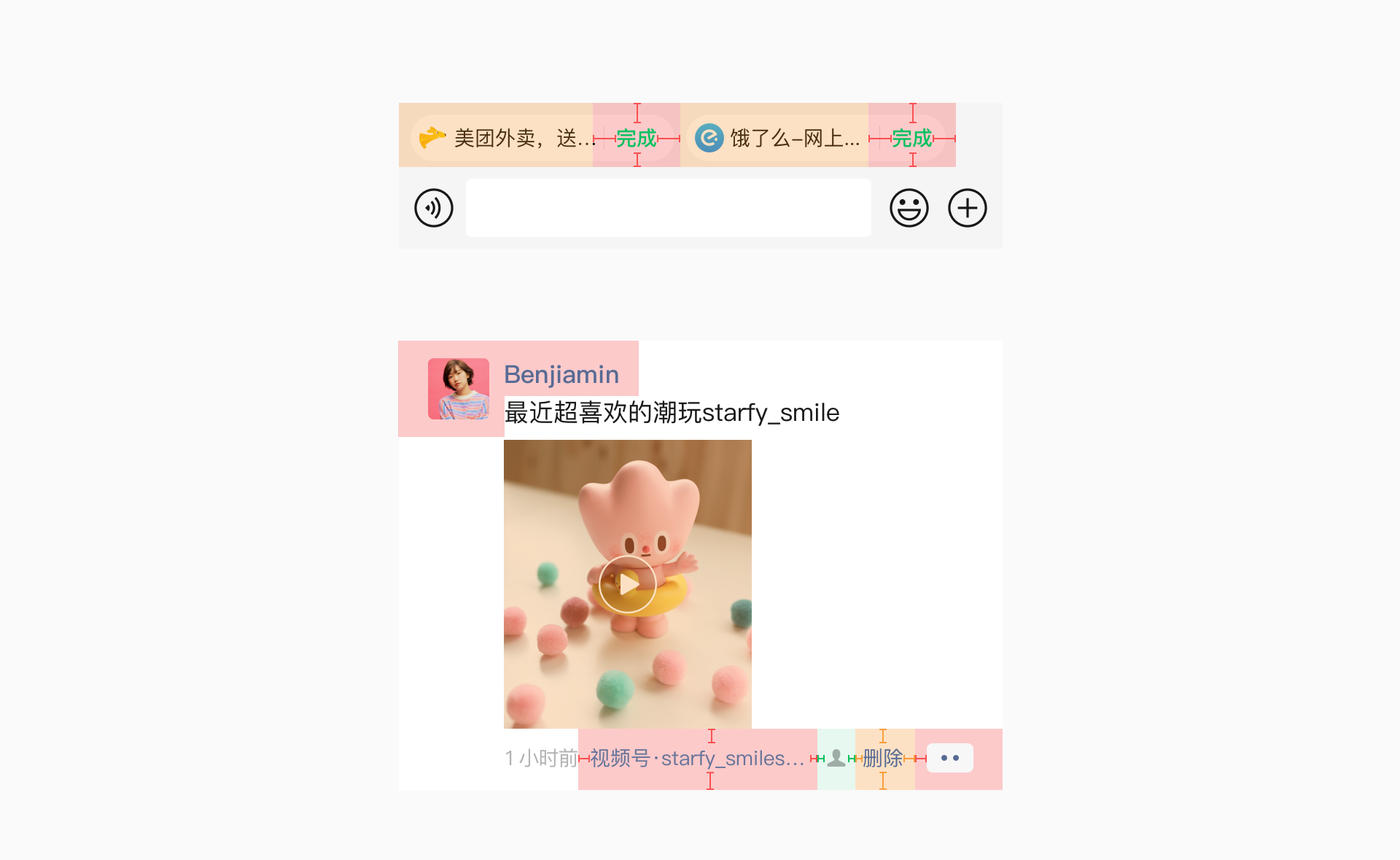
Expanding the click hotspot around interactive elements may require determining the correct size of the element’s clickable area. If the target area is too small, it might make users feel that they need to be particularly precise when interacting with the element:
- 1.Add a 12pt feedback hotspot around elements such as icons, icon-text links, and images;
- 2.If an icon and text point to the same result, use a complete and continuous hotspot;
- 3.Elements that are larger in size (at least ≥44pt) and have clear boundaries do not require an additional hotspot. (For example, large buttons and avatars).
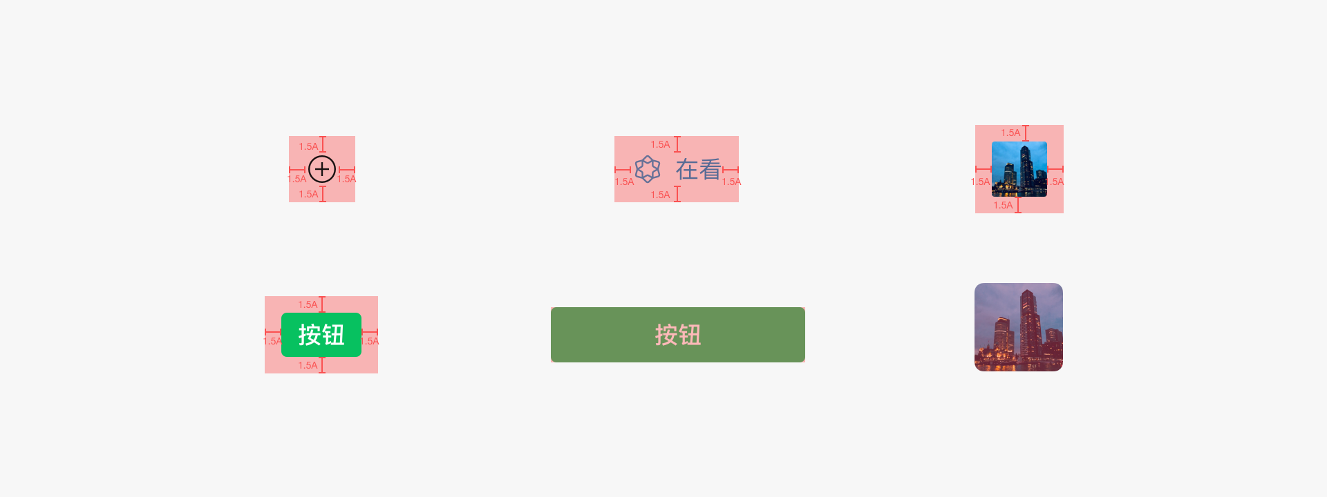
If an interactive element is within a container (such as a navigation bar, card, or cell), the maximum hotspot should not exceed the size of the container itself. If the entire container points to the same result, the pressing area should be the container itself.
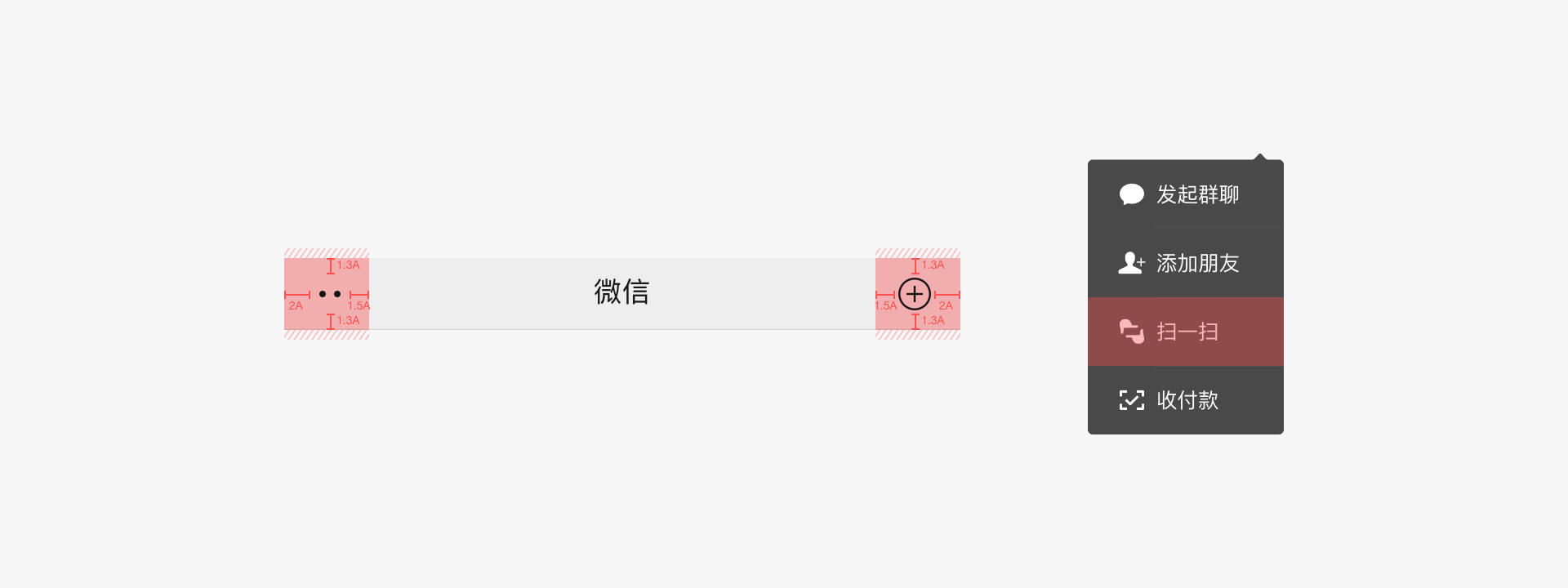
Avoid overcrowding interactive elements, with a visual distance between elements of at least 2A. The operation hotspot should be evenly spaced from other elements. When overcrowded, prioritize ensuring that elements without clear boundaries have sufficient hotspots.
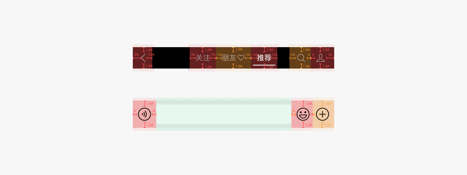
For particularly small elements, consider expanding the hotspot beyond the container or even covering other elements to ensure a minimum hotspot size of 40*40pt.
# 3.4 Basic Component Adaptation Rules
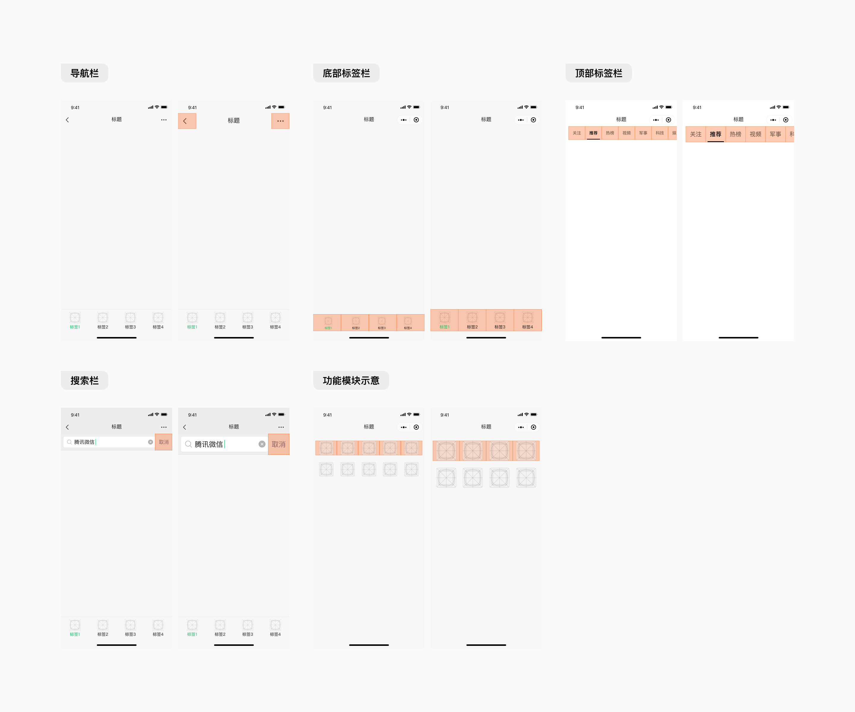
Navigation Bars
- 1.On iOS and Android platforms, standard navigation bars do not need to be scaled;
- 2.For navigation bars larger than the standard size, the scaling factor is 1.18, and the hotspot needs to be expanded.
WeChat Mini Program’s native navigation bars are automatically adapted, while custom navigation bars require separate adaptation.
Bottom Tab Bars
- 1.Tab bars are divided equally according to the number of functions, with icons and text centered;
- 2.Icons and text are scaled according to the scaling factor.
WeChat Mini Program’s native tab bars are adapted, while custom tab bars require separate adaptation.
Top Tab Bars
- 1.Tab bar text and underlines are proportionally scaled according to the scaling factor;
- 2.The spacing between tabs remains fixed.
Search Bars
- 1.The search bar adapts by proportionally enlarging text and graphic elements, while maintaining constant spacing;
- 2.The margin around the search box remains fixed.
Function Modules
- 1.Module components maintain a fixed distance from the left and right edges, with elements scaling according to the system’s scaling factor;
- 2.Elements scale according to the global scaling factor;
- 3.After scaling, ensure that information and elements are fully displayed.
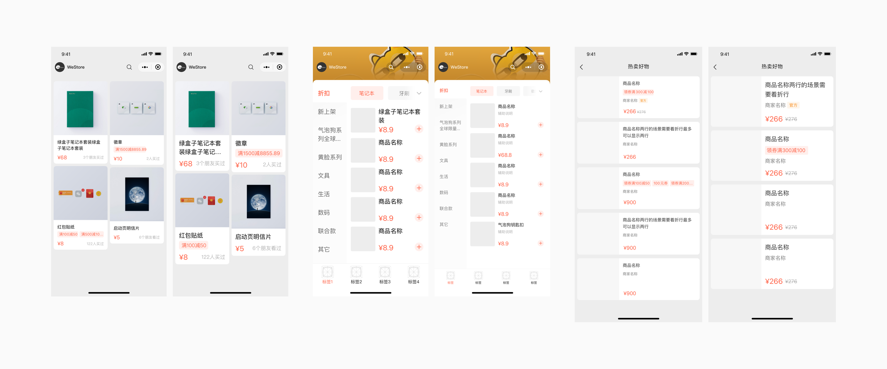
# 3.5 Page Adaptation Examples
# IV、Automatic Adaptation Tools
To help developers quickly adapt, WeChat has released the Mini Program Elderly-Friendly Automatic Adaptation Tool to assist in adaptation.
It should be noted that this elderly-friendly adaptation tool cannot cover all scenarios. After conversion using this tool, testing and manual adaptation are still required to meet product expectations.