# WeChat Mini Program Design Guidelines
Based on the lightweight nature of WeChat Mini Programs, we have developed guidelines and recommendations for mini program interface design. These guidelines are designed to fully respect users' rights to information and operation. The aim is to create a friendly, efficient, and consistent user experience within the WeChat ecosystem, while also accommodating and supporting various needs to achieve a win-win situation for both users and mini program service providers.
# I、Friendliness and Politeness
To prevent users from being distracted by the complex surrounding environment when using mini program services on WeChat, designers should minimize the interference of irrelevant design elements with users' goals. The services provided by the program should be presented politely to users, who should then be guided in a friendly manner through the operations.
# 1.1 Highlighting Key Points
Each page should have clear key points so that users can quickly understand the content of each new page they enter. Once the key points are determined, efforts should be made to avoid any distracting elements that are unrelated to users' decisions and actions on the page.
Case Example 1
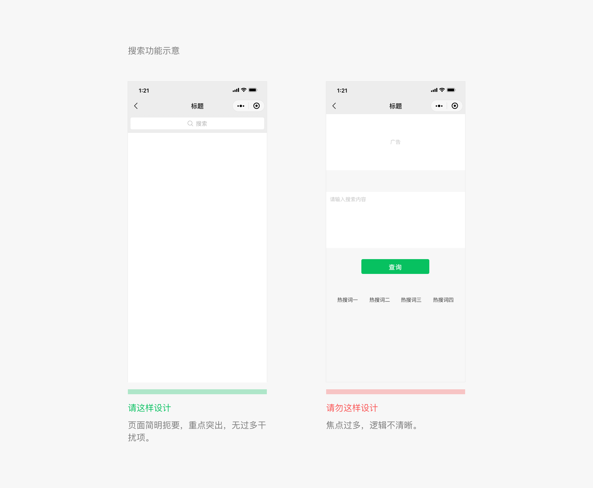
Case Example 2
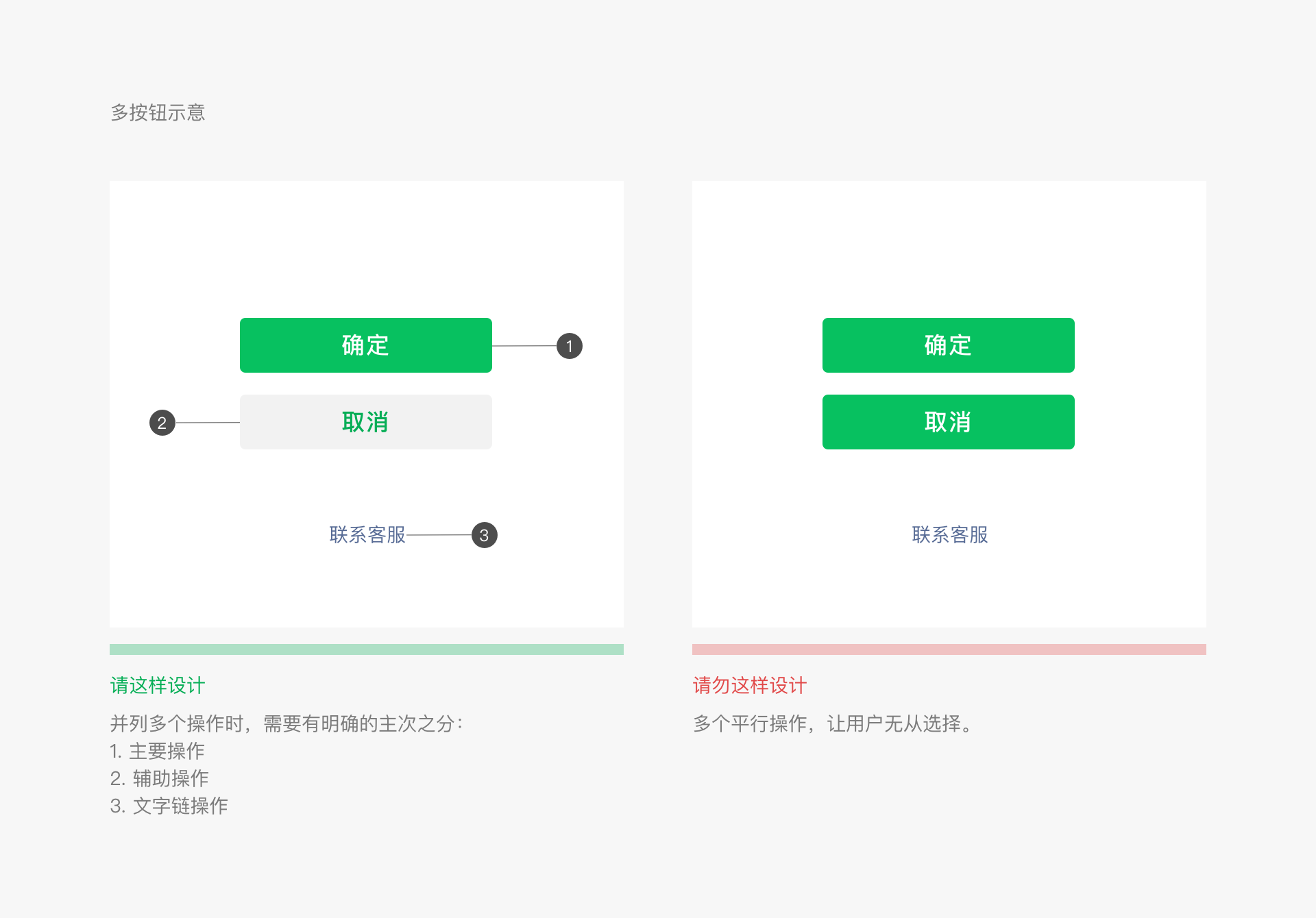
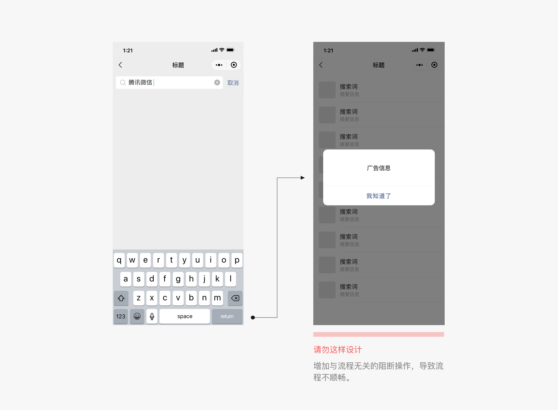
# 1.2 Clear Process
To ensure that users can use the page smoothly, any content that deviates from the user's intended process should be avoided to prevent interruptions.
# II、Clarity and Precision
Once users enter our Mini Program page, it is our responsibility and duty to clearly inform them of their current location and where they can go next. This ensures that users can navigate the page with ease without getting lost, thereby providing them with a safe and enjoyable user experience.
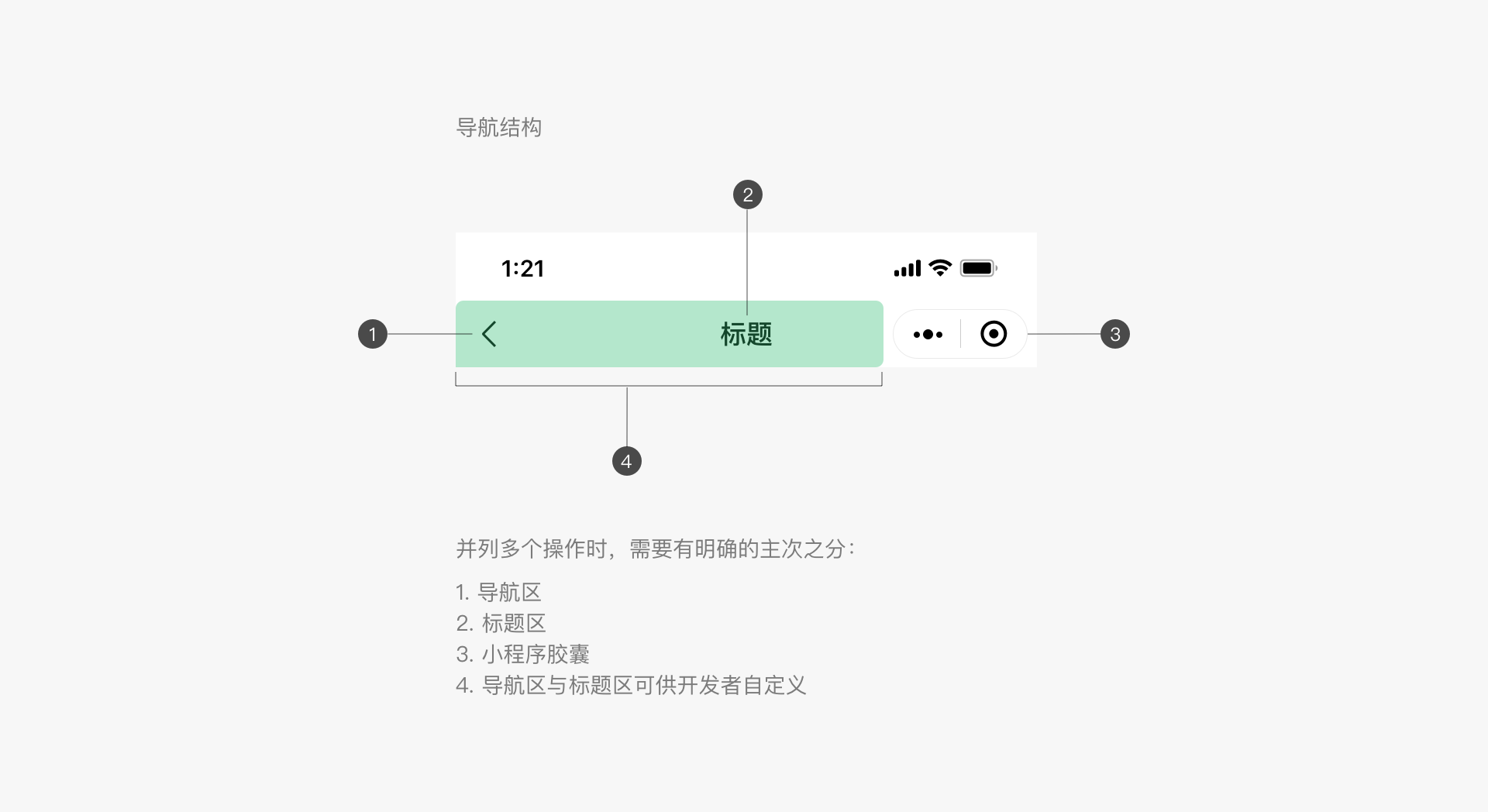
# 2.1 Clear Navigation, Easy To Use
Navigation is crucial for ensuring that users do not get lost when browsing and jumping between pages. Navigation needs to tell users where they are currently, where they can go, and how to return. WeChat does not provide a unified navigation bar style for mini programs, so developers can design their own navigation for the home page and secondary pages as needed. It is recommended that all secondary pages have a back button in the upper left corner to return to the previous level. In addition, iOS users can swipe right on the edge of the screen to return to the previous mini program or WeChat page. Android users can use the physical back button for the same purpose.
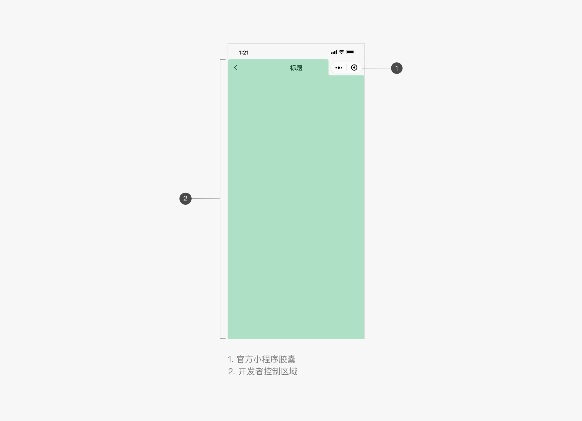
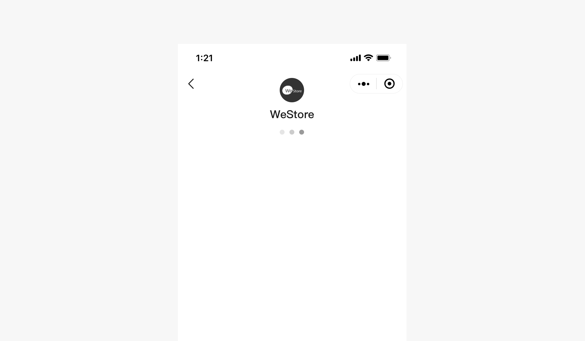
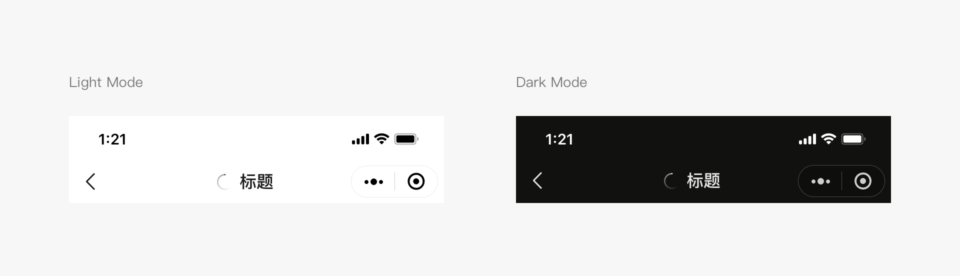
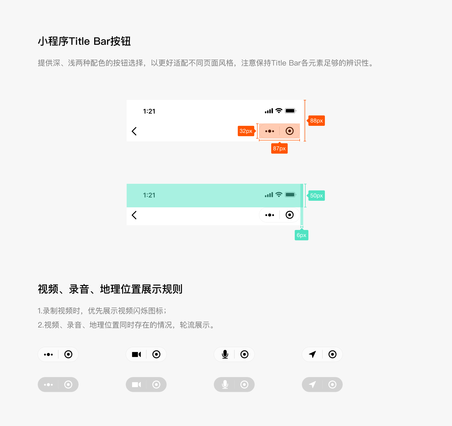
# Mini Program Menu
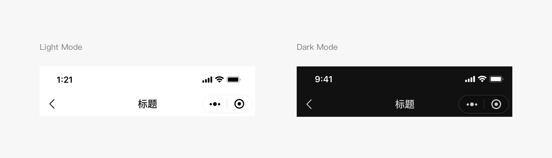
For all pages of a mini program, including embedded web pages and plugins, WeChat will place an official mini program menu in the upper right corner, as shown in the image. Developers cannot customize its content, but they can choose from two basic color schemes to match the page design style. The official mini program menu will be placed in a fixed position on the interface. Developers should reserve space for this area when designing the interface. If interactive elements need to be placed near this area, special attention should be paid to whether the interaction events will conflict and whether the operations are easy to use.
# Mini Program Menu Color Schemes (iOS and Android)
Developers can choose from two color schemes provided by WeChat for the mini program menu, taking into account usability, to match the design style of the mini program page.
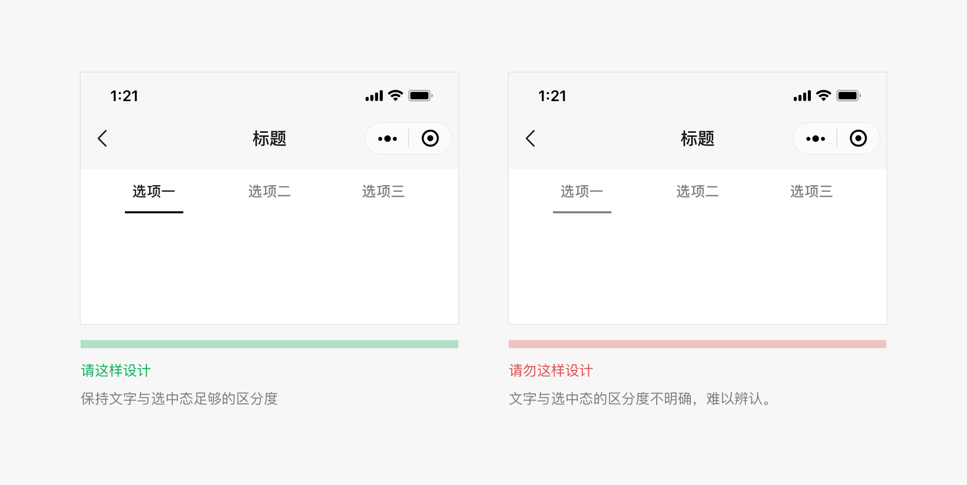
# In-Page Navigation
Developers can add their own navigation based on their functional design needs. It is important to maintain consistent navigation between different pages, with clear directions and options to return. Due to the limitations of mobile screen sizes, navigation on mini program pages should be kept simple. It is recommended that developers' custom navigation styles differ from the official WeChat mini program menu style to distinguish them.
Developers can add tab-based navigation to mini program pages. The tab bar can be fixed at the top or bottom of the page, making it easy for users to switch between different tabs. The number of tabs should not be less than 2 and not more than 5. To ensure sufficient click areas, it is recommended that the number of tabs does not exceed 4. A page should not have more than one tab bar.
For the home page of a mini program, developers can choose from WeChat's native bottom tab bar style, which is only available for the home page. During development, developers can customize icon styles, tab text, and text colors, among other settings. For specific details, refer to the development documentation and WeUI basic control library for icon size and other settings.
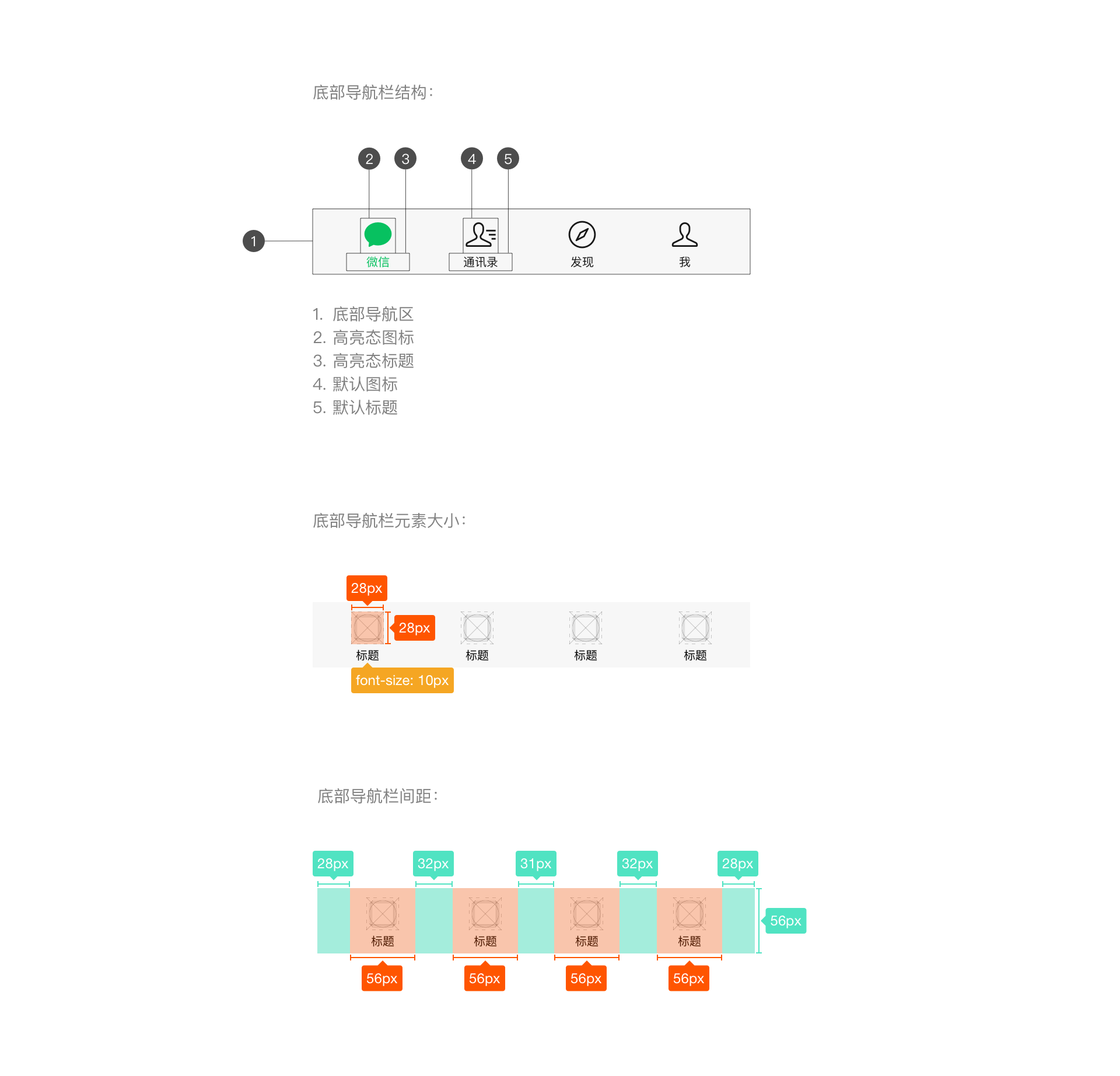
The color of the top tab bar can be customized. When choosing a custom color, it is important to ensure that the tab bar remains usable, visible, and operable.
# 2.2 Minimize Waiting Time, Provide Timely Feedback
Prolonged waiting on a page can cause negative emotions among users. The technologies provided by WeChat Mini Programs can significantly reduce waiting times. Nevertheless, when loading and waiting are inevitable, timely feedback is necessary to alleviate users' frustration.
# Launch Page Loading
The launch page of a Mini Program is one of the screens where the program's brand characteristics are displayed within WeChat. This page highlights the brand features and loading status of the Mini Program. In addition to displaying the brand logo, all other elements on the page, such as the loading progress indicator, are provided uniformly by WeChat and cannot be modified by developers.
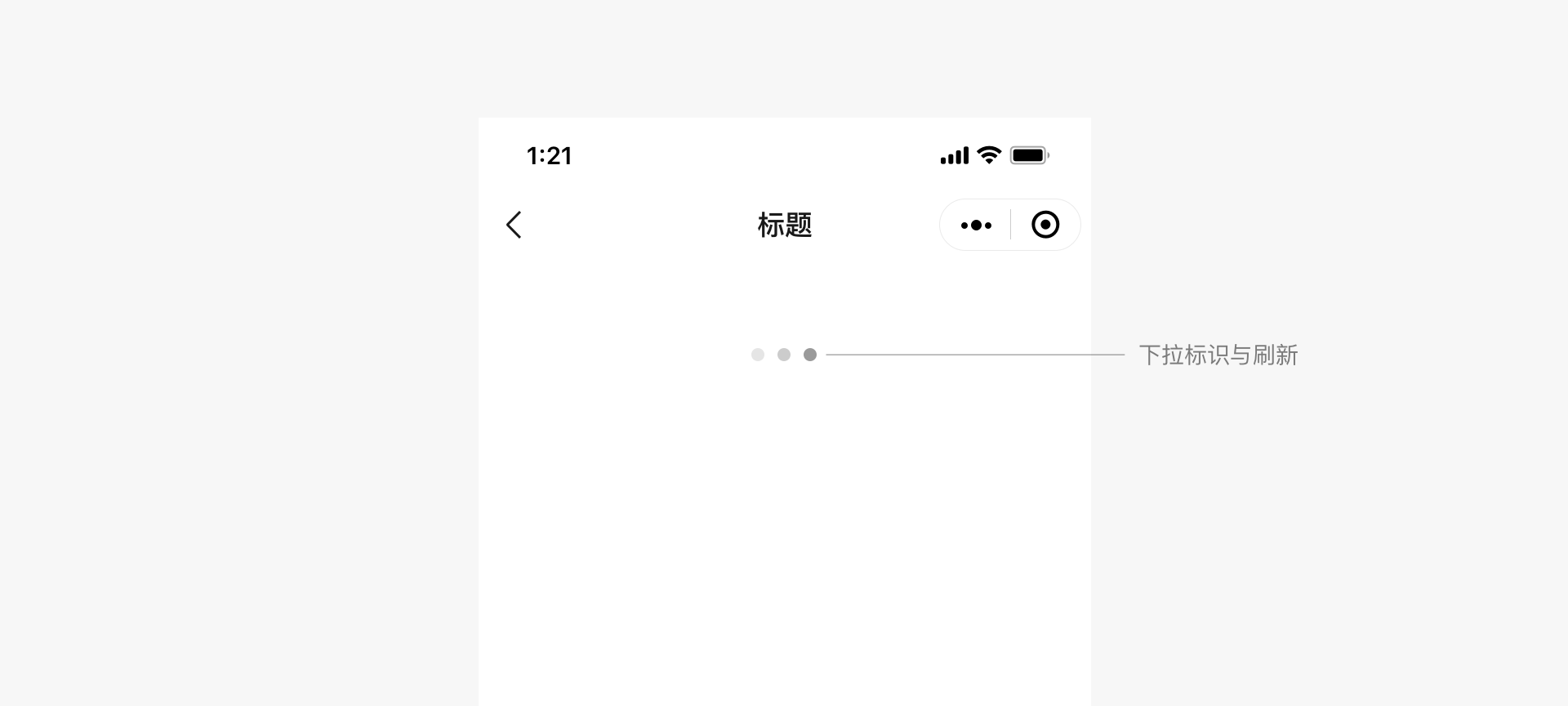
# Page Scroll Refresh Loading
WeChat Mini Programs come with standard page scroll refresh functionality and styling, which developers do not need to implement themselves.
# In-page Loading Feedback
Developers can customize the loading style for page content within Mini Programs. It is recommended that custom loading styles be kept simple, whether used for local or global loading, and that simple animations be used to inform users of the loading process.
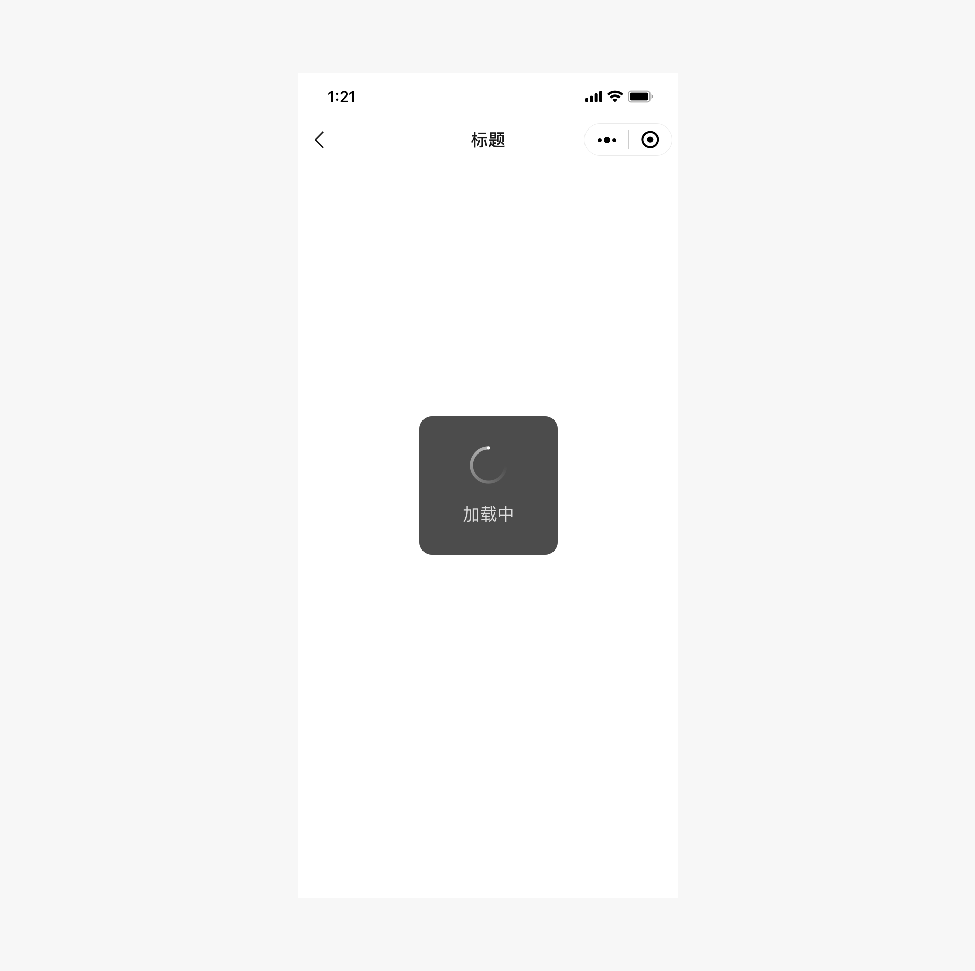
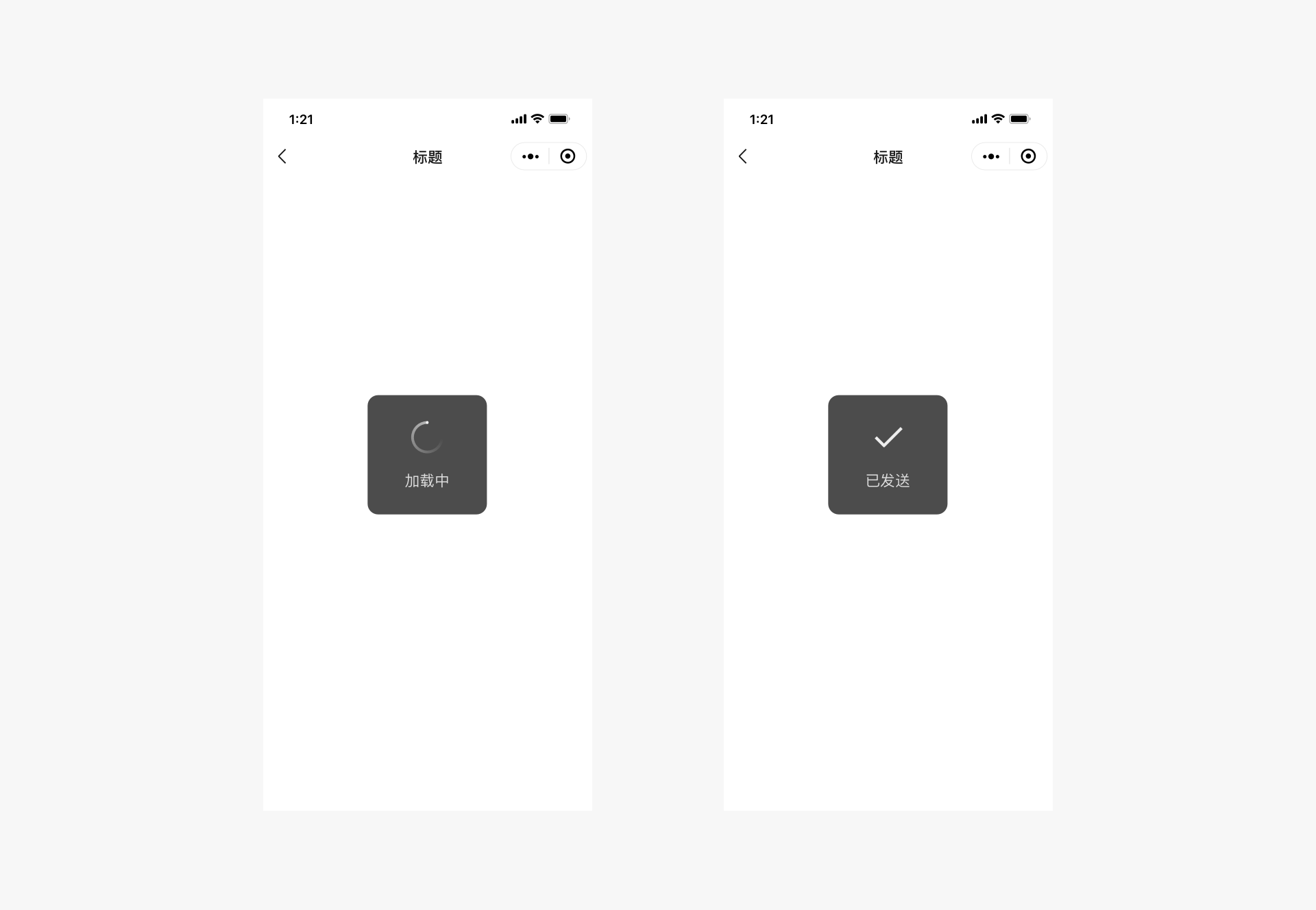
# Modal Loading
Modal loading styles cover the entire page. Since it is impossible to clearly indicate the specific location or content being loaded, this may cause anxiety among users. Therefore, modal loading should be used cautiously. Except for certain global operations, modal loading should be avoided.
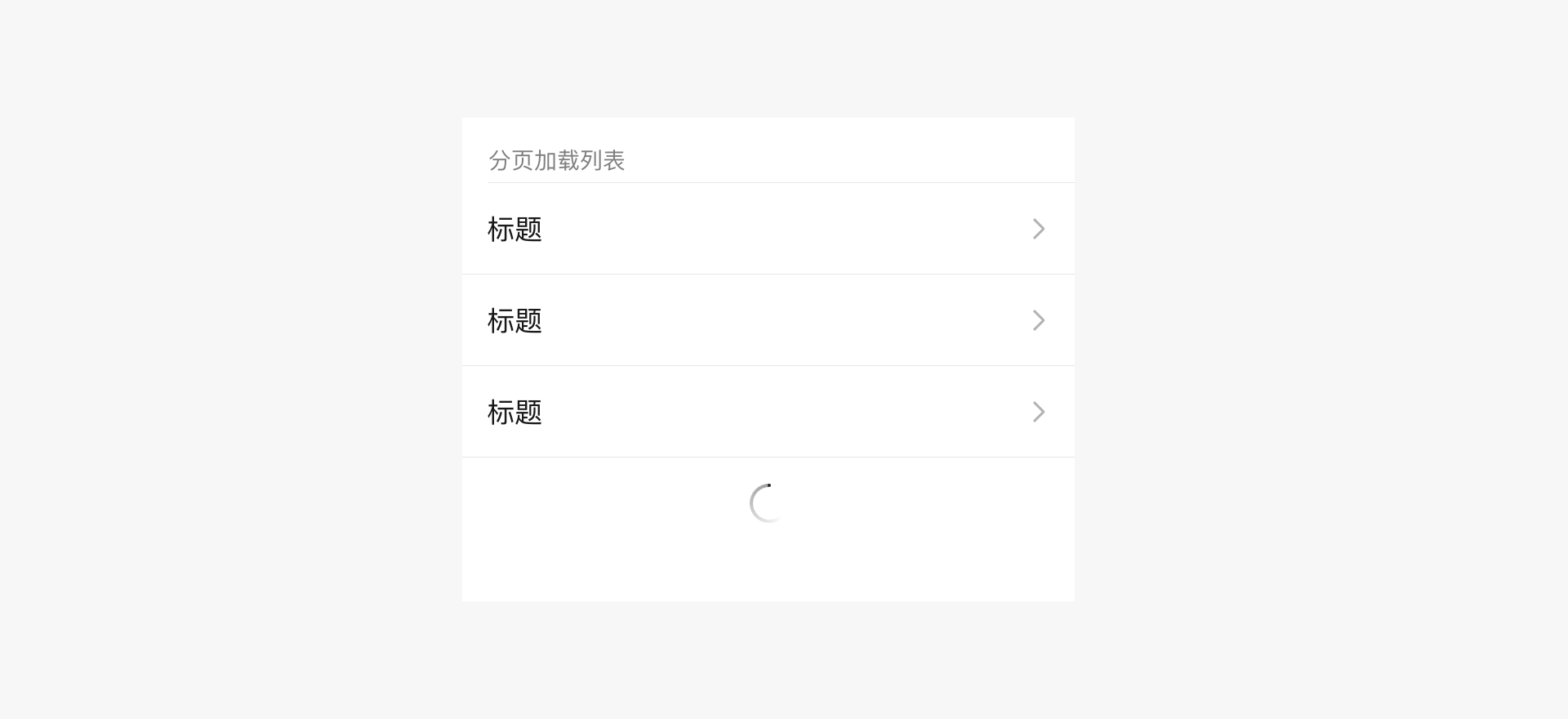
# Local Loading Feedback
Local loading feedback refers to providing feedback only within the page where the loading occurs. This approach is more targeted, with minimal page disruption, and is recommended by WeChat. For example:
# Global Loading Feedback
Developers can refer to the styles in the diagram to use a title bar to indicate the loading process of the Mini Program page content. For example:
# Loading Feedback Best Practices
- If the loading time is long, provide an option to cancel the operation and use a progress bar to show the loading progress.
- Maintain animation effects during loading; without animation, it may seem like the interface is stuck.
- Do not use more than one loading animation on the same page.
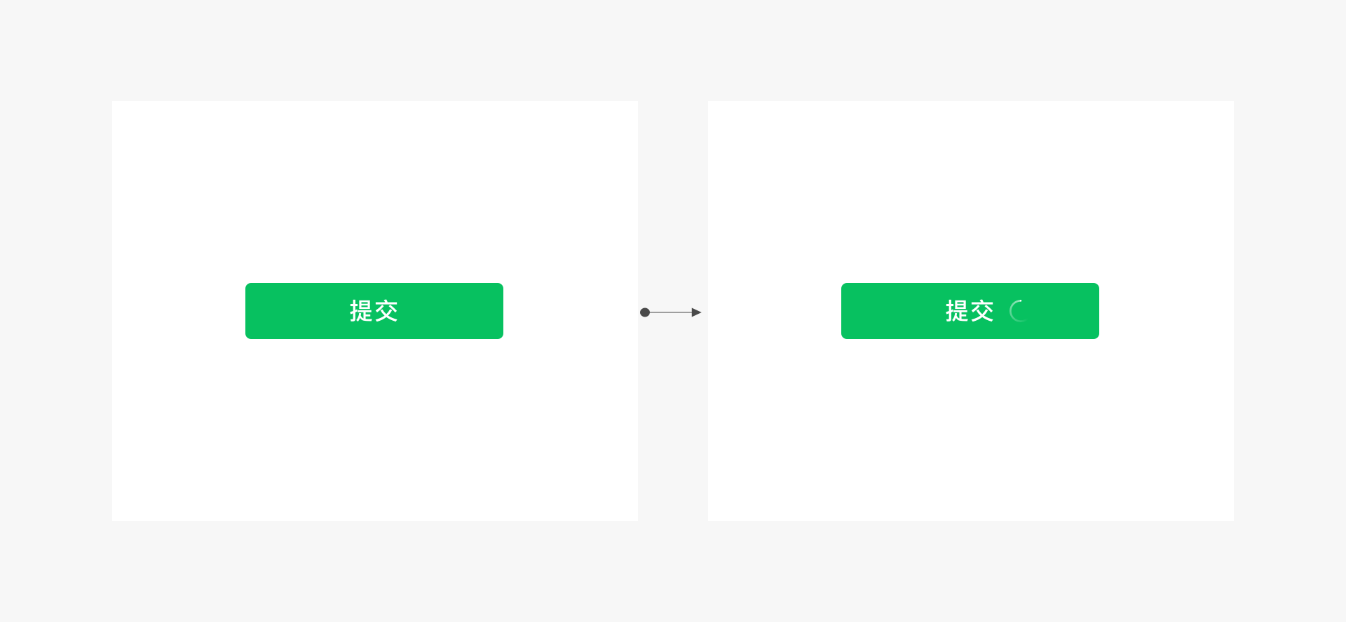
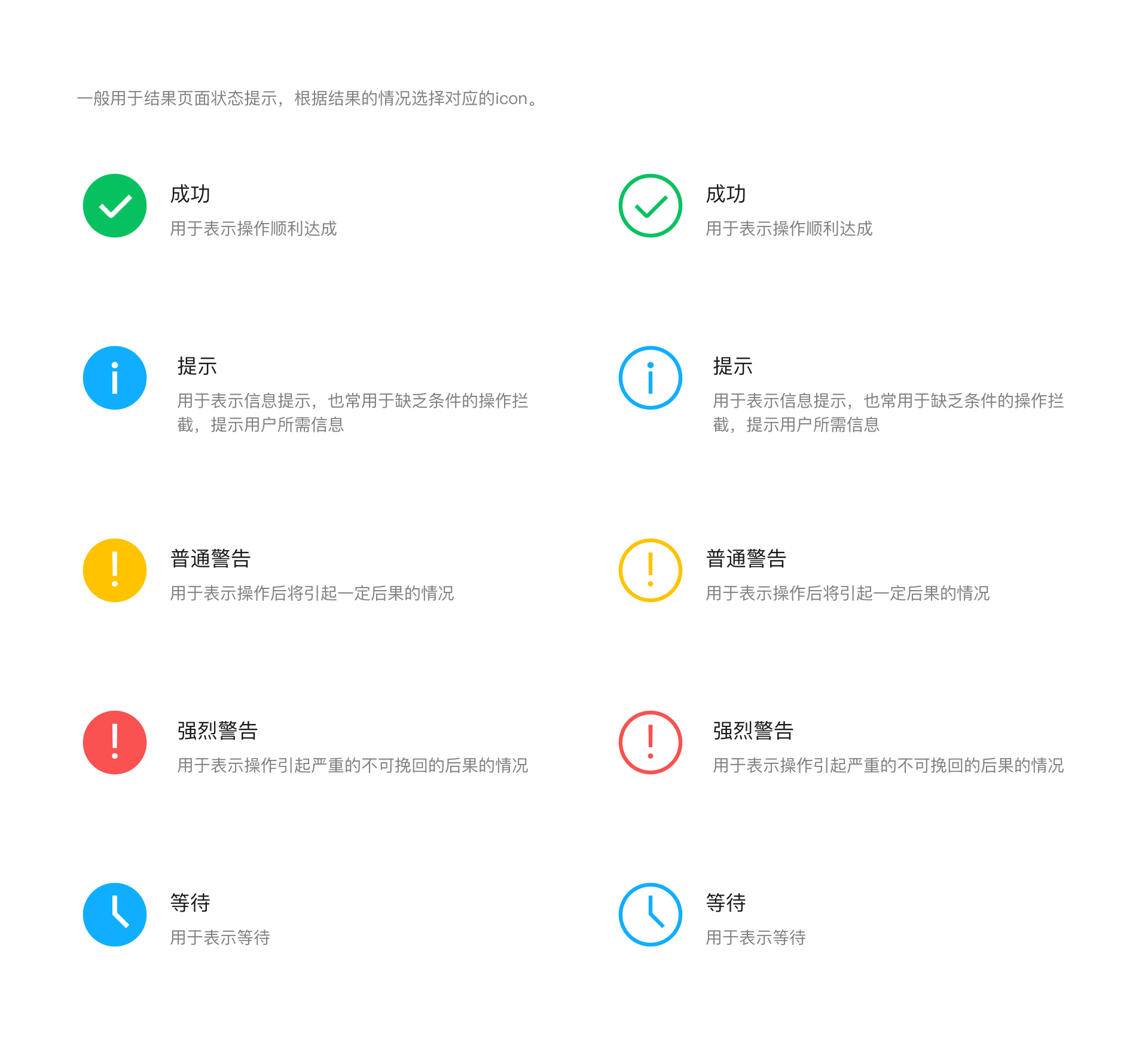
# Result Feedback
In addition to providing timely feedback during user waiting, it is also important to clearly communicate the results of operations. Depending on the situation, different types of result feedback can be chosen. For local page operations, direct feedback can be provided in the operation area. For page-level operation results, pop-up alerts, modal dialog boxes, or result pages can be used.
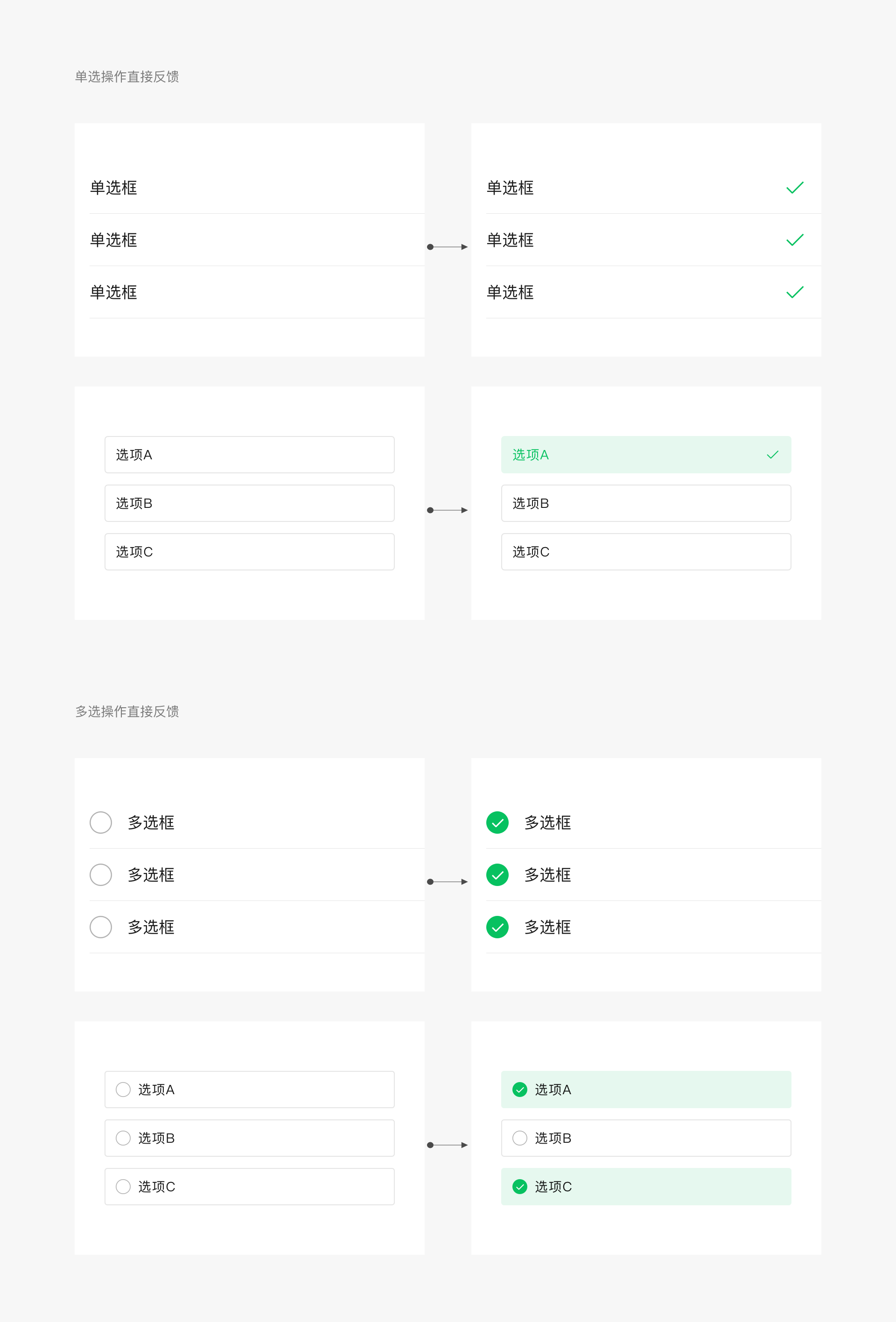
# Local Page Operation Result Feedback
For local page operations, direct feedback can be provided in the operation area. For example, before and after clicking a multiple-selection control, the following image shows the feedback. For commonly used controls, WeChat Design Center provides a control library with complete operation feedback.
# Page-Level Operation Result — Iconic Pop-up Alert
Iconic pop-up alerts are suitable for lightweight success notifications. They disappear automatically after 1.5 seconds without interrupting the user experience, making them ideal for non-critical operation reminders, such as successful notifications. Note that this format is not suitable for error notifications, as error notifications require clear communication to users, so they are not suitable for brief pop-up alerts.
# Page-Level Operation Result — Textual Pop-up Alert
Textual pop-up alerts are suitable for providing lightweight text explanations of the current status or for reminding users of minor errors. They disappear automatically after 1.5 seconds without interrupting the user experience.
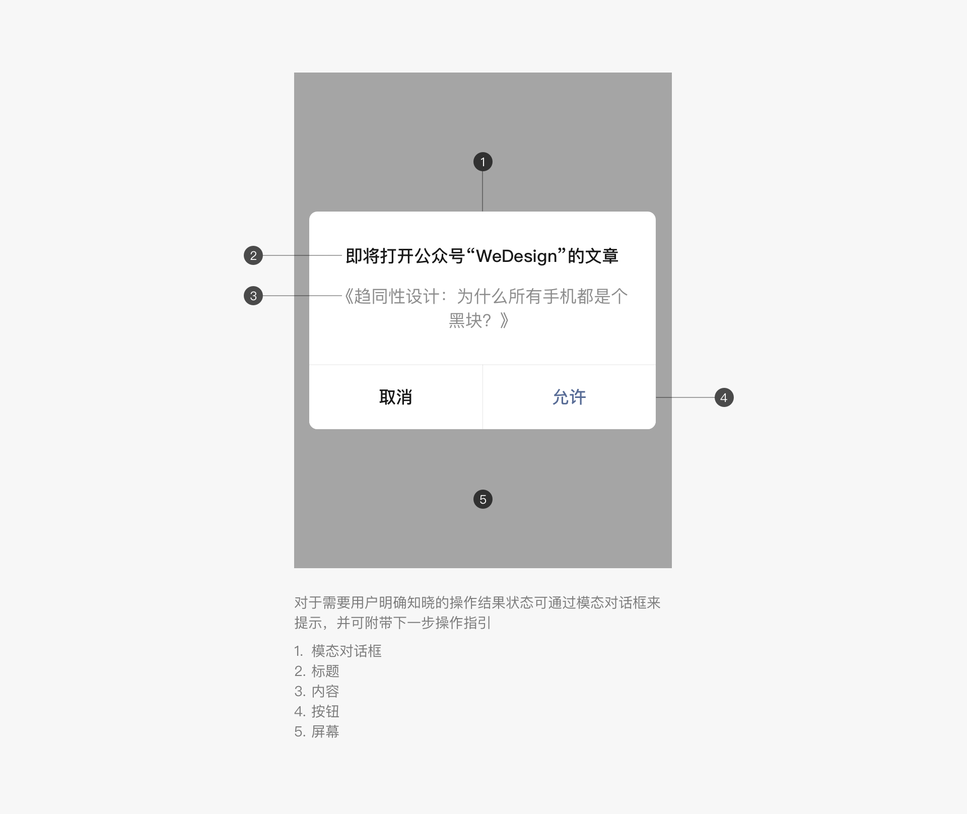
# Page-Level Operation Result — Modal Dialog Box
For operations that require users to be aware of the results, modal dialog boxes can be used to provide feedback, along with instructions for the next step.
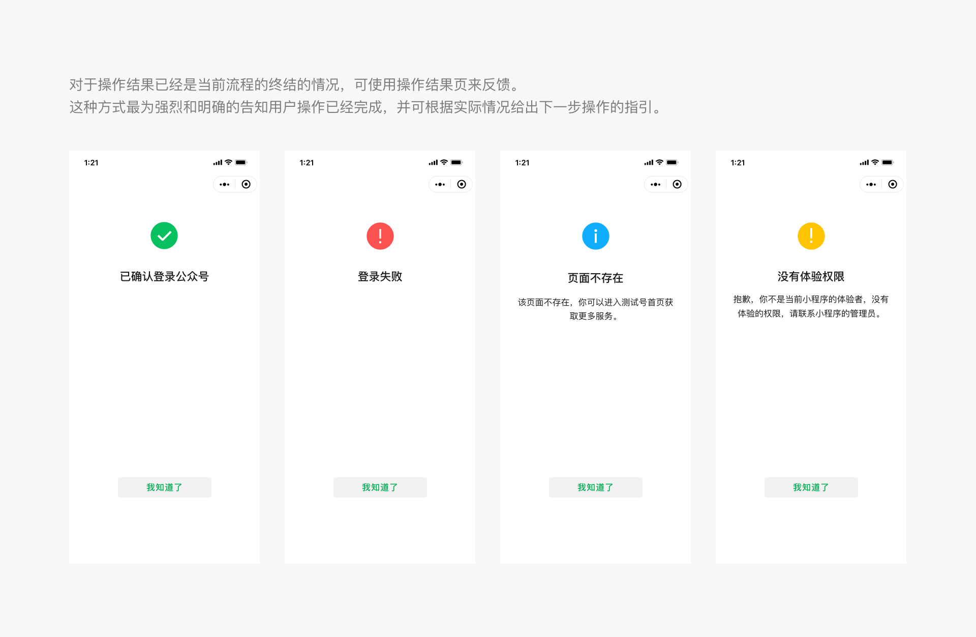
# Page-Level Operation Result — Result Page
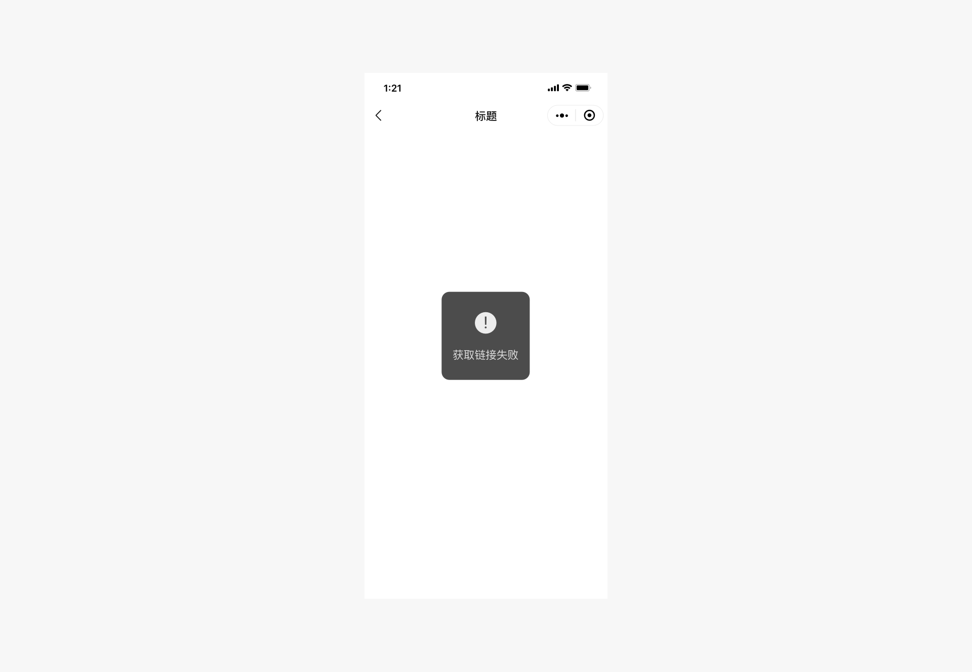
When the operation result marks the completion of the current process, a result page can be used to provide feedback. This method is the most direct and clear way to inform users that the operation is complete and can include instructions for the next step, depending on the situation.
# 2.3 Exceptions Should Be Controllable and Provide a Way Out
When designing any tasks or processes, exceptional situations and flow are often overlooked. However, these exceptions are when users feel most frustrated and in need of assistance. Therefore, special attention should be paid to the design of exceptional states. When an exception occurs, users should be provided with necessary status alerts and solutions, ensuring they have a way out. It is essential to prevent users from being stuck on a page due to unexpected errors without knowing what to do. The modal dialog boxes and result pages mentioned earlier can be used as ways to alert users of exceptional states. Additionally, on form pages, especially those with many form fields, the error-prone items should be clearly indicated so that users can make corrections.
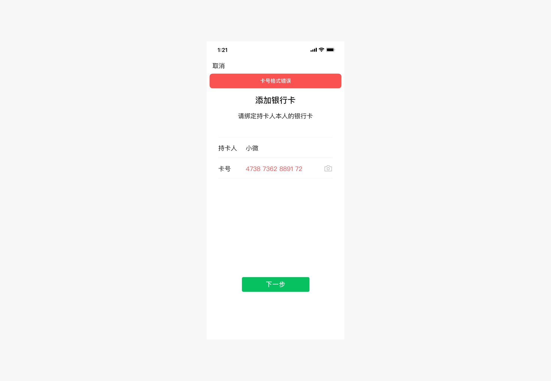
# Exceptional State — Form Errors
When a form error occurs, the reason for the error should be displayed at the top of the form, along with the erroneous field, prompting the user to make corrections.
# III、Convenience and Elegance
From the physical keyboards and mice of the PC era to finger operations in the mobile era, although input devices have become much more compact, the accuracy of finger operations is far inferior to that of keyboards and mice. To adapt to this change, developers need to fully utilize the characteristics of mobile phones during the design process, enabling users to control the interface conveniently and elegantly.
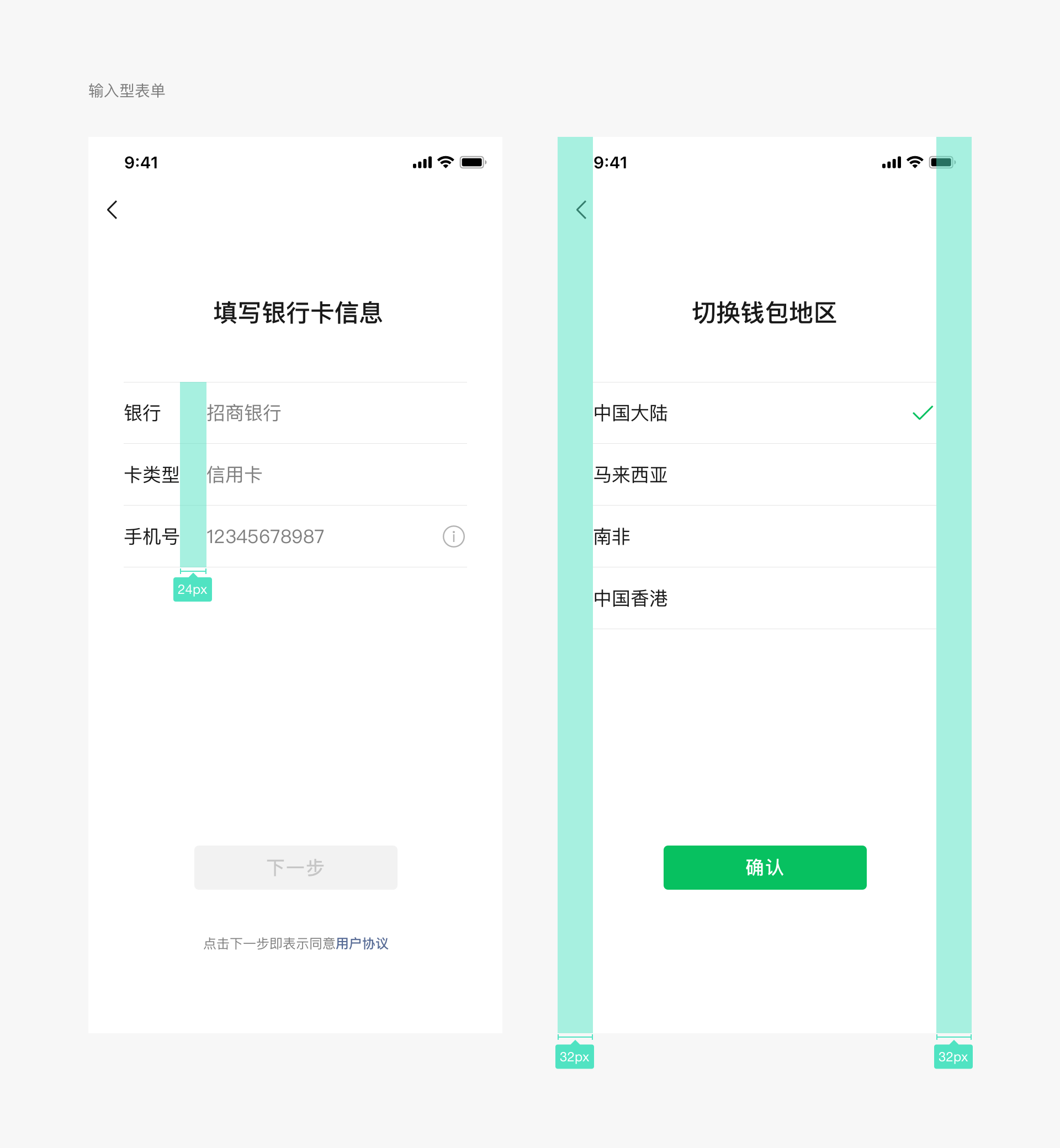
# 3.1 Reduce Input
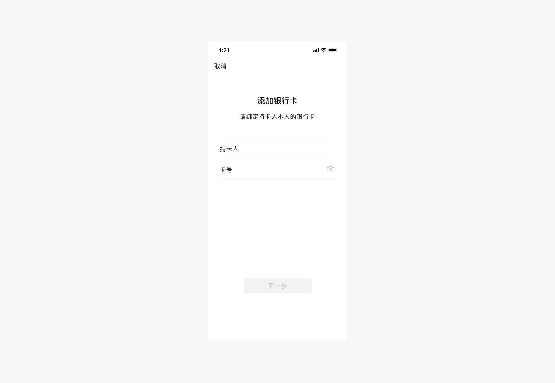
Due to the small and dense keyboard area on mobile phones, input is difficult and prone to errors. Therefore, when designing Mini Program pages, efforts should be made to reduce user input as much as possible. Existing interfaces or other easily operable selection controls can be used to improve the user input experience.
For example, when adding a bank card, the camera recognition interface can be used to assist users with input. In addition, the WeChat team also provides various WeChat Mini Program interfaces, such as the geographical location interface. Making full use of these interfaces can greatly improve the efficiency and accuracy of user input, thereby optimizing the experience.
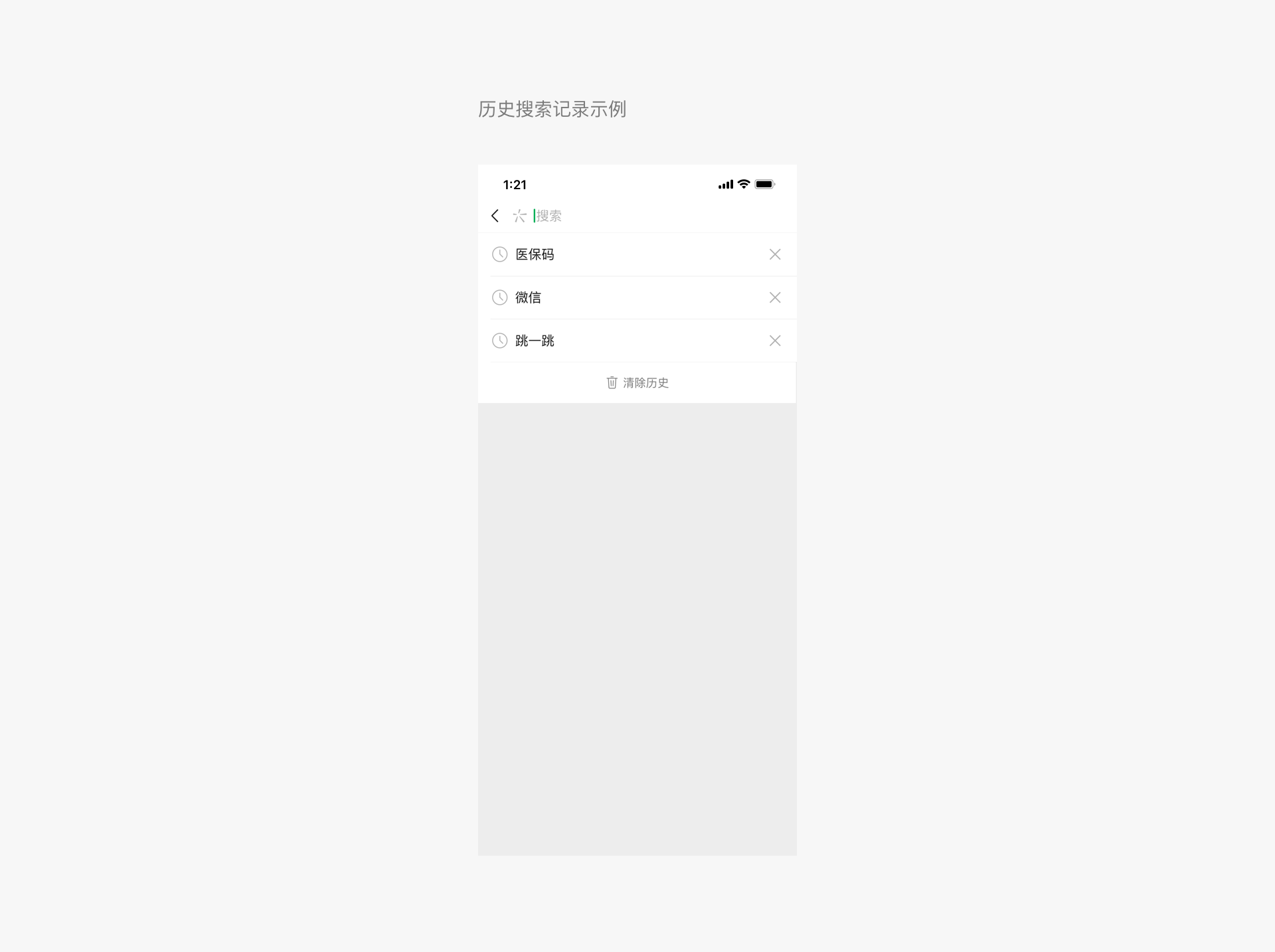
 In addition to using interfaces, when manual input is necessary, users should be given options rather than having to type on the keyboard. On one hand, making choices from a limited set of options is usually easier than relying solely on memory for typing. On the other hand, it is still because single-key input on the mobile keyboard is prone to errors. For example, when users search, providing quick search history options will help them search quickly, reducing or avoiding unnecessary keyboard input.
# 3.2 Avoid Mistakes
Since we control the interface on mobile phones by touching the screen with our fingers, the accuracy of finger clicks is far inferior to that of a mouse. Therefore, when designing buttons that need to be clicked on the page, it is necessary to fully consider the size of their hotspots to avoid mistakes caused by too small or too dense clickable areas. When simply transplanting interfaces designed for computer screens to mobile phones without any adaptation, such problems often occur. Since the resolution of mobile phone screens varies, the optimal click pixel size also varies, but when converted into physical size, it is roughly between 7mm and 9mm. In WeChat's standard component library, various control elements have been designed with page click effects and adaptation to different screens in mind. Therefore, it is once again recommended to use or imitate the standard control sizes in design.
# 3.3 Utilize Interfaces to Improve Performance
The WeChat Design Center has released a set of standard web control libraries, including the Sketch Design Control Library and the Photoshop Design Control Library. In the future, Mini Program components will also be improved. These controls are fully optimized for mobile page characteristics, ensuring their usability and operational performance on mobile devices.
At the same time, the WeChat development team is continuously improving and expanding the WeChat Mini Program interface, as well as providing a public library. Utilizing these resources not only offers users faster services but also significantly enhances page performance, thereby improving the overall user experience.
# IV、Consistency and Stability
In addition to the principles mentioned above, it is recommended that Mini Programs integrating with WeChat pay attention to consistency and continuity across different pages. Wherever possible, use consistent controls and interaction methods across various pages.
A unified page experience and coherent interface elements help users achieve their goals with minimal learning effort, reducing discomfort caused by frequent page transitions. Therefore, Mini Programs can use the standard controls provided by WeChat as needed to achieve consistency and stability.
# V、Visual Standards
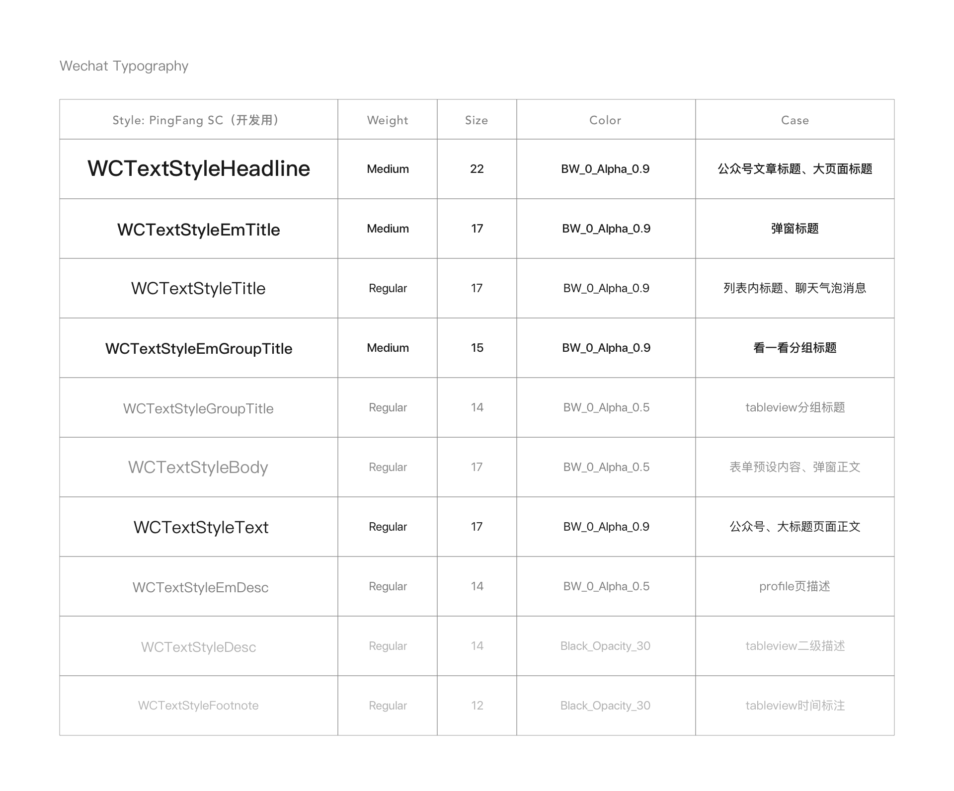
# 5.1 Fonts
The fonts used within WeChat should match the system fonts of the device. Common font sizes include 22, 17, 15, 14, and 12 (pts). Specific usage scenarios are as follows:
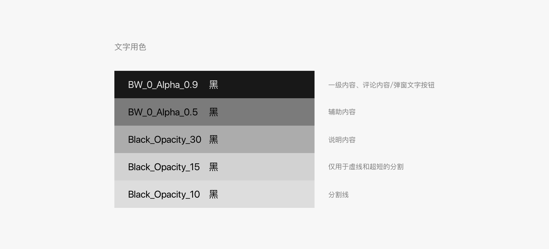
# Font Colors
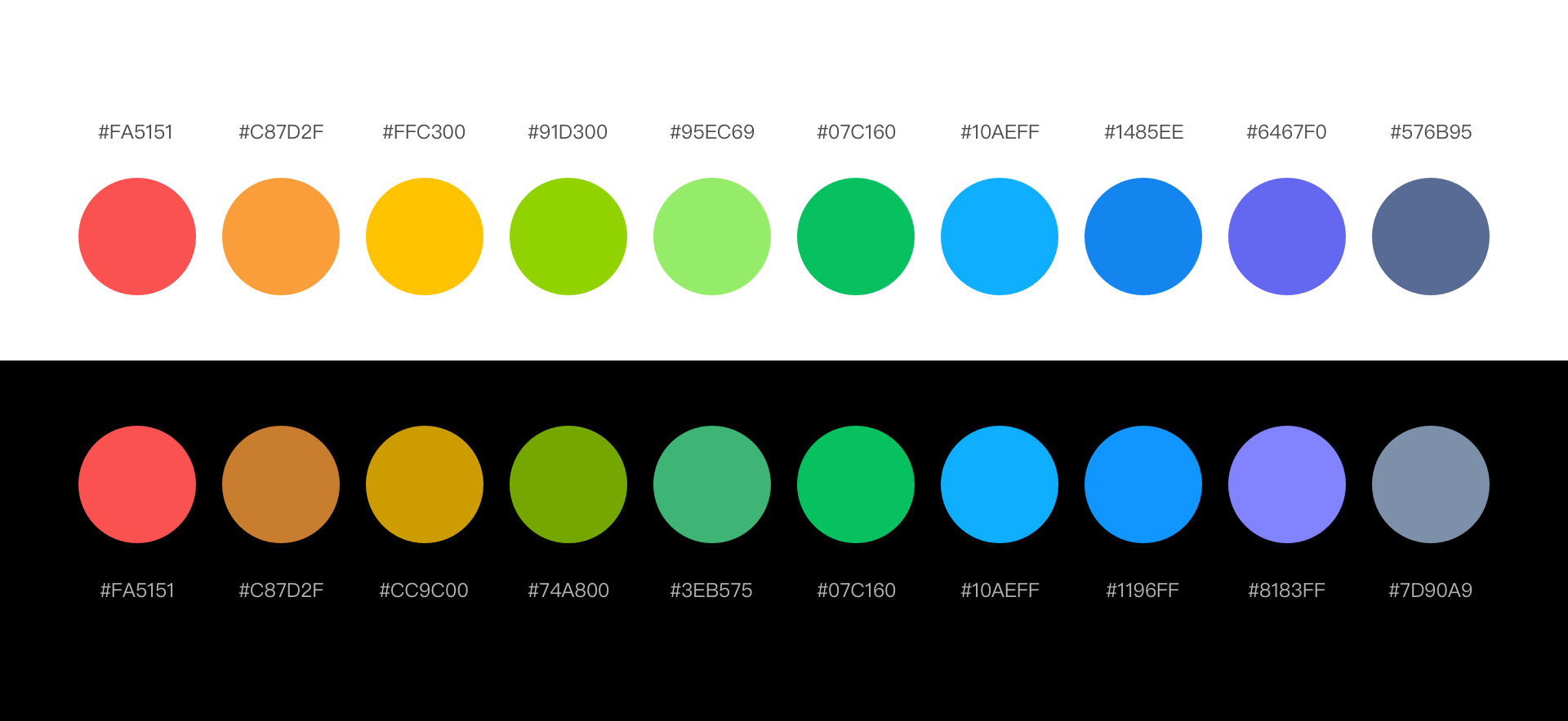
# 5.2 Color Palette
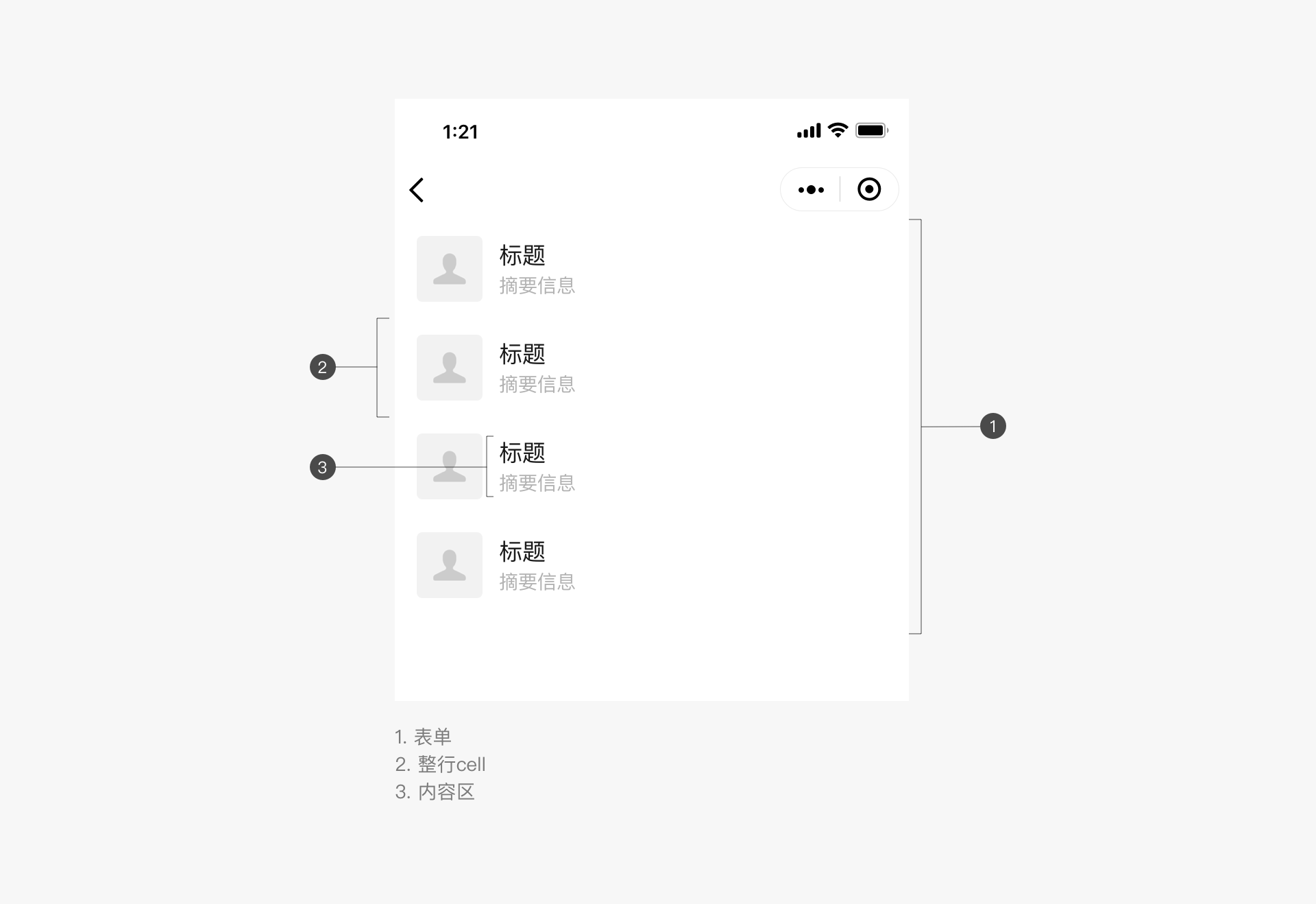
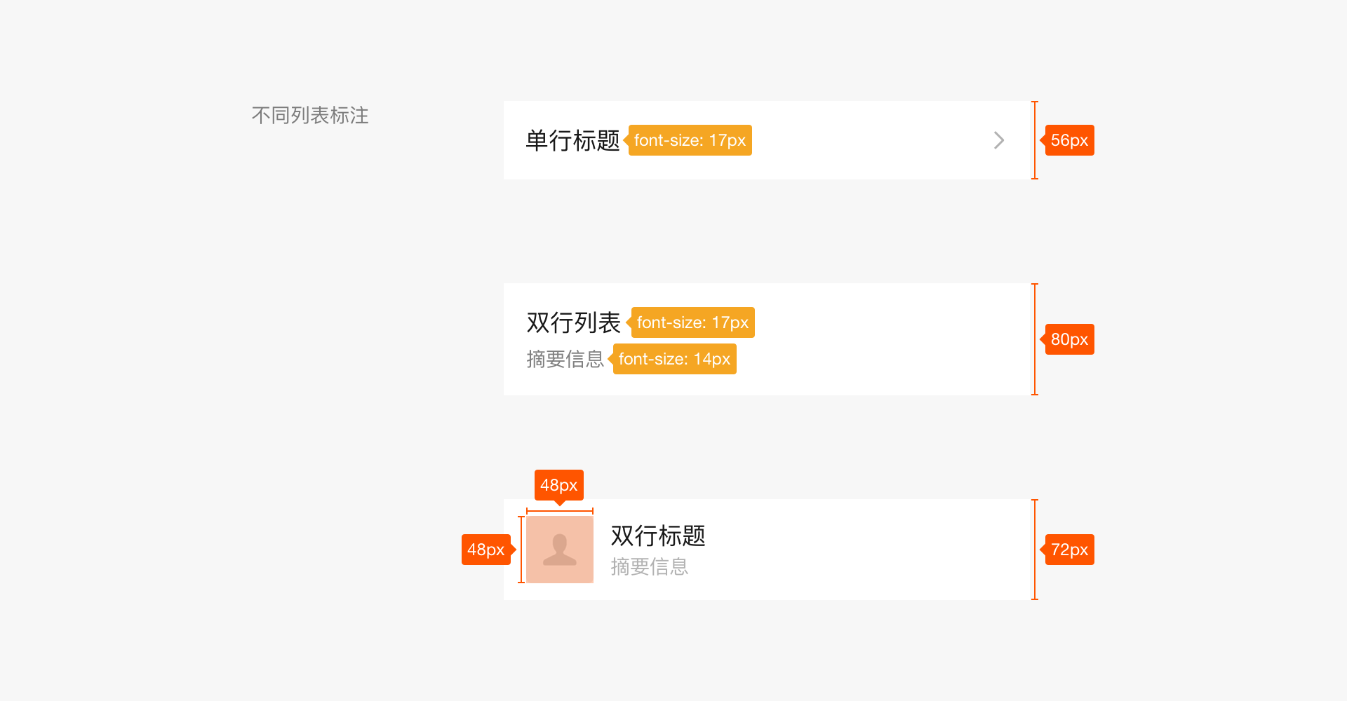
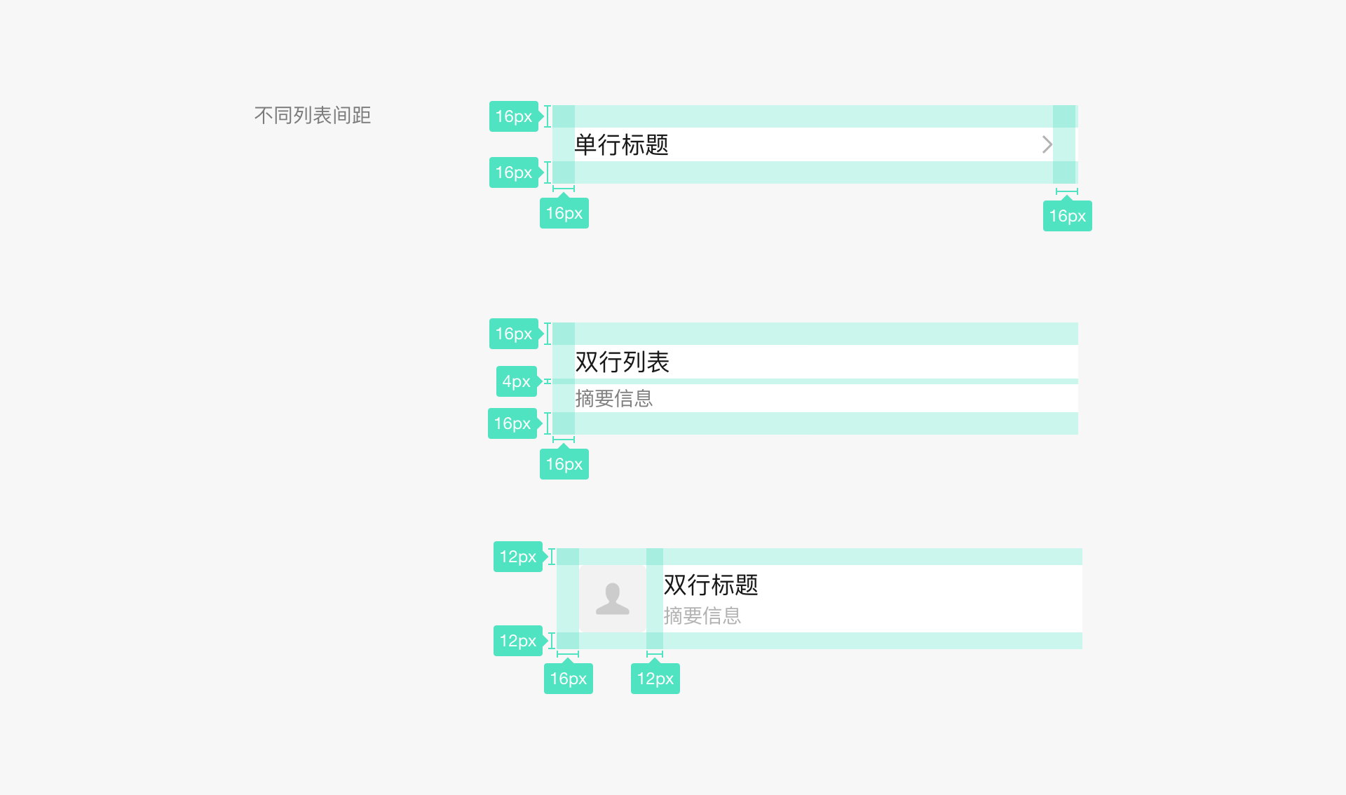
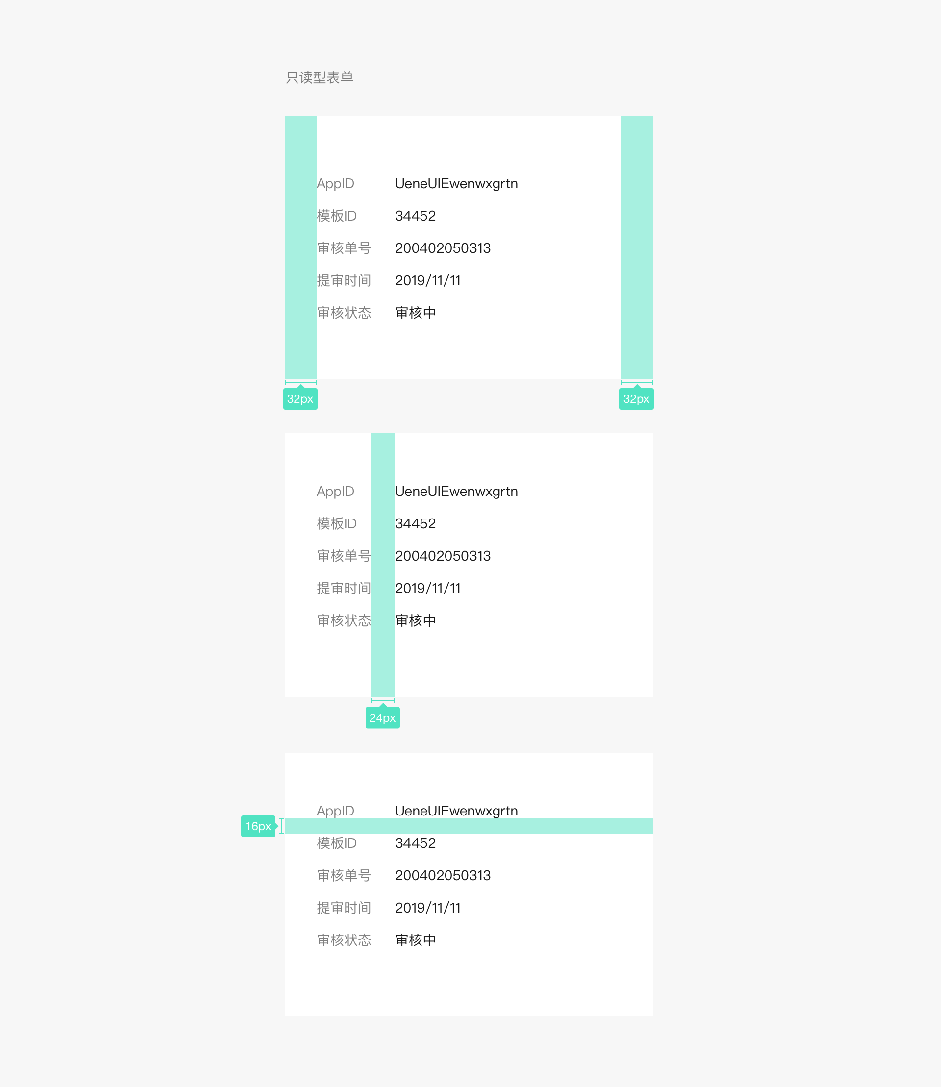
# 5.3 Lists
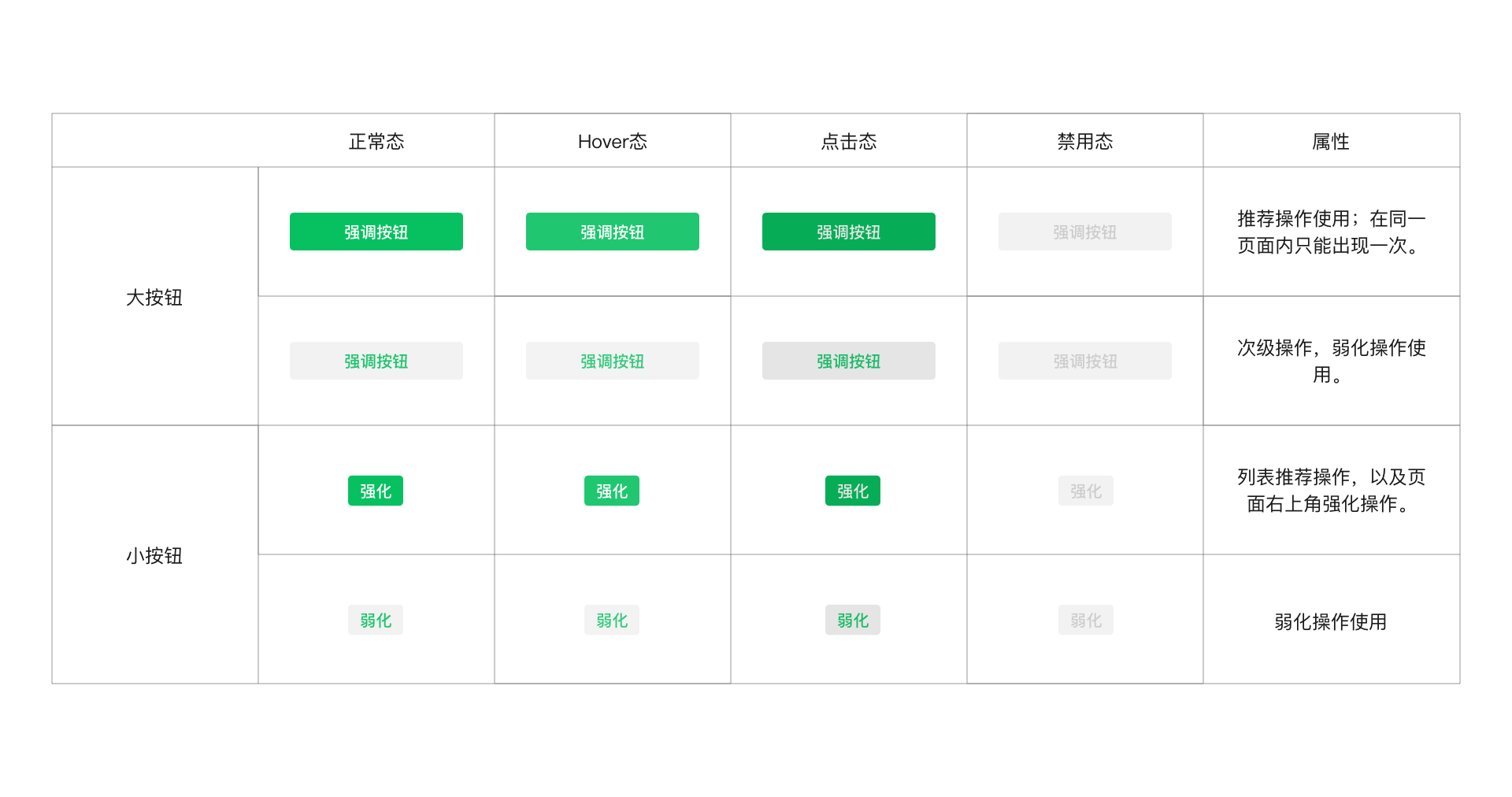
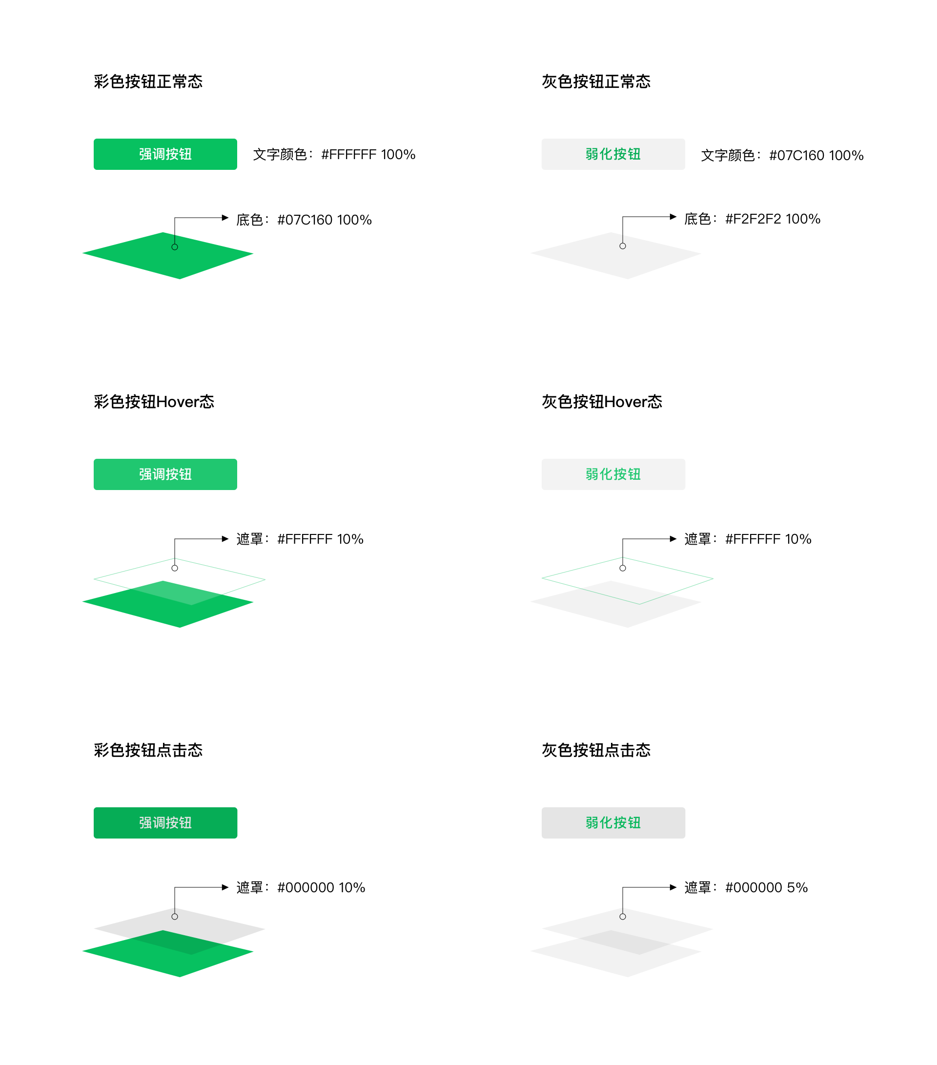
# 5.4 Buttons
# 5.5 Icons
# VI、Resource Download
To facilitate designers' work, WeChat provides a basic control library that can be used for both web design and Mini Programs. It also offers resources that developers can easily access.
Preview address: https://weui.io