# Weixin Mini Game Design Guidelines
Mini Games are a new format of traditional games. They can tell a story, convey an outlook, and serve as a vehicle for the creativity of both developers and players. Based on the lightweight, convenient, and sharable nature of Mini Games, we have drawn up a Mini Game interface design guide and suggestions to help Mini Game developers create more outstanding products and provide players with an even better gaming experience.
# Clear Process
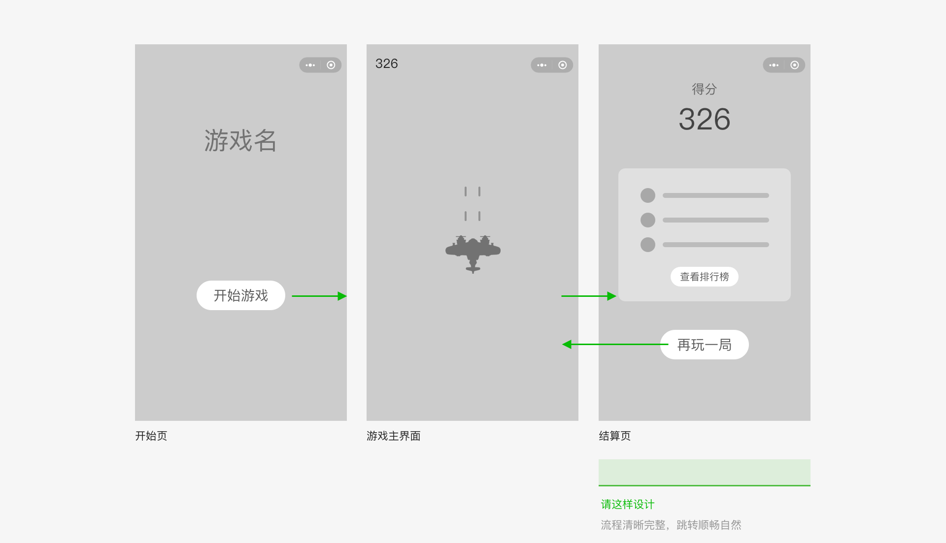
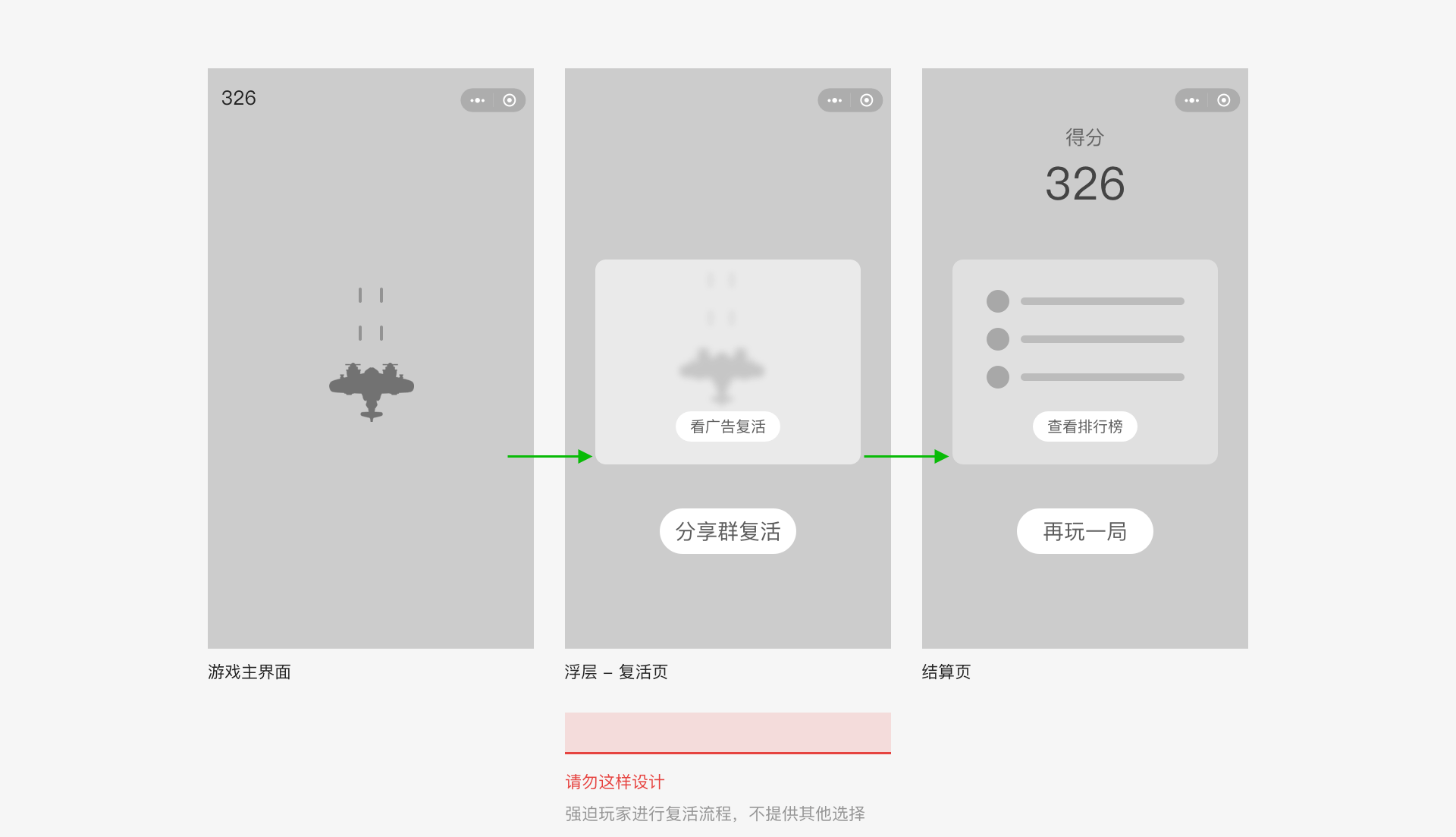
The overall Mini Game should have a clear process, making it easy for gamers to freely switch between pages without hassles or obstructions. The logical relationships between pages should be simple and clear so that gamers do not get lost in the game.
The figure below shows a common operation process players may encounter in a Mini Game. Developers can customize the redirect logic between pages based on their own games. These pages include, but are not limited to: start page, main game interface, results page, ranking page, and sharing card.
# Rational Interface Design
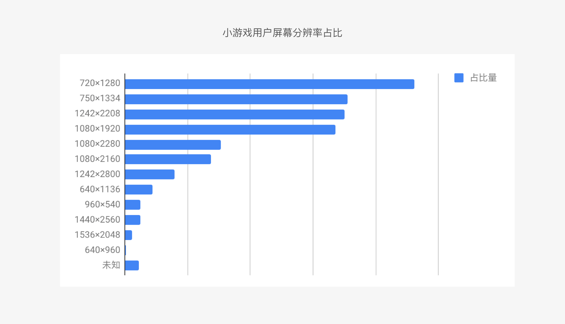
In the game interface design, the page structure and interface layout have a direct impact on the gameplay experience. Based on our Mini Game user statistics, we found that most users have a screen aspect ratio of 16:9. Considering both screen resolution usage and design versatility, we recommend developers use a resolution of 750x1334 and a screen size of 4.7 inches as the design baseline.
# Device Compatibility
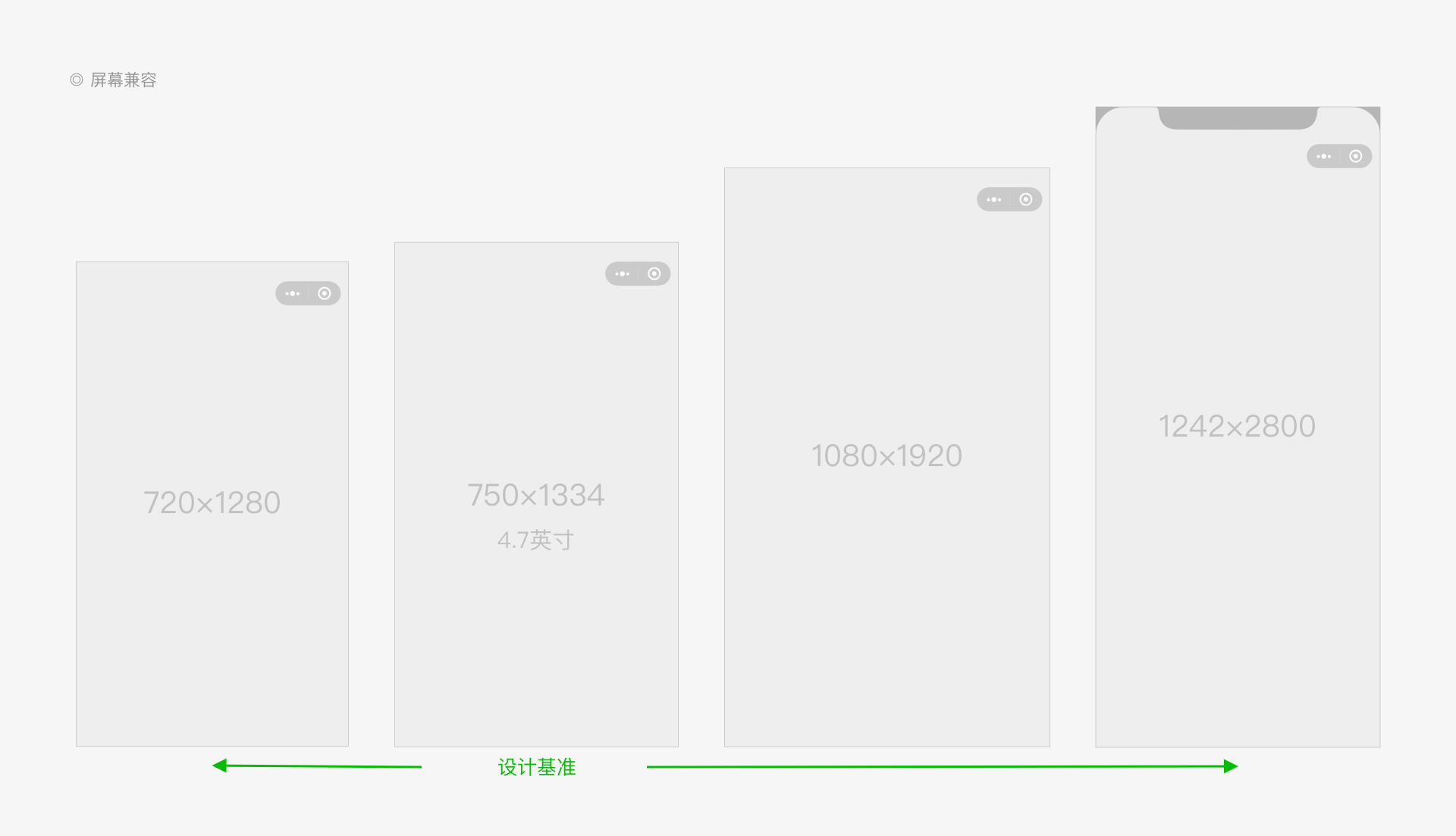
Game developers must be aware of compatibility with different devices and operating systems and adopt an adaptation solution that ensures gamers enjoy an optimal gameplay experience. We recommend using a baseline resolution of 750x1334 and taking measures to ensure compatibility with other screen sizes. In addition, you can provide independent compatibility solutions optimized for devices with special screens, such as bezel-less screens, screens with a notch at the top, and special-shaped screens.
# Ease of Operation
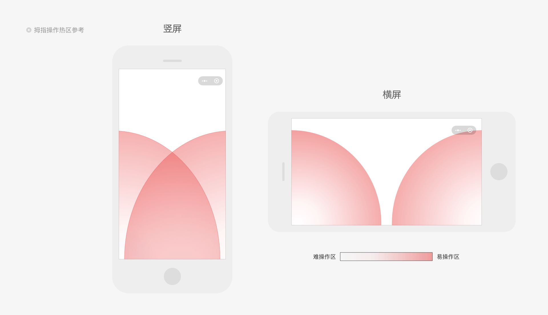
Most cell phone interactions are performed with the thumb. During interface design and layout, developers should give priority to ease of operation to make interface operations more user-friendly.
# Function Thumb Zones
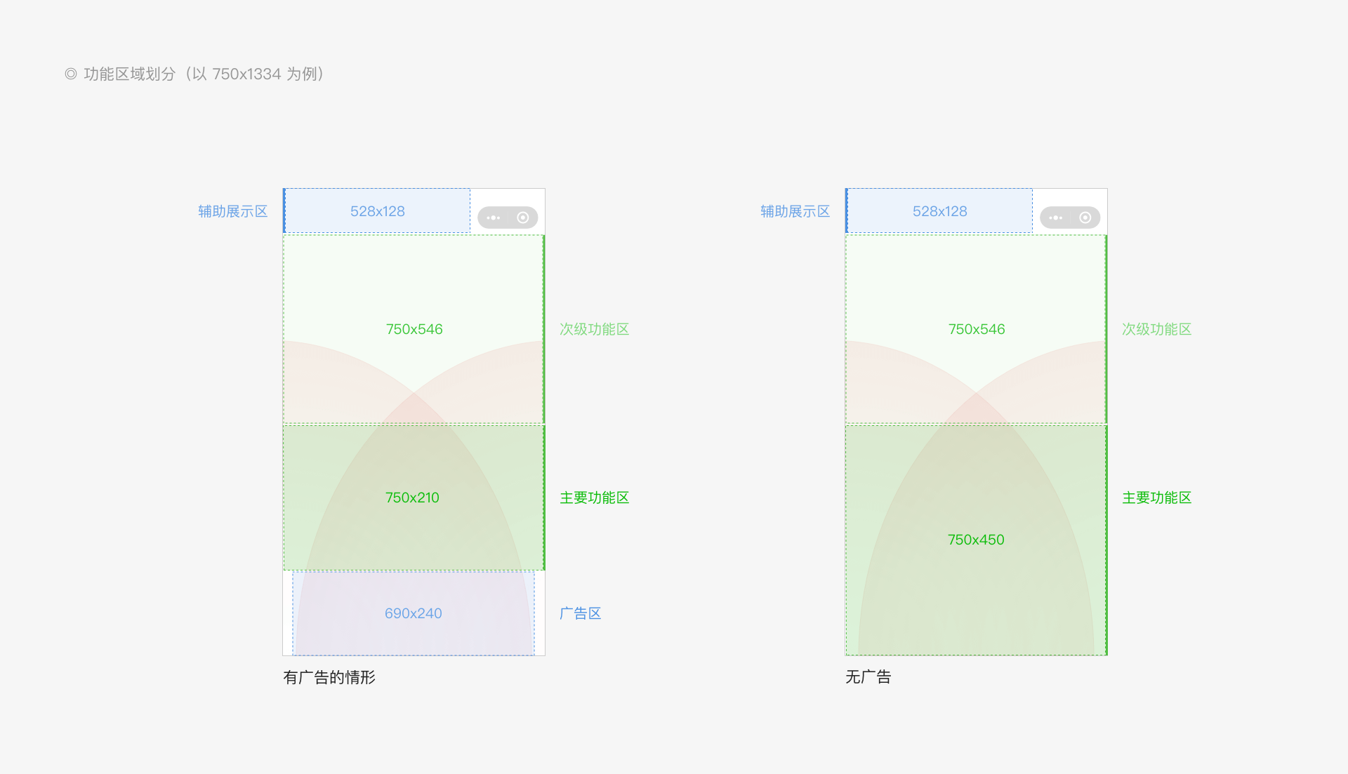
By considering the "thumb zone" (the most comfortable area for users to touch the screen), we can divide the game interface into zones suited for different functions, such as the primary function zone, secondary function zone, auxiliary display zone, and ad zone. Developers can create a reasonable layout based on the weights of different components.
# Ad Content
Common ad content can be placed at the bottom of the interface. Developers should select an appropriate zoom ratio that ensures the ad banner is displayed properly and does not interfere with the gameplay experience. For detailed ad specifications, see Mini Game Ad Application Regulations and Penalties. For more compatibility information, see Mini Game Banner Ad Host Guide.
# Clear Division of Primary and Secondary Content
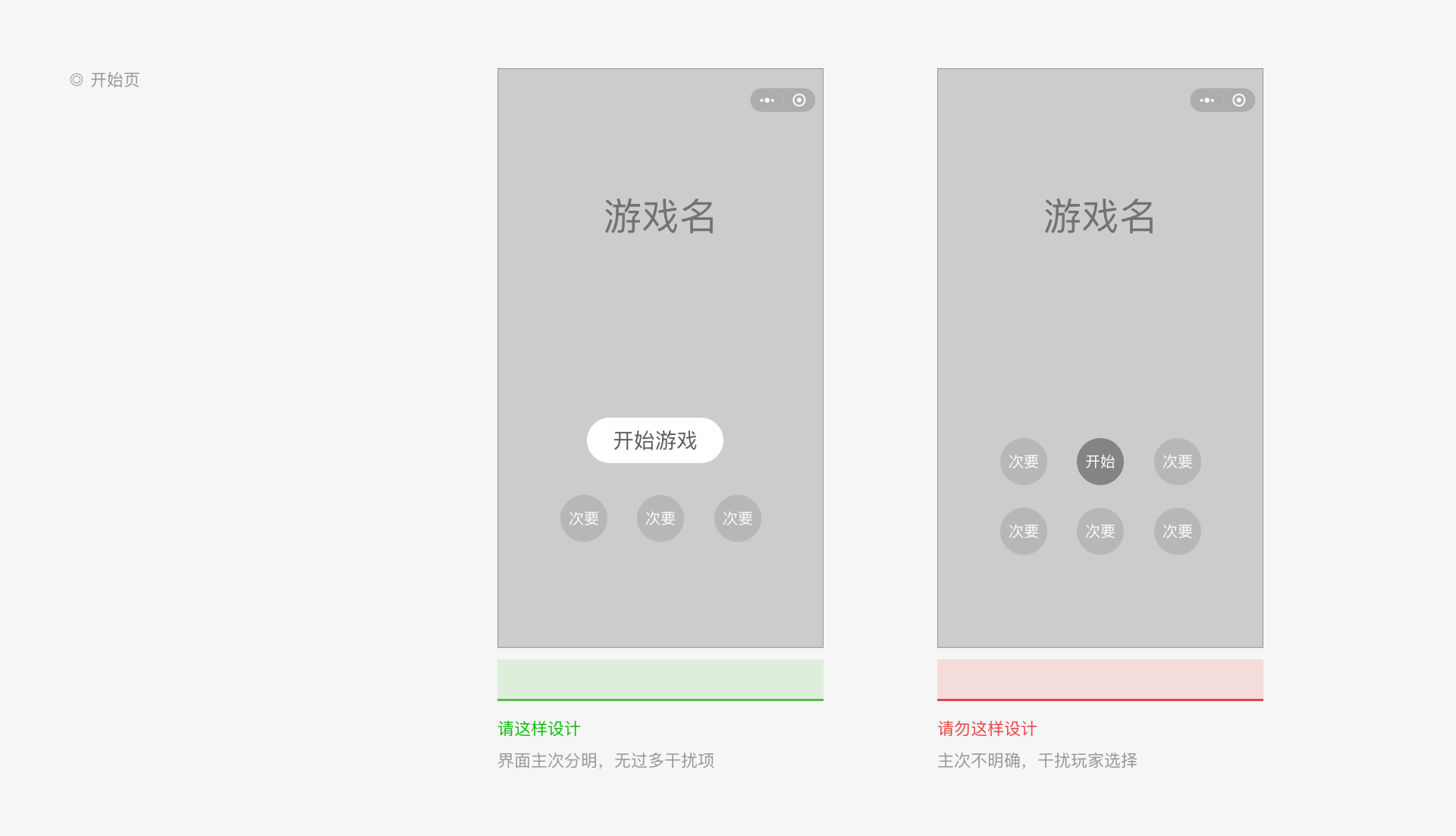
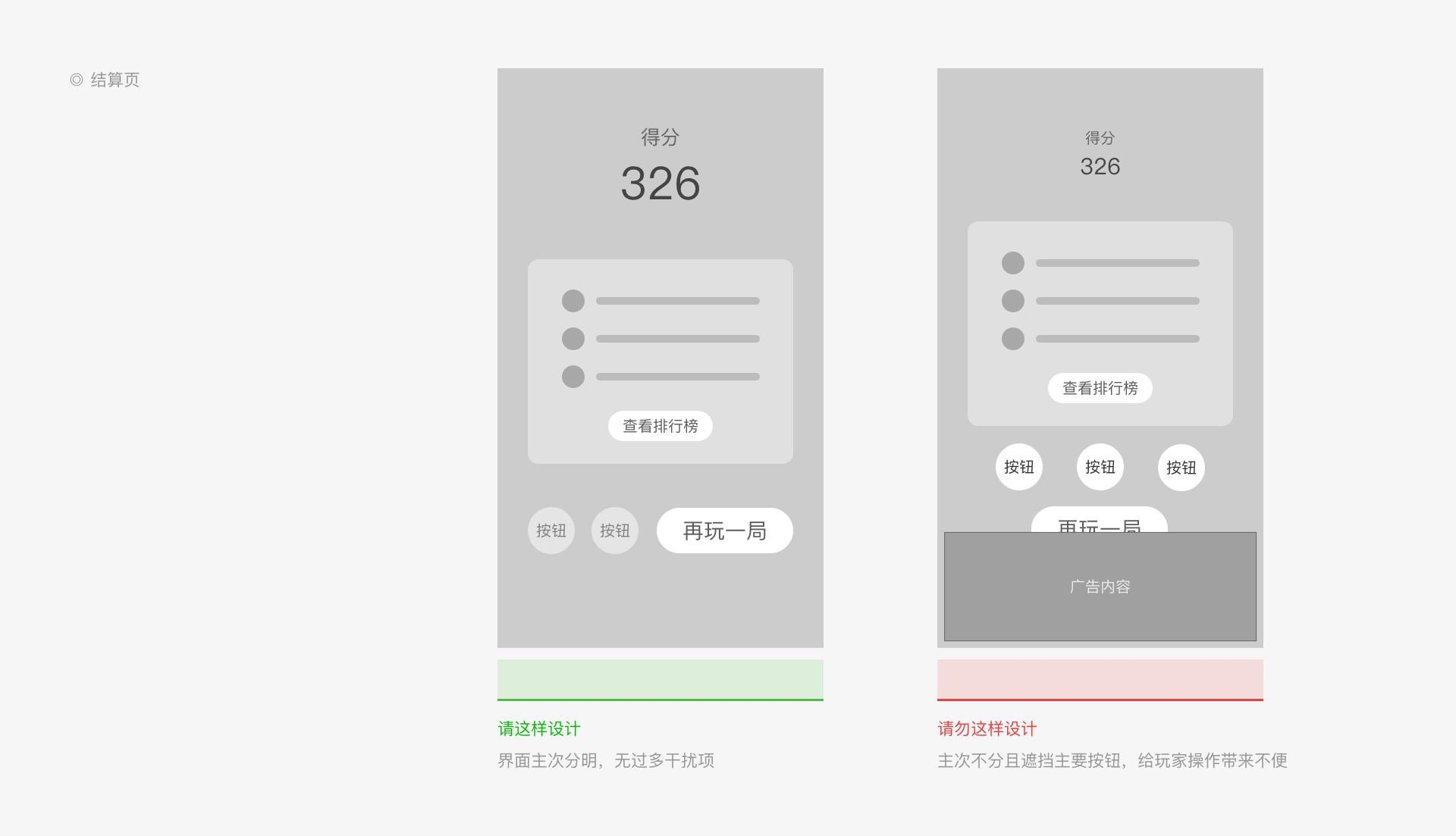
Each page should have clear goals and display important content. Reduce the amount of unessential design content to avoid interfering with gameplay. Take the start page and the results page as examples:
# Start Page
The start page is the first page players see when they open the Mini Game. It is a critical factor that determines the Mini Game’s ability to retain players. The player’s primary goal is to quickly learn about and play the game, so we suggest using an intuitive presentation format. In addition, for games with more complicated gameplay, you can provide a new player tutorial.
# Results Page
The results page is responsible for transitions from a previous process to a new process. It summarizes the previous game and displays its results. Then, it guides the player to perform subsequent operations, such as “Play Again” and “Rankings”.
# Rankings Page
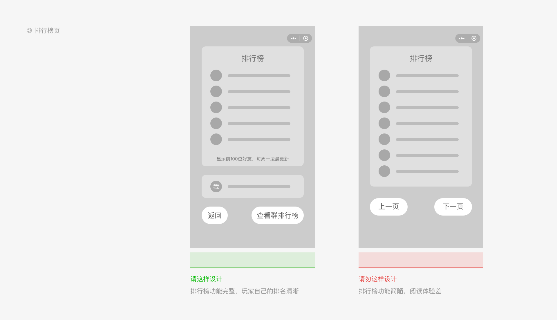
The rankings page allows players to quickly see their ranking compared to other players. Developers should clearly describe the nature and dimensions of the rankings, such as friends rankings, global rankings, weekly rankings, or special gameplay rankings. We suggest displaying the player's own score separately from the other rankings so that it is easy to view. The number of items in the rankings should be limited. We do not recommend using separate pages to load all the content as this can create a poor viewing experience.
# Carefully Select Content Elements
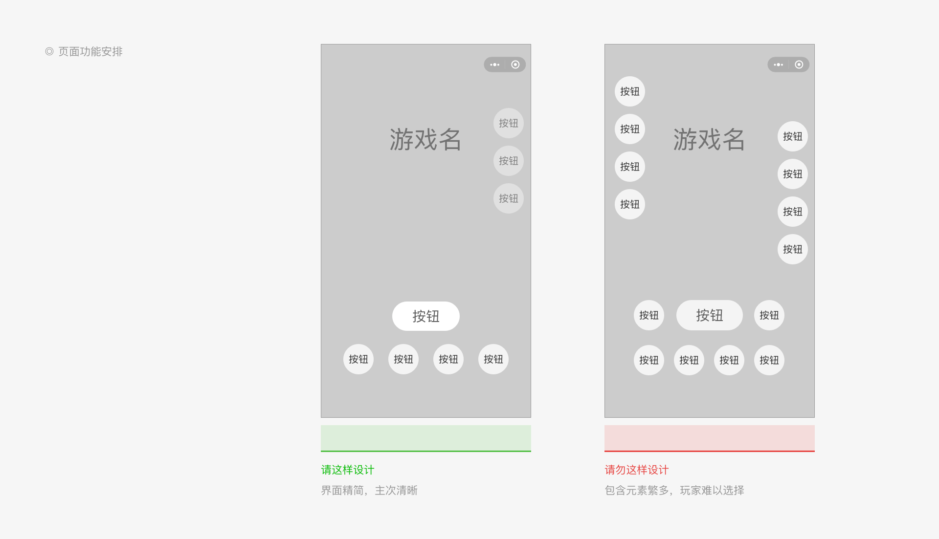
In order to avoid creating a messy appearance and interfering with player choices, the interface should not overwhelm users with too many elements. Some trades offs have to be made in this respect when carefully selecting content elements.
# Button Elements
In games, button elements are very common. These include buttons, icons, and pendants. You should avoid all-tile displays and differentiate the display based on player features. Some choices may be hidden and accessed through a layered interface.
# Share Cards
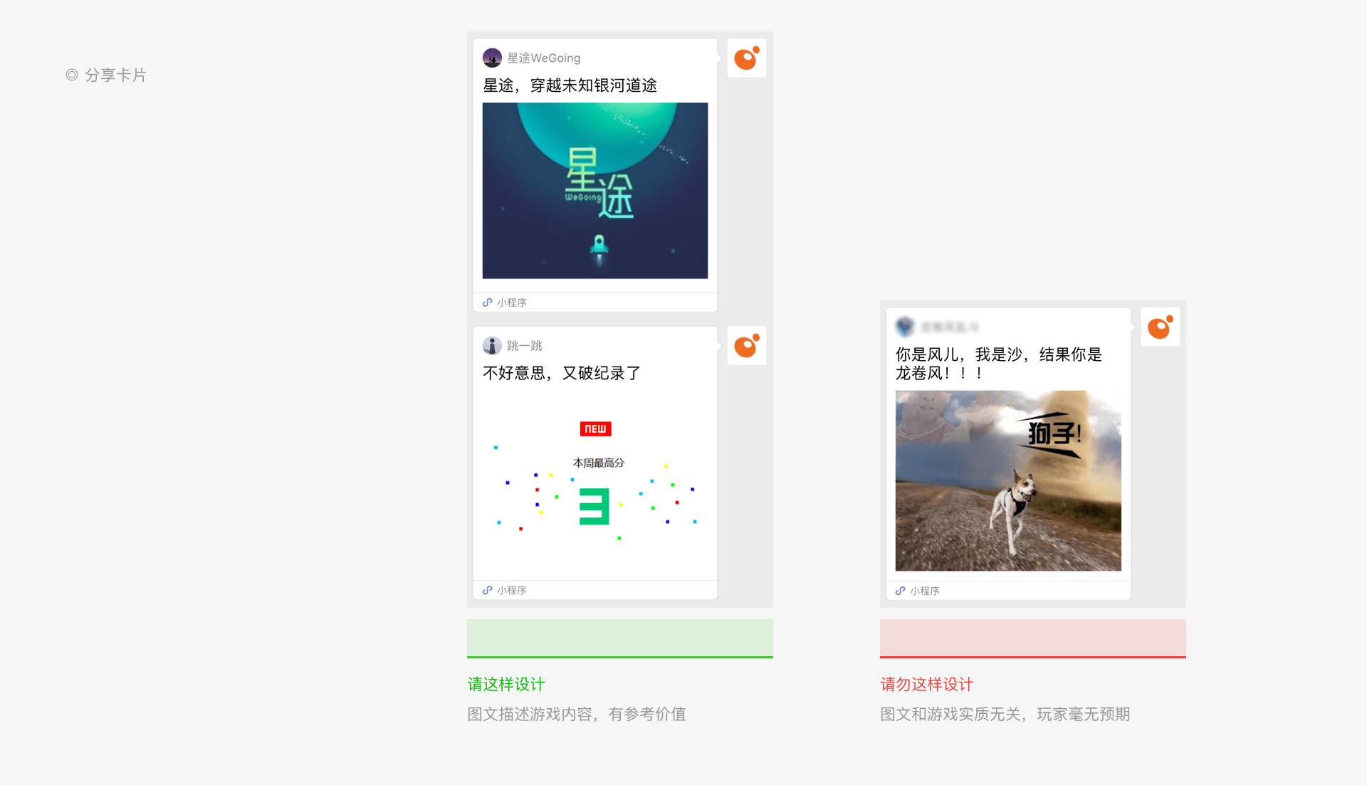
Developers should use the share card function correctly. The shared image and text should serve the game content and help users understand what happens after they follow the link. Do not improperly entice users to share. For more details, see Mini Game Published Content Regulations.
# Distinctive Personality
# Consistent Style
In addition to the principles above, developers should maintain a consistent overall style when designing games. This includes the element dimensions, color schemes, UI style, and interactive experience. The game elements should form a distinctive design concept, expressed on the various pages. This will give players a more immersive gaming experience.
# Creative Design
Each Mini Game should have its own brand. We suggest that developers incorporate distinctive Mini Game features into a creative design that combines core gameplay, aesthetic presentation, plot design, sound effects, and overall integrity. In the end, this should give players a more memorable experience that they want to share with their friends. We provide four official incentives for creative games. For more details, see the Weixin Mini Game Creativity Incentive Policy.