# Skeleton screen
A skeleton screen is a blank version of a page, usually outlined by some gray blocks before the page is fully rendered, and replaced with the real content when the data is loaded.Usually in Weixin Mini Program, we need to manually maintain the skeleton screen code, when the business changes, the same need to adjust the skeleton screen code.For development convenience, the developer tool provides the ability to automatically generate the skeleton screen code.
# Operating environment
Download and install 1.03.2006032 or 1.04.2006032 for the above versions of the developer tools
# How to use it
Tool to generate skeleton screen code for currently previewing a page.The tool entrance is located at three points in the lower right corner of the simulator panel.
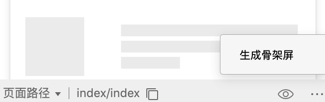
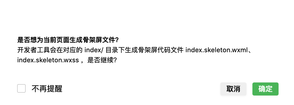
Click Generate a skeleton screen. A pop-up will indicate whether you are allowed to insert a node screen code.When this is determined, two files -page.skeleton.wxmlandpage skeleton.wxss- are generated in the current page hierarchy, respectively, as templates and styles for the skeleton screen code.
Skeleton screen code via Weixin Mini Program template ( template )pages / index / indexpages as an example.
<!-- pages/index/index.wxml 引入模板 -->
<import src="index.skeleton.wxml"/>
<template is="skeleton" wx:if="{{loading}}" data="{{}}"/>
/* pages/index/index.wxss 中引入样式 */
@import "index.skeleton.wxss";
Example code: https://developers.weixin.qq.com/s/3AQoEBmh7XhF
# Show and hide
As with normal templates, display and hide are controlled bywx: if.
# Generate configuration
You can add fieldsproject.config.jsonto skeletonConfig``to make the skeleton-related configuration, and the page configuration overrides the global configuration.
// project.config.json
{
  "skeletonConfig": {
    "global": {
      // 默认的全局配置
      "loading": "",
      "outline": {
        "remain": false,
        "replace": "none"
      },
      "text": {
        "color": "#EEEEEE"
      },
      "image": {
        "shape": "",
        "color": "#EFEFEF",
        "shapeOpposite": []
      },
      "button": {
        "color": "#EFEFEF",
        "excludes": []
      },
      "pseudo": {
        "color": "#EFEFEF",
        "shape": "circle",
        "shapeOpposite": []
      },
      "excludes": [],
      "remove": [],
      "empty": [],
      "hide": [],
      "grayBlock": [],
      "showNative": false,
      "backgroundColor": "transparent",
      "mode": "fullscreen",
      "templateName": "skeleton",
      "cssUnit": "rpx",
      "decimal": 4,
    },
    "pages": {
      "pages/index/index": {
        // 页面配置,key 为页页面路径
      }
    }
  }
The configuration is as follows.Developers can set the color and shape of text, pictures, and buttons as needed, and can also set the color or shape of the text, pictures and buttons according toexcludes、remove、hideIgnore or hide some of the page elements for a better display.
| field | type | Required to fill in | Default values | Introductions |
|---|---|---|---|---|
| loading | String | No | spin | Animation when skeleton screen is displayed:spin``chiaroscuro``shine |
| outline | Object | No | This configuration accepts aremainBooleanField, defaults to true, indicates that the border color is kept, and when false, replacewith thefield for style.border | |
| text | Object | No | This configuration accepts acolorfield that determines the color of the text blocks in the skeleton page. Color values support hexadecimal. | |
| image | Object | No | This configuration accepts 3 fields, [[]]color、shape、shapeOpposite。Color and shape are used to determine the color and shape of the image block in the skeleton page, color values support hexadecimal, shape supports two enumeration values,circle(round) andrect(rectangular).The shapeOpposite field accepts an array. Each element in the array is a DOM selector for selecting DOM elements,The shape of the selected DOM will be the opposite of the configuration shape, for example, ifrectis configured. The picture block in shapeOpposite will then appear in the skeleton page as a circle shape (circle). | |
| button | Object | No | This configuration accepts two fields,colorandexcludes.Color is used to determine the color of what is considered to be a button block in the skeleton page, and excludes accepts an array of elements in an array that are DOM selectors for selecting elements. The elements in the array will not be considered as button blocks . | |
| pseudo | Object | No | This configuration accepts two fields,colorandshape.Color is used to determine the color of the pseudo-element block in the skeleton page, and shape is used to set the shape of the pseudo-element block, taking two enumeration values: circle and rect. | |
| excludes | Array | No | [] | If you have an element that does not require skeleton processing, write the element's CSS selector to the array. |
| remove | Array | No | [] | Elements that do not need to generate the page skeleton and need to be removed from the DOM are configured with a CSS selector with the value of removing the element. |
| hide | Array | No | [] | There is no need to remove it, but the element is hidden by setting its transparency to 0 and configuring the CSS selector with the value of the hidden element. |
| empty | Array | No | [] | The elements in the array are CSS selectors, and the selected elements will be emptied of child elements. |
| grayBlock | Array | No | [] | The elements in the array are CSS selectors, and the selected elements will be processed by the plugin into a color block, which is the same color as the button block. Internal elements will no longer be treated with special treatment and text will be hidden |
| showNative | Boolean | No | false | Displays native components, which are treated as view whenfalse. |
| backgroundColor | String | No | transparent | Skeleton screen background color |
| mode | String | No | fullscreen | By default, absolute positioning is used to occupy the full screen.When using custom components, as a local load style, can be set toauto, height with content |
| templateName | String | No | skeleton | The name value of the skeleton screen template |
| cssUnit | String | No | rpx | Supported enumeration values: rpx, rem, vw, vh, vmin, vmax |
| decimal | Number | No | 4 | The number of decimal places reserved for css values in the generated skeleton page, the default value is 4 |
Native components includecamera,live-player, [[TAG2-START]] live-pusher,video,map,canvas,picker,input,textarea`。
# Custom properties
Sometimes we need to make a part of the skeleton display a specific backview, which can be done bydata-skeleton-bgColor = "# ff00000"This is how you specify.
When working with the list, we assimilate the list to make it as beautiful as possible, and the sub-items that follow are clones of the first sub-items.Since the Weixin Mini Program list is not declared by theul / oltag, it is marked here with thedata-*attribute.Considering that other structures may be inserted within the list container, there are two ways to declare: the direct sub-nodes ofdata-skeleton-listwill be treated as clones of the first item;data-skeleton-liElements with the same attributes are considered children of the same list.
<!-- 方式一:列表容器内容均为列表项 -->
<view wx:for="{{array}}" data-skeleton-list>
  <view class="list-item">子项内容</view>
</view>

<!-- 方式二:列表容器中插入了其它元素 -->
<view wx:for="{{array}}">
  <view class="other-block">其它</view>
  <view class="list-item" data-skeleton-li="goods">子项内容</view>
  <view class="list-item" data-skeleton-li="goods">子项内容</view>
  <view class="list-item" data-skeleton-li="goods">子项内容</view>
</view>
In addition, the page may be divided into different areas, with different requests for data, and their response times may be inconsistent. The skeleton screen was originally a whole, and we wanted to split it up so that whenever a request returned, the corresponding region's skeleton was replaced with the real content to achieve progressive loading.Declarationdata-skeleton-hideTheattribute is replaced by thehiddenattributes when the node generates the skeleton screen, and the developer can control its display / hidden viadata.Note that in order to align the location of the real data with the skeleton screen, you should useabsoluteto locate the page main module at this time. For more information, refer to the example]]demo。
<!-- 原 wxml 内容 -->
<view data-skeleton-hide="hideBlock1"></view>
<view data-skeleton-hide="hideBlock2"></view>

<!-- 骨架屏 wxml 内容 -->
<view hidden="{{hideBlock1}}"></view>
<view hidden="{{hideBlock2}}"></view>

# Tips
- The skeleton screen includes only the visible area in the first screen of the page. For containers such as
swiperthat scroll horizontally, child elements beyond the screen will be ignored; - The layout of skeleton screen duplicates the developer's page layout. When the skeleton screen is needed to adapt the page size, the page layout should adopt the adaptive scheme such as rpx;
- Some components such as
movable-view,movable-area、rich-text、editor、picker、picker-view、picker-view-column、ad、officail-accountAndopen-datacan not generate an ideal skeleton effect, you can add a parent container, combined with grayBlock, empty and other configurations, gray it. - Do not modify the code of the automatically generated skeleton screen. When the effect is not ideal, it is recommended to adjust the configuration so that it can still be automatically created when the page changes;
- The generated skeleton screen code will contain page data at the time of preview and will be used to populate the page;
- Skeleton screens are often used for products lists, news lists, etc., and do not display well for pages with more animation / native components;
- In addition to the ability to display the skeleton of the first screen, it can also be used as a local loading
loadingstyle, which can be used flexibly;