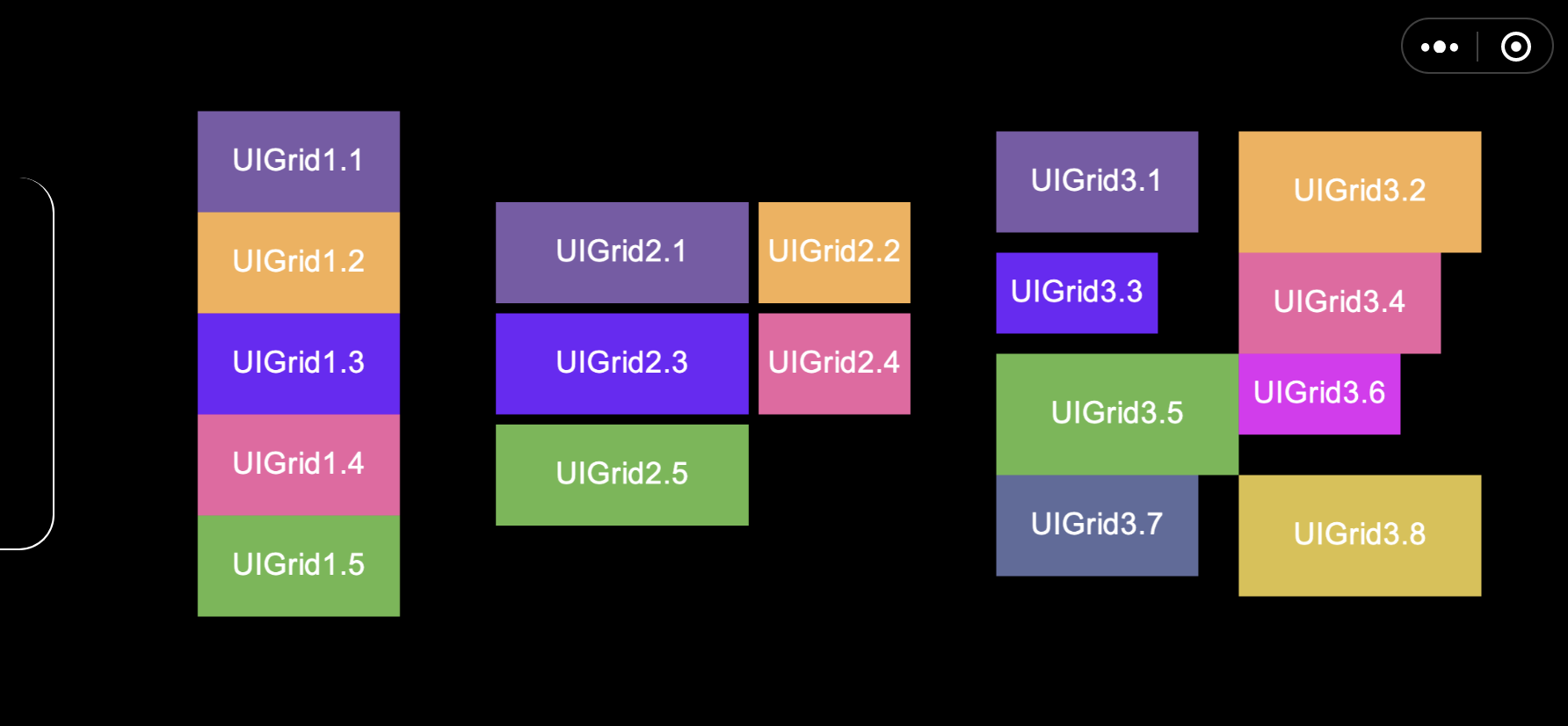
# UIGrid List component
# Overview
UIGrid is the basic list layout component, with two layout strategies: fixed size layout and dynamic size layout.

# Static attribute description
Arrangement: List direction enumeration value
// engine.UIGrid.Arrangement
enum Arrangement {
  Horizontal, // Horizontal direction
  Vertical // vertical direction
}
# Property description
| Property name | Type | Default value | Description |
|---|---|---|---|
| arrangement | Arrangement | Arrangement.Horizontal | List layout direction. |
| cellWidth | number | 0 | Fixed size layout, the width of each cell. |
| cellHeight | number | 0 | Fixed size layout, the height of each cell. |
| columns | number | 0 | The number of columns in the current layout direction. If it is 0, the number of sub-elements is used as the number of columns. In the fixed size layout, the columns are perpendicular to the current main direction; in the dynamic size layout, the columns are parallel to the main direction. |
| autoSize | boolean | false | Whether to enable dynamic size layout, take the largest element of each row and column as the current row and column cell size for layout. |
| cellAlignmentX | number | 0.5 | Used for dynamic size layout, represents centering, the value range (0-1), determines the horizontal alignment rules inside all cells in each column. |
| cellAlignmentY | number | 0.5 | Used for dynamic size layout, represents centering, the value range (0-1), determines the vertical alignment rules inside all cells in each row. |
| paddingX | number | 0 | Dynamic size layout is used, the distance between each cell is the horizontal distance. |
| paddingY | number | 0 | Used for dynamic size layout, the default value is 0, the distance between each cell in the vertical direction. |
# Method description
| Method | Parameters | Return Value | Function |
|---|---|---|---|
| resetContext | Void | Immediately redo the layout of the UIGrid. | |
| setResetFlag | Void | Update dirty (will be updated in the Update phase by default). |
# Layout strategy
UIGrid has two modes, with different layout strategies:
This component has the autoSize property. When the property is false, the layout will be performed according to the set cellWidth and cellHeight as the child node size. At this time, the column corresponding to columns is perpendicular to the current main direction.
When the component's autoSize property is true. The component will be laid out according to the size of the child node itself, with the current row and column largest element as the row and column size, and the column corresponding to columns, parallel to the main direction; you can set cellAlignmentX, cellAlignmentY to determine the child elements The alignment rules in the grid of the current row and column can be set to paddingX and paddingY to determine the distance between different rows and columns.
# Notice
- When the number of columns attribute is 0, the number of columns in the layout will take the number of child elements as the number.
- The
Column DirectionunderautoSizewill be different.
# Instructions
# Code usage
// In the default mode, layout is performed according to cellWidth and cellHeight, the default columns is 0, and the number of columns is determined according to the number of child elements during layout.
const grid1Entity = game.createEntity2D('UIGrid1');
const grid1 = grid1Entity.addComponent(engine.UIGrid);
grid1.cellWidth = 200;
grid1.cellHeight = 100;
grid1.arrangement = engine.UIGrid.Arrangement.Vertical;
// Add child nodes
for (let i = 1; i <6; i++) {
    const gridItem = game.createEntity2D('UIGrid1.' + i);
    gridItem.transform2D.size.x = 200;
    gridItem.transform2D.size.y = 100;
    grid1Entity.transform2D.addChild(gridItem.transform2D);
}