# Use various rendering elements
This chapter mainly introduces the basic usage of various 2D rendering components (pictures, graphics, text, rich text) in a 2D scene.
Before starting the case, you can read Prepare 2D Rendering Resources to prepare resources.
# Create render elements
Rendering elements of common list: Right click on Hierarchy panel-Create UI node-Corresponding rendering element
Rendering elements that do not exist in the common list: Right click in the Hierarchy panel-create an empty node-Inspector panel-add components
# Picture rendering
# UISprite
Responsible for the rendering of two-dimensional images. The following case is to achieve the general effect of the basic four types of rendering.
![]()
# Image rendering component use
- Right-click to create a UI node, add a UISprite component, and set
spriteFrameto slice the image you want to render.
# Simple normal image rendering
- Set the Type to
Simple, and render the picture with a normal rectangle.
# Sliced Jiugongge Picture Rendering
- Set Type to
Sliced, Set theRectandSlicedRectof the spriteFrame used to determine the nine-square grid area.
# Tiled tiled image rendering
- Set Type to
Tiled, Set node size, tile size, set tile scale affected bytileScale.
# Filled image rendering
- Set Type to
Filled, SetfillDirto determine the type of filling, setinvertFillto determine the filling direction, and setfillAmountto determine the filling ratio.
# Text rendering
# UILabel
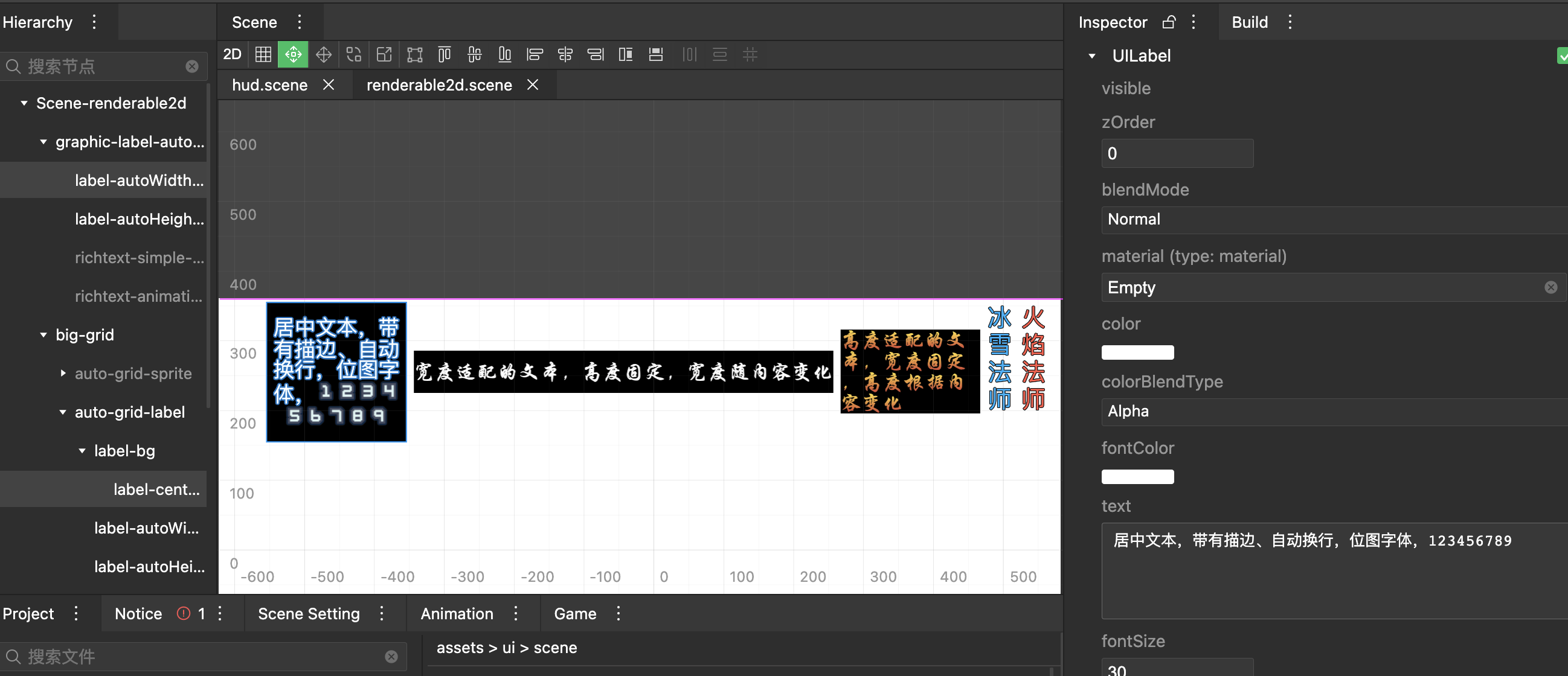
Responsible for basic text rendering, the following case is implemented, basic bitmap font rendering, automatic size effect display.
autosize: Whether the text automatically changes size according to the content

# Text component use
- Right-click to create a node, add UILabel components, and UILabel sets related properties (
fontColor...).
# Text alignment settings
- Set
alignhorizontal alignment mode,valignvertical alignment mode, and set whetherwordwrapperforms automatic line wrapping.
# Bitmap font rendering
- Set
bitmapFontas the required external bitmap font resource. The existing font of the bitmap font will take effect automatically, and the system font will be used for rendering if it does not exist.
# Node size adaptation content
- Set
autoSizeto determine whether the text automatically changes in size according to the content, combined withwordwrapto determine whether the height is automatically adapted or the width is automatically adapted.
# Rich text rendering
# UIRichText
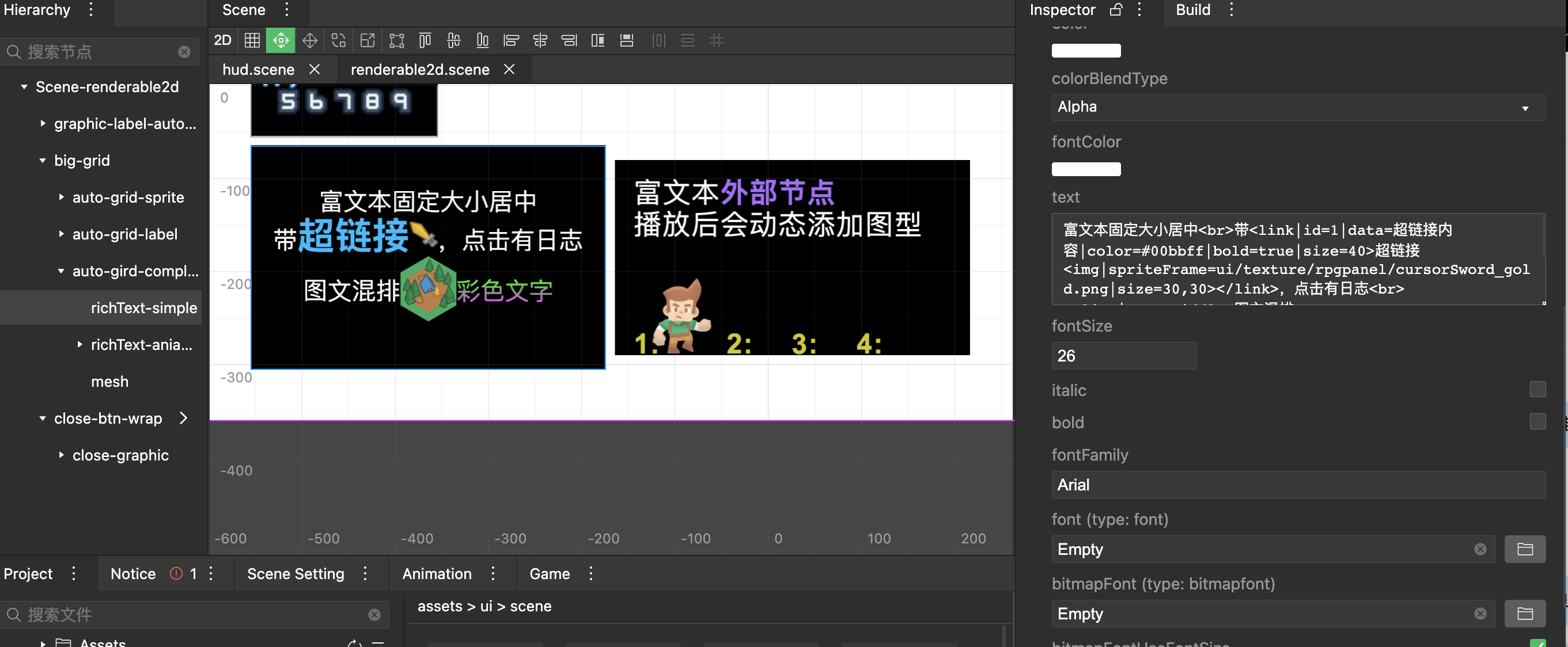
Responsible for the rendering of mixed graphics and text, supports inline styles, hyperlinks, external animation and other capabilities. The following cases have been implemented, with graphics, hyperlinks, and external animation.
Inherit UILabel, support most of UILabel properties
<align>: Align tags, need to be closed manually
<img>: Image tag
<br>: line break, support specifying line break height
<style>: style tag, supports global style and local style
<link>: Hyperlink tag, which can trigger a callback after clicking on a rich text element
<node>: placeholder tag, supports binding external nodes for rich text layout

# Rich text node usage
- Right-click to create a node, add UIRichText components, and set related properties.
# Component attribute style
- Rich text inherits from the text component, with basic properties such as
fontColor,align,valign,wordwrap...
# Rich text content editing
The
<align>tag, which controls the alignment of the inner block of the rich text. horz affects the alignment of the entire block, and will automatically wrap when encountering different alignments; vert affects the vertical alignment of different elements within the same block.<align|horz=center|vert=middle>Mixed graphics and text</align>The
<img>tag, according to the set size, uses external image rendering, Since this part of the pictures does not automatically rely on analysis, you need to manually set the pictures used as the entry resource.<align|horz=center|vert=middle>Image and text mixed<img|spriteFrame=ui/spriteframe/modern_campsite.png|size=60,70></align><br>tag, control line breakRich text fixed size centered<br>with
# Use style
- The
<style>tag supports the use of global styles and inline styles. Inline style (supports most text attributes):Global style:<style|applyGradient=true|gradientTop=#00ff00|gradientBottom=#ff44ff>Colored text</style><style|value=gradientColor>Color text</style>// Rich text style object, key is the class name, value is the attribute object const styleObject = { gradientColor: { applyGradient: true, gradientTop:'#00ff00', gradientBottom:'#ff44ff' } } // Set the global style, all rich text is common, will be overwritten engine.UIRichtext.setStyle(styleObject); // Set the internal style of the component, it will override the global style richtextComp.style = styleObject;
# Use hyperlinks
- The
<link>tag, used as a hyperlink, adds an externally set click callback to all elements inside the tag, and click callback needs to add a script component with a specific function to start.<link|id=1|data=Hyperlink content|color=#00bbff|bold=true|size=40> Hyperlinks <img|spriteFrame=ui/texture/rpgpanel/cursorSword_gold.png|size=30,30> </link>After playing, you can click the hyperlink area, and the corresponding callback onClickRichTextLink will be executed.export default class RichTextlLink extends engine.Script { public onClickRichTextLink(obj: {id: number, data: string}) { console.log(obj.id, obj.data); } }
# Use external nodes (external animation)
- The
<node>tag is used as a layout occupying area. The label is set with a default width and height for use, and an id is set. The script can be used to bind the id to an external node to synchronize the external node with the layout occupying area Information.<node|id=1|size=96,128>Follow-up textThe external node must be the first-level child node of the rich text, and the case is a picture frame animation node. After playing, you can dynamically modify the rich text layout to view, and the external nodes are directly synchronized with the rich text layout.this._richText.bindNodeWithTransform(1, this._renderSpriteTransform);
# Graphical rendering
# UIGraphic
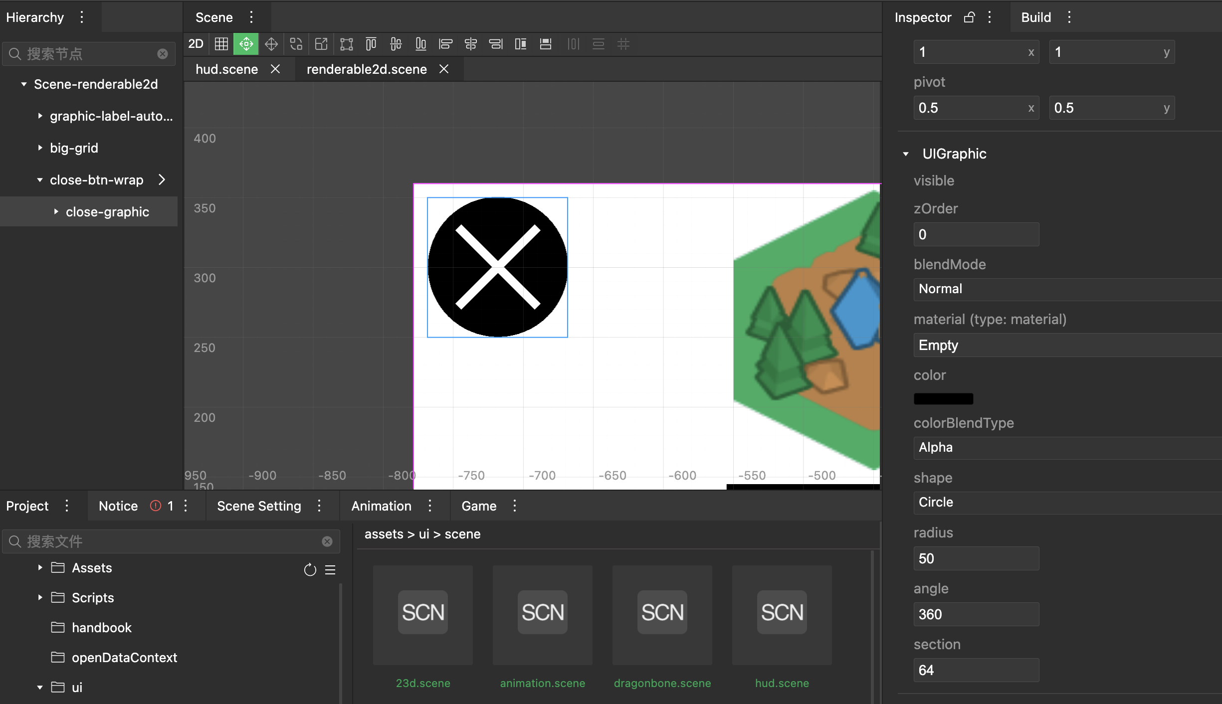
Responsible for basic graphics rendering (rectangle, circle), the case is to build a graphics close button, and dynamic text background graphics.

# Image component usage
- Right-click to create a new node, and add the UIGraphic component to the Inspector panel on the right.
# Graphic button background
- Set
shapetoCircleto use circular rendering, and setradiusto determine the size of the circle. - Set
colorto determine the rendering color.
# Graphic button slash
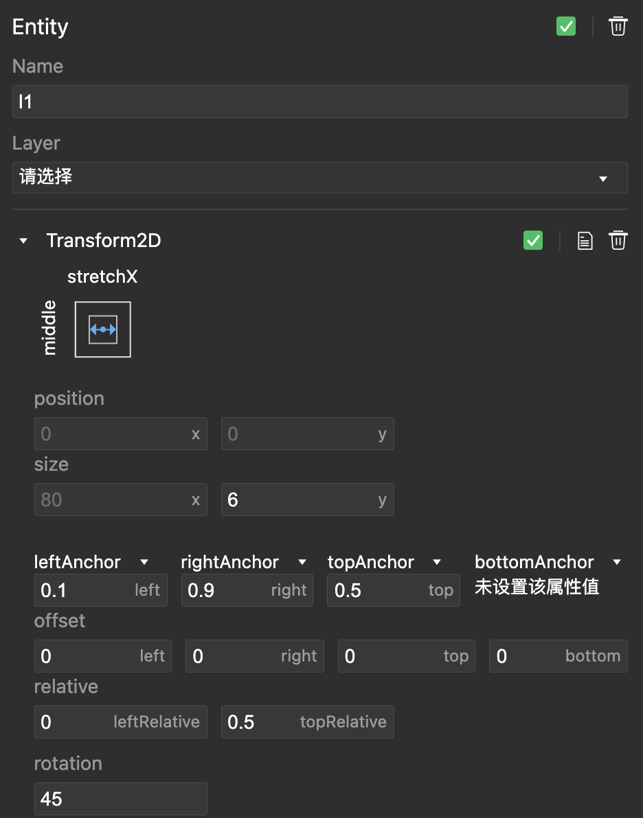
- Create new empty nodes l1 and l2, and add UIGraphic components.
- Set the adaptation method to
stretchX-middle, At this time, the height is fixed, and the width is stretched according to the parent element, Set leftAnchor and rightAnchor so that the scaling is based on the ratio of 0.1-0.9.
- Set l1 and l2 nodes, two different rotation values
# UIMesh vertex rendering component
Responsible for the rendering of custom vertex rendering, the case is to build a hexagon.
For details of the case, please refer to Custom Vertex Drawing and Material