# Making buttons and scrolling lists
This chapter mainly introduces how to build a general button prefab, and will use the button prefab to create a scrolling button list.
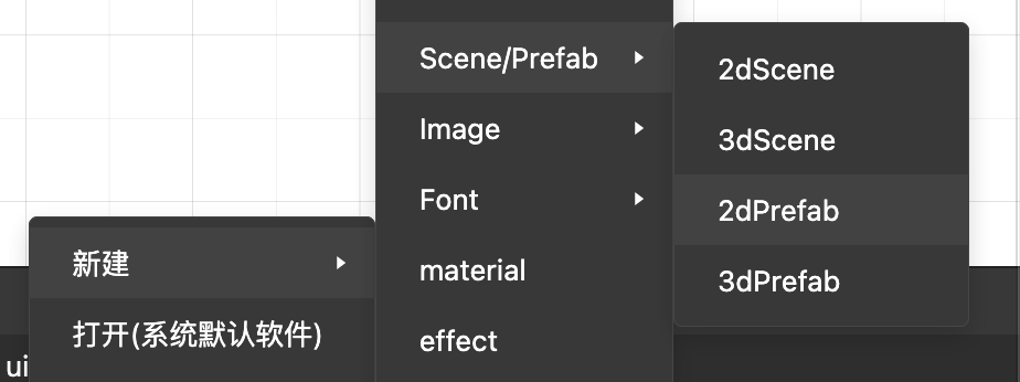
# Create a prefab
- Create a new two-dimensional prefab resource
# Create button
# UIButton
The control component contains the control logic related to the button,
Use UIButton component, IDE will automatically add to the current node
-UISprite component, used for the reality of button pictures
-TouchInputComponent, used for touch-related controls (touchThrough can be set so that the click behavior can penetrate to the rear)
# Using UIButton
- Create a Button node, and automatically add UIButton, UISprite, and TouchInputComponent to the current node.
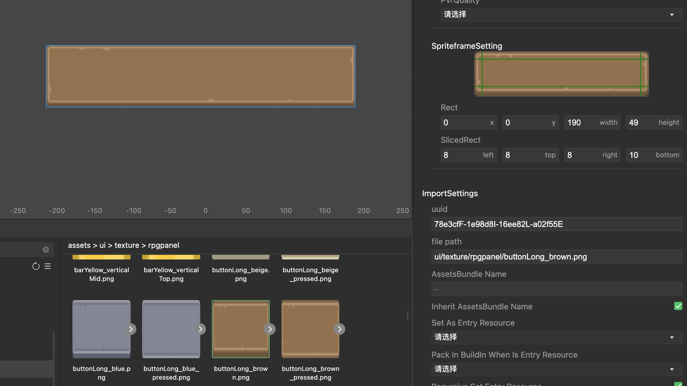
Default button image: spriteFrame onUISprite component
Click and non-click button pictures: the corresponding properties on the UIButton component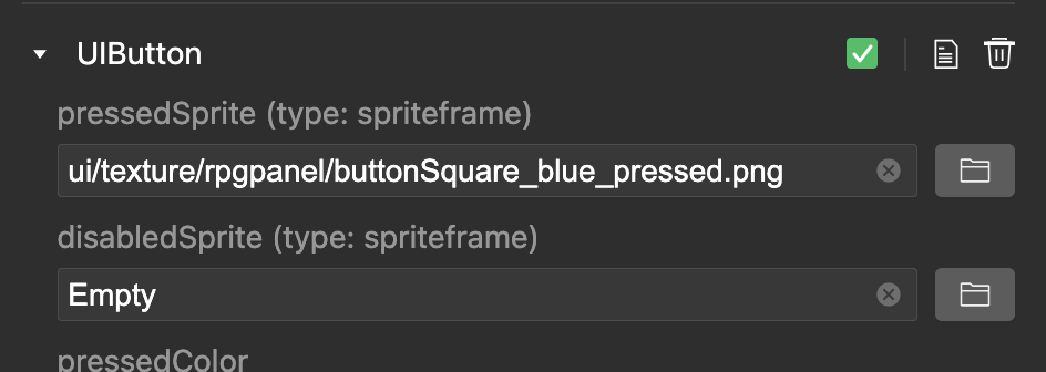 The effect after setting the corresponding picture
# UIButton button text
- After adding UIButton, child nodes with UILabel components will be created automatically,
Used as button text (can be removed manually). In order to support text of various lengths, bestFit is set for the text here, and the size is changed according to the content.


# Create a rolling container
# UIScrollView / UIMask
Control components, which are used to control the scrolling of child nodes.
Use UIScrollView components, usually need to be used with related components
Touch control:
-TouchInputComponent, used for scrolling and touch related controls
Cutting control:
-UIMask component, which needs to be used with the rendering component to define the current node as the clipping area. Property details
-UIGraphic / UISprite, used in conjunction with the UIMask component, UIMask will be cropped according to the rendering area of the rendering component.
# UIScrollView use
- Create a new empty node, add components to the Inspector on the right,
Add responsible for controlling sliding
UIScrollView, Add theTouchInputComponentresponsible for clicking, AddUIMaskandUIGraphicresponsible for cross-border cropping together, and UIMask will crop according to the rendering area of the rendering component.
# Scrolling area size scaling setting
- Set the size of the node. In the case, set it to [center-stretchY 中心](../gameplay/entities/index.md#two-dimensional node). The height is expanded and contracted according to the parent node to determine the sliding area.
# Create a scrollable content area-list
# UIGrid
The typesetting component controls the position of the child nodes according to the given rules.
# Use UIGrid
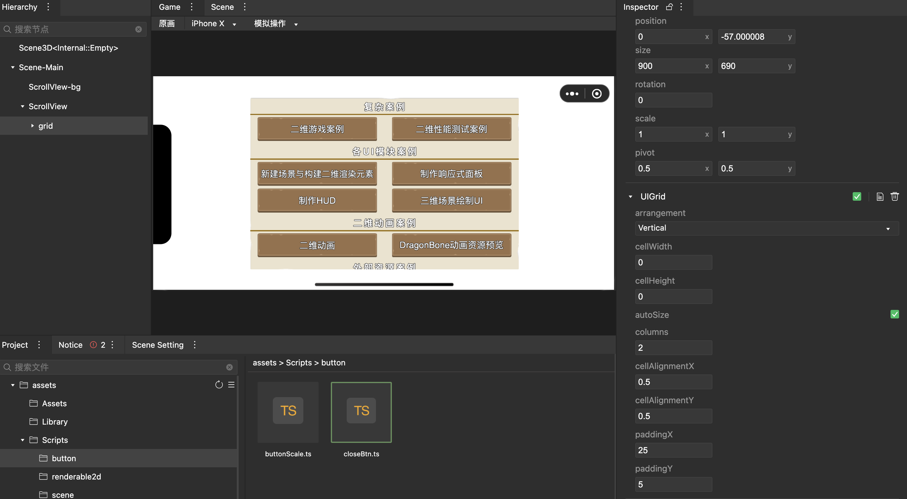
- Create a new child node and add the component UIGrid.
- Right-click the node Grid, add Prefab, and add the button prefab built before
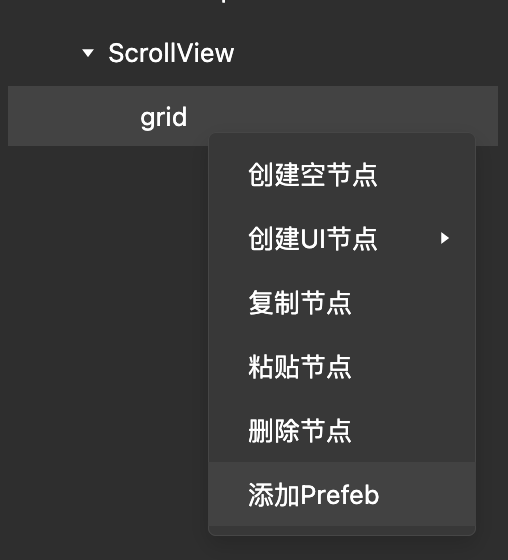
- Set the name of the local button prefab as needed. Changing the configuration of the prefab button will automatically synchronize to the scene’s prefab. The data of the scene setting prefab button will be saved in the scene data. UIGrid can be set to autoSize, combining nodes of different sizes to achieve the desired effect.