# Rolling containers and their application scenarios
Fluctuating scrolling is essential to enhancing the user experience.To achieve native scrolling effects and reduce development costs,Skylineexpanded the oldScrollViewcomponent, and added some scrolling containers for some scenarios.Many of the new capabilities can sometimes make the choice difficult for developers, and the typical application scenarios for them are described below.
# Long list
WebViewunder theScrollViewcomponent, which is prone to white screen and rendering stutter when swiping quickly.For the optimization of long lists, it is usually necessary to render on demand, i.e., ideally only on screen nodes, and nodes beyond the visible area are recycled in a timely manner.
Skylinehas built-in ability to render on demand, but there are requirements for writing that list items serve as direct subnodes in the following structure.
<scroll-view type="list" scroll-y>
  <view> a </view>
  <view> b </view>
  <view> c </view>
</scroll-view>
# Vision size
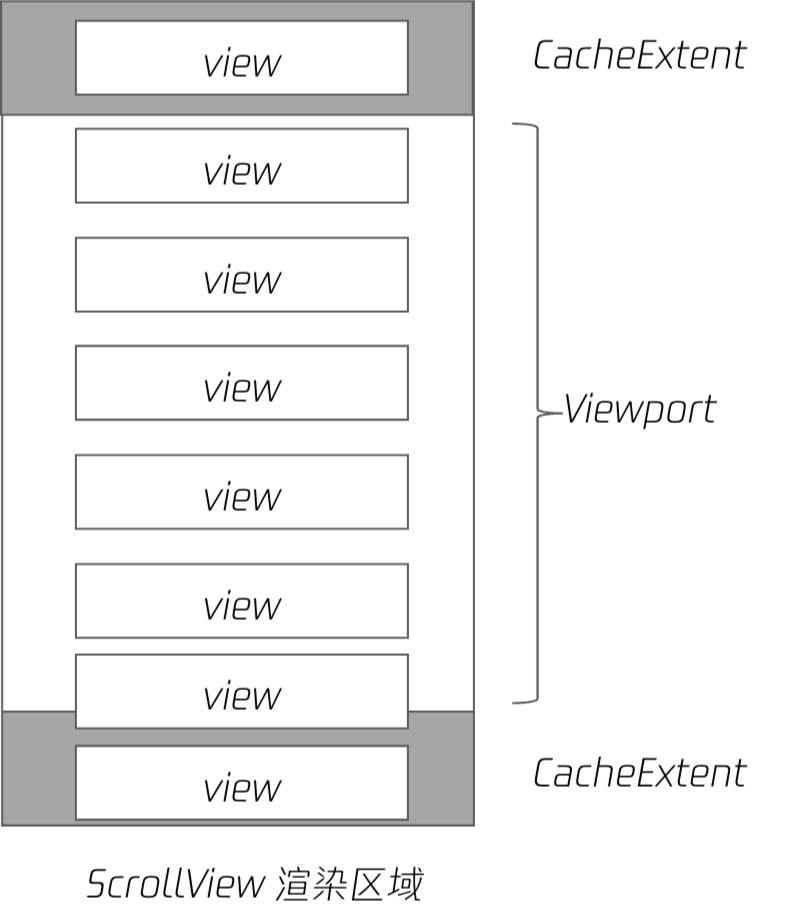
ScrollViewViewport size =ScrollView [[TAG1-END]] Height + specified upper and lower buffersCacheExtent`。
SpecifyCacheExtentOptimizes the scrolling experience and loading speed, but increases memory footprint and affects first screen speed. It can be enabled on demand.
The node begins rendering when it enters the field of view and recycles resources when it leaves the field. The particle size of resource recovery is its direct sub-node.WhenScrollViewhas only a single subnode, all resources cannot be recycled to ensure its rendering, and all content needs to be fully layouted and mapped, which performs poorly, so the flattened subnode is required.
 For business reasons
ScrollViewcontent is often encapsulated as components, resulting in no direct child node.Here's a trick to make the encapsulated component virtual and turn onvirtualHost: true.At real rendering, thevirtual-compnode does not exist and the list items are still flat.
<scroll-view type="list" scroll-y>
  <virtual-comp>
    <view> a </view>
    <view> b </view>
    <view> c </view>
  </virtual-comp>
</scroll-view>
# Full on-demand rendering
The on-demand rendering in Weixin Mini Program is divided into two stages.
- List items create their
DOM nodeson demand; - List items are drawn on the screen as needed;
Thelistpattern of ScrollViewis created on demand, but theDOM nodeof the list item is still created in full.As the number of nodes increases, it puts pressure on memory.
This framework provides a newbuilderpattern that can be used withlist-builder、grid-builder``DOM nodesare created on demand.
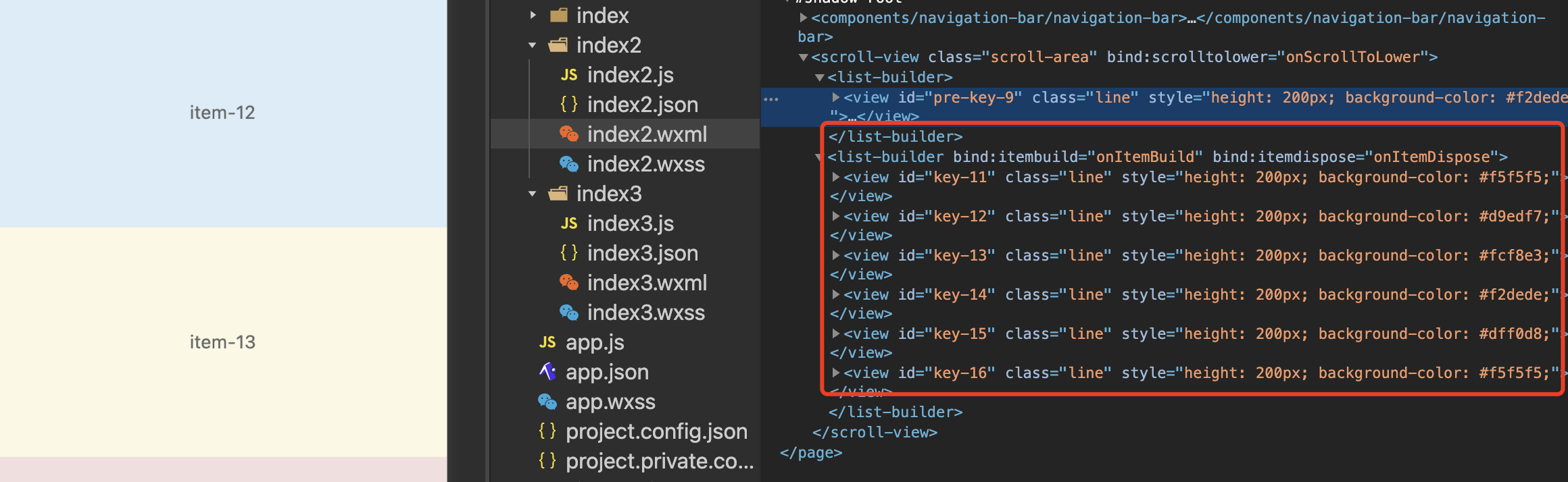 Above is the
buildermode In the developer toolswxmlrender results, the list items are actually created only when the screen is closed, the list item is recycled after the screen is left, and there are always several sub-nodes when scrolling.
# Sample code snippet
# Three modes of ScrollView
ScrollViewprovides a listlist,Customcustomand nested`How do you choose the three rendering modes when actually developing?
# List mode
By default, built-in on-demand rendering capabilities are implemented, but no node recovery is performed. Use when list items are simple and do not cause significant memory pressure.
For non-long lists, even if the list items are not flat, there is no obvious performance problem, using thesingle child nodenotation.
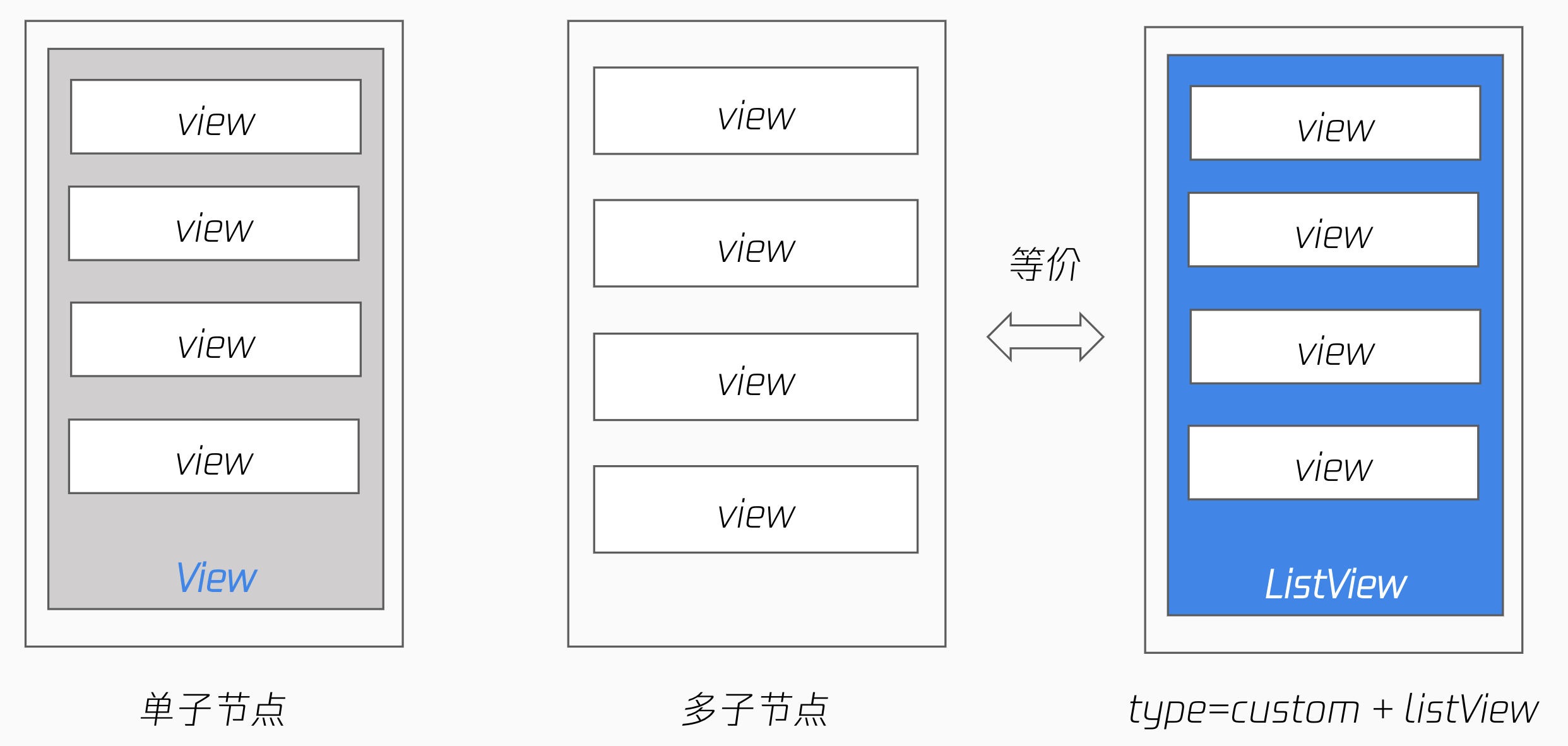
<!-- 单子节点写法,全量绘制 -->
<scroll-view type="list" scroll-y>
  <view>
    <view> a </view>
    <view> b </view>
    <view> c </view>
  </view>
</scroll-view>

<!-- 列表项作为直接子节点,有按需绘制优化 -->
<scroll-view type="list" scroll-y>
  <view> a </view>
  <view> b </view>
  <view> c </view>
</scroll-view>

<!-- 列表项作为 list-view 直接子节点,有按需绘制优化,同上 -->
<scroll-view type="custom" scroll-y>
  <list-view>
    <view> a </view>
    <view> b </view>
    <view> c </view>
  </list-view>
</scroll-view>
# Custom Mode
List scrolling is often used in conjunction with special layout capabilities, such as theeffect when scrolling to the top, sticky, or waterfall layout.
Skylinehas this capability built in and can be implemented directly using thesticky-headerand thegrid-viewcomponents.
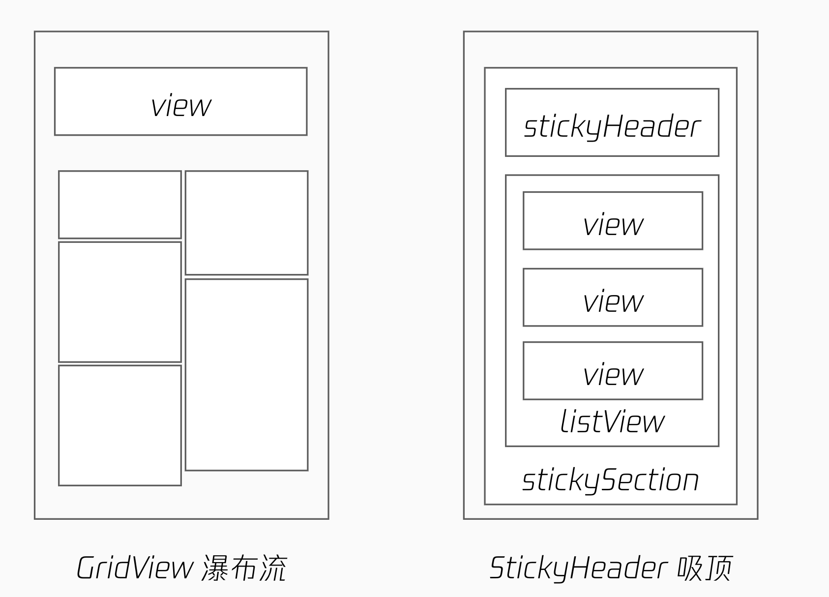
The effect of the list-viewcomponent is equivalent to the list pattern, and if these special layout capabilities are not required, they can be written arbitrarily.
Note that in custom mode,ScrollViewThe direct subnodes themselves are not optimized for on-demand mapping. The capabilities for on-Demand mapping are implemented by thelist-viewcomponent, and thecustompattern combines these capabilities.
<scroll-view type="custom" scroll-y>
  <sticky-section>
    <sticky-header>
      <view> h </view>
    </sticky-header>

    <!-- 非 list-view 子节点,无按需绘制优化 -->
    <view> 1</view>
    <view> 2 </view>

    <!-- 列表项作为 list-view 直接子节点,有按需绘制优化 -->
    <list-view>
      <view> a </view>
      <view> b </view>
      <view> c </view>
    </list-view>
  </sticky-section>
</scroll-view>

<scroll-view type="custom" scroll-y>
  <sticky-section>
    <sticky-header>
      <view> h </view>
    </sticky-header>

    <!-- 列表项作为 grid-view 直接子节点,有按需绘制优化 -->
    <<grid-view type="masonry">
      <view> a </view>
      <view> b </view>
      <view> c </view>
    </<grid-view>
  </sticky-section>
</scroll-view>
# Sample code snippet
# Embedding Mode
This is mainly for a type of nested scrolling scenario.As shown in the figure below,SwiperItemalso has vertical scrollingScrollViewComponent that slides on the internalScrollViewcreates a gesture conflict with the outer layerscrollingView, causing the page in the outer layers to remain unscrollable.
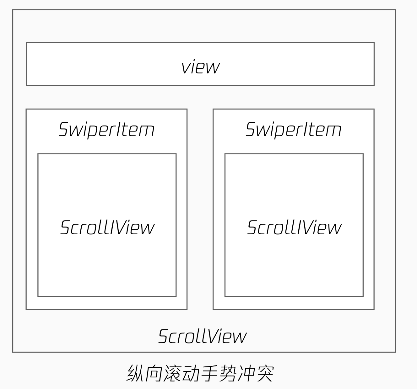
- A nested combination of longitudinal axis + horizontal axis + longitudinal
- There is a gesture conflict between a rolling container in the same direction
- It can be resolved using gestures to negotiate, but the process is more cumbersome
To make the internal and external scrolling interface smoother, the framework adds '
<scroll-view type="nested" scroll-y>
  <nested-scroll-header>
    <view></view>
  </nested-scroll-header>
  <nested-scroll-body>
    <swiper>
      <swiper-item>
        <scroll-view
          type="list"
          associative-container="nested-scroll-view"
        >
          <view>a</view>
          <view>b</view>
        </scroll-view>
      </swiper-item>
      <swiper-item>...</swiper-item>
      <swiper-item>...</swiper-item>
    </swiper>
  </nested-scroll-body>
</scroll-view>
# Sample code snippet
# Draggable containers
A semi-screen drag-and-drop container within a page is a common interaction, allowing the user to expand the list by scrolling. In the past, developers could achieve this through the ability to negotiate by gestures, but it was cumbersome.
The framework provides a draggable-sheet`component that encapsulates this capability, including
- Hide scroll bar
- The effect of rolling back bounce
- Scroll to the specified position (
snapto the key point) - Scroll frame callback (implement scrolling-driven animation)
<draggable-sheet
  class="sheet"
  initial-child-size="0.5"
  min-child-size="0.2"
  max-child-size="0.8"
  snap="{{true}}"
  snap-sizes="{{[0.4, 0.6]}}"
  worklet:onsizeupdate="onSizeUpdate"
>
  <scroll-view
    scroll-y="{{true}}"
    type="list"
    associative-container="draggable-sheet"
    bounces="{{true}}"
  />
</draggable-sheet>