# A guide to large screen adaptation
At present, user devices on the market can be roughly divided into small-screen mobile phone ends, medium-screen tablets, and large-screen PC ends, and among these three types of devices there will be small dimensions differences, also called screen fragmentation.
As Weixin Mini Program can run on more and more devices, developers should also adapt to different screen sizes.
For information on how to achieve better multi-end adaptations in design and user experience, refer to the Mini Program adaptations design guide .
# 1. Adapting scenarios
According to the general principle of adaptation, combined with the characteristics of Weixin Mini Program, it is usually necessary to adapt in the following three situations:
Under the same type of equipment, there are subtle differences in dimensions
Use](https://developers.weixin.qq.com/miniprogram/dev/framework/view/wxss.html#%E5%B0%BA%E5%AF%B8%E5%8D%95%E4%BD%8D) rpx](https://developers.weixin.qq.com/miniprogram/dev/framework/view/wxss.html#%E5%B0%BA%E5%AF%B8%E5%8D%95%E4%BD%8D) units provided by [[TIS-0]] to scale the page layout with little difference in size.
When the screen is allowed to rotate, it can be divided into horizontal and vertical screens.
Mobile settings"pageOrientation": "auto"or iPad settings"resizable": trueWhen the screen rotates, you can use Page'sonResizeevent or thewx.onWindowResizemethod to listen to this action to determine whether you are using a horizontal or vertical layout.
Different types of devices or PC with free drag windows Weixin Mini Program
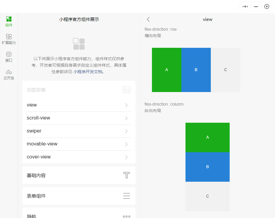
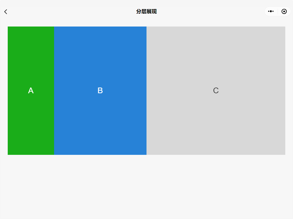
Weixin Mini Program is currently based on Webview, which uses CSS media queries to monitor screen size in real time, display different UI layouts under different screens, and combine Flex elastic layout and Grid grid layout to achieve more responsive adaptations.
# 2. MatchMedia - Abstract Media Queries
Weixin Mini Program The base library adds a set of procedural and defined interfaces to thewindow.matchMedia API`` match-media。Developers can use '] ((match-media)) and [wx.createMediaQueryObserver' To explicitly use media query capabilities, it has the following advantages for multi-end adaptation:
- Developers can more easily and explicitly use MediaQuery capabilities, rather than coupling them into CSS files that are difficult to reuse.
- Being able to use dynamically with data bindings in WXML not only allows components to be displayed or hidden, but also allows greater plasticity in procedural APIs, such as being able to dynamically add class names and change styles based on size changes.
- The ability to use MediaQuery components nested means that changes in the layout style of local components can be met.
- Componentization makes it more encapsulated, isolates styles, templates, and interactive events bound to templates, as well as provides greater reusability.
- The browser has a built-in API that is compatible with all Weixin Mini Program based Webview applications.
The specific use of match-media can refer to the relevant API documentation .
# 3. Adaptive layout
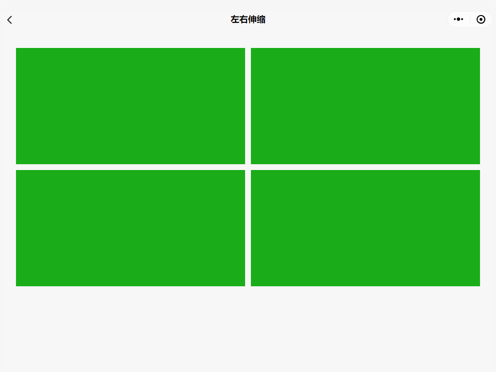
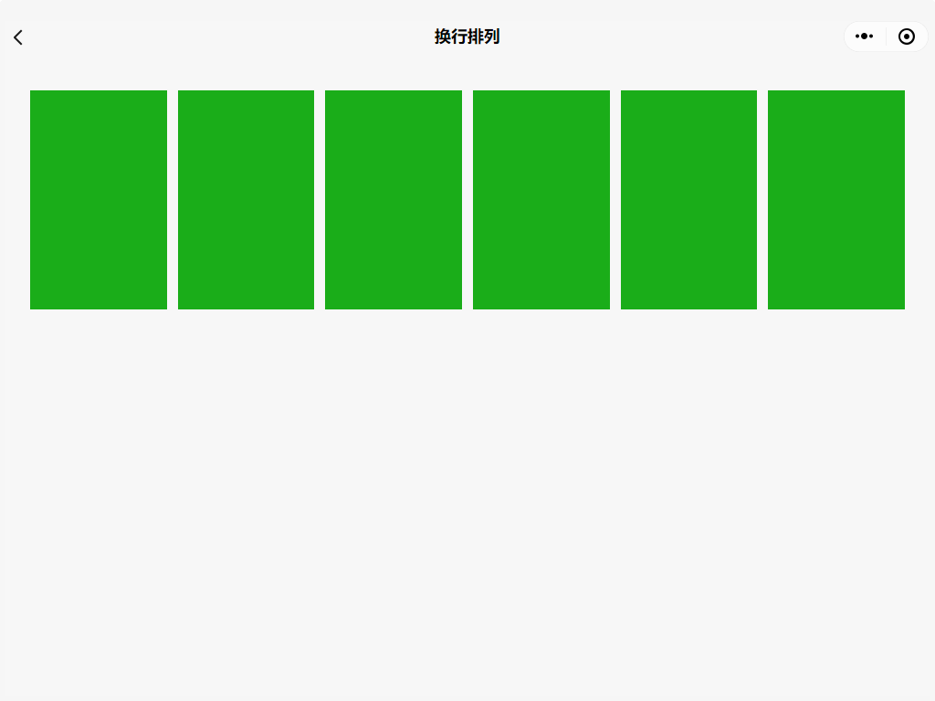
In order to make developers better adaptive large screen, Weixin Mini Program provides row / col component for developers to use.
The main characteristics of adaptation are:
- The entire row is limited to a maximum of 24 places, and excess rows are automatically moved down
- Each size setting does not affect the layout of the other sizes
Design guidelines and code examples
At the same time, we also provide multiterminal adaptation example , experience path: "Extended ability" - > "multiterminal adaptation (need to experience on the PC side)"

In the example Weixin Mini Program, common adaptation scenarios are simply implemented based on the row / col component , such as:
- The bigger the screen, the layout remains the same, and the module shrinks from side to side
- The bigger the screen, the more content, and the module content is arranged across lines
- The larger the screen, the layout changes, and the module content can be folded / displayed
# 4. Rowing Mode
Small programs are supported in](../view/frameset.md) columnar mode](../view/frameset.md) for large scale display of [[TIPs -0]], such as PC.The column mode divides the WeChat window into two halves, each showing a page.